Scoring genre clarity...
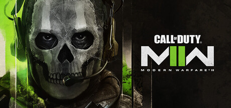
Call of Duty®: Modern Warfare® II capsule

Call of Duty®: Modern Warfare® II

Call of Duty®: Modern Warfare® II drops players into an unprecedented global conflict that features the iconic Operators of Task Force 141.

$69.99Mixed(2,134)
ActionFPSShooter
Infinity Ward, Raven Software, Beenox, Treyarch, High Moon Studios, Sledgehammer Games, Demonware, Toys for BobOct 22, 2022

Call of Duty®: Modern Warfare® II scores 88/100 — better than 99% of Action capsules (n=9,649).

Mixed (2,134 reviews) · $69.99 · Released Oct 22, 2022 · By Infinity Ward

Quick text summary

Call of Duty®: Modern Warfare® II scored 88/100 on Steam Analyzer — Excellent for a Action capsule. Top priority fix: [uniqueness_polish] Consider adding a subtle environmental context or secondary visual element that hints at the global conflict scale beyond the single operator portrait to increase distinctive narrative appeal.

Capsule scores by dimension

  • Genre Clarity: 9/10 — Military action instantly readable. The skull-faced operator with headset, tactical gear, and menacing expression immediately signals hardcore military shooter at any size. The neon green accent on the left reinforces modern tactical warfare aesthetic. Even at tiny size, the skull silhouette and operator context are unmistakable as combat-focused action.
  • Title Readability: 9/10 — Strong logo hierarchy and contrast. The 'CALL OF DUTY MW2' logo is positioned on a clean dark background on the right with bold white letterforms and distinctive geometric styling that survives all the way to tiny thumbnail size. The 'MODERN WARFARE II' subtitle below maintains legibility without competing for attention. The design avoids noisy texture behind text and the bold sans-serif construction holds shape perfectly when scaled down.
  • Contrast & Color: 9/10 — Striking neon-dark value separation. The bright neon green element on the left creates dramatic contrast against the dark skull and background, making the capsule pop strongly on the Steam dark theme. The grayscale test shows clear silhouette separation between the skull's light concrete texture and the black background, with the green providing a saturated accent that draws the eye. The overall value range is wide and reads cleanly even when squinting.
  • Uniqueness & Polish: 8/10 — Polished tactical aesthetic with edge. The weathered skull operator with combat headset feels premium and iconic rather than generic—this is recognizable Call of Duty visual language executed with clean craft. The asymmetrical composition with the neon accent shows intentional art direction beyond a standard soldier pose. The rendering quality and lighting on the skull demonstrates above-baseline production polish, though the overall concept is within expected military shooter conventions.
  • Brand Consistency: 9/10 — Iconic MW2 visual identity. The skull operator is a signature Task Force 141 motif recognizable from the franchise, combined with the distinctive MW2 logo treatment and neon green accent color that carries through the game's visual branding. The palette of blacks, grays, whites, and acid green is cohesive and would be instantly recognizable in a series of marketing materials. Internal elements align perfectly with established Modern Warfare II brand language.
  • Composition: 9/10 — Balanced asymmetry with clear focal point. The skull operator anchors the left side as primary subject while the logo occupies the right in a clean left-right split that creates dynamic balance. The neon green highlight guides the eye and adds depth without cluttering. The composition remains readable and impactful from full header down to tiny thumbnail, with no critical elements hugging edges or falling into unsafe margins.

What works

  • Logo clarity and placement. The MW2 logo sits on clean dark background with exceptional contrast and legibility at all scales, including tiny thumbnails.
  • Instant genre recognition. The tactical operator skull with headset and neon accent immediately communicates hardcore military action shooter without ambiguity.
  • Strong value contrast. The composition leverages wide dark-to-light range and saturated neon accent to stand out distinctly against Steam's dark background.
  • Brand icon usage. The skull operator is a signature franchise visual that reinforces Call of Duty identity and creates recognizable consistency.

What hurts the capsule

  • Predictable military template. While polished, the skull operator aesthetic follows expected military shooter visual conventions without groundbreaking originality.
  • Limited storytelling depth. The capsule communicates 'tactical military action' but lacks visual hints of the specific global conflict narrative or unique campaign hook mentioned in the description.

Priority fixes

  1. [uniqueness_polish] Consider adding a subtle environmental context or secondary visual element that hints at the global conflict scale beyond the single operator portrait to increase distinctive narrative appeal.

Store copy priority fixes

  1. [hook_strength] Replace 'unprecedented global conflict' with a specific, action-forward hook: e.g., 'Command elite Task Force 141 operatives through high-stakes covert missions across global hotspots.' This leads with player agency and concrete setting.
  2. [feature_communication] Add 2-3 concrete gameplay details per mode, such as 'Campaign: infiltrate enemy strongholds in 7 globe-spanning missions' or 'Multiplayer: compete across 16 maps with class customization' to help players visualize what they'll do.
  3. [uniqueness] Identify and highlight one clear differentiator from Modern Warfare 2019 and competing shooters (e.g., new weapons, AI squad mechanics, map design innovation) to justify purchase choice.
  4. [audience_targeting] Explicitly signal difficulty modes, progression pace, or learning resources to clarify whether this suits casual players or hardcore competitive audiences.

Related guides

Steam app ID: 3595230 · Tags: Action, FPS, Shooter, Multiplayer, Singleplayer