Scoring genre clarity...

Tiny Vending Machines capsule

Tiny Vending Machines

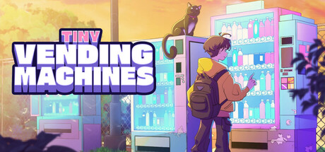
Tiny Vending Machines is an idle pixel art game that runs at the bottom of your screen. Buy and upgrade vending machines, stock them with drinks, snacks, and more, and keep customers happy. Automate your machines at higher levels and grow your vending empire while you work or study!

$4.99Mixed(68)
IdlerDesktop CompanionEconomy
Frozen Logic StudiosOct 10, 2025

Tiny Vending Machines scores 78/100 — better than 73% of Idler capsules (n=1,270).

Mixed (68 reviews) · $4.99 · Released Oct 10, 2025 · By Frozen Logic Studios

Quick text summary

Tiny Vending Machines scored 78/100 on Steam Analyzer — Good for a Idler capsule. Top priority fix: [uniqueness_polish] Enhance the vending machine designs or cat character with a more distinctive visual hook or signature asset that sets this apart from generic casual sims.

Capsule scores by dimension

  • Genre Clarity: 8/10 — Clear casual simulation with pixel charm. The capsule immediately communicates a cozy pixel art idle/simulation game through the vending machines, character interacting with them, and warm aesthetic. At tiny size, the vending machine silhouettes and character pose remain readable and strongly suggest a management/automation game, though the exact 'vending' focus requires the title to fully land.
  • Title Readability: 9/10 — Bold, clean, highly legible throughout. The title 'TINY VENDING MACHINES' uses a thick blue outline font with strong white fill that contrasts sharply against the warm orange-yellow background. Even at tiny size, each word remains distinct and readable; the outline strategy ensures legibility without collapsing, and the logo placement on a controlled upper-left region avoids texture noise.
  • Contrast & Color: 8/10 — Warm glow with strong value separation. The warm orange-yellow gradient background creates excellent separation from the cool blue title text and purple-cyan vending machines in the right half. The character and machines read clearly against the background; in grayscale, the mid-tone vending machines maintain distinct silhouettes against the lighter sky, though the warm background softens some edge definition at tiny size.
  • Uniqueness & Polish: 7/10 — Polished pixel art with solid execution. The capsule features clean pixel art rendering, intentional warm color grading, and a coherent cozy aesthetic that aligns well with top-performing casual sims like Tiny Glade and Moonstone Island. The scene communicates the core loop (buy machines, stock them, serve customers) through visual storytelling, though the composition is relatively straightforward and lacks a distinctive hook that would push it to 8+.
  • Brand Consistency: 7/10 — Consistent pixel palette, recognizable style. The warm orange-purple-cyan color scheme, pixel art style, and cozy tone are internally cohesive and would be recognizable across multiple marketing materials. The character and vending machine designs feel branded to this specific game rather than generic, though without seeing other store screenshots it is difficult to confirm whether iconic motifs or symbols repeat consistently.
  • Composition: 8/10 — Strong focal hierarchy with clear depth. The character in the foreground (center-right) serves as the primary focal point, with vending machines creating a layered background that guides the eye naturally. Title placement in the upper left leaves ample breathing room, and the composition maintains clear reads at small and tiny sizes; at tiny size the character and machines remain distinct though some fine pixel detail softens.

What works

  • Excellent title contrast and legibility. Blue outline font on warm background pops at all sizes and remains readable even at tiny thumbnail scale.
  • Clear genre communication through visuals. Vending machines, character interaction, and warm cozy aesthetic immediately signal a casual simulation game without ambiguity.
  • Coherent pixel art style and palette. Warm orange-purple-cyan scheme feels intentional and branded rather than generic, creating a memorable look.
  • Well-balanced composition with hierarchy. Character focal point, supporting vending machine backdrop, and safe title placement create natural eye flow without clutter.

What hurts the capsule

  • Limited visual distinctiveness in crowded genre. While polished, the scene composition and visual hook are relatively conventional compared to top-tier casual sims that feature more unique mechanics or art directions.
  • Fine pixel detail softens at tiny size. Some machine interior details and character features become slightly muddy at thumbnail scale, though core silhouettes remain intact.

Priority fixes

  1. [uniqueness_polish] Enhance the vending machine designs or cat character with a more distinctive visual hook or signature asset that sets this apart from generic casual sims.
  2. [contrast_color] Increase subtle shadow or rim lighting on the character to push it slightly forward and reinforce the focal point at tiny sizes.

Store copy priority fixes

  1. [hook_strength] Rewrite the opening line to lead with the fantasy, not the mechanic: instead of 'idle pixel art game that runs at the bottom,' try 'Build a vending machine empire that runs itself—watch profits grow while you work or stream.'
  2. [uniqueness] Add a sentence in the detailed description explicitly positioning the Twitch integration as a core differentiator earlier and explaining how it changes gameplay compared to solo play.
  3. [tone_match] Soften or remove corporate jargon like 'balancing affordability and profit' and replace with language that feels cozy and playful to match the pixel art aesthetic.
  4. [feature_communication] Clarify the automation progression: at what level do machines become fully automated, and what do players do after that happens?

Related guides

Steam app ID: 3595460 · Tags: Idler, Desktop Companion, Economy, Simulation, Life Sim