Scoring genre clarity...

Viking Breaker capsule

Viking Breaker

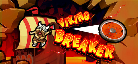
Break through the walls of Hell and crush hordes of infernal creatures aboard your drakkar! Viking Breaker is an arcade roguelite mixing brick-breaker and bullet hell mechanics. Launch your shields, activate runes, and survive the trials of the Norse gods!

$4.991 user reviews
Bullet HellAction RoguelikeLooter Shooter
Gamific, Kode Game StudioSep 3, 2025

Viking Breaker scores 70/100 — better than 26% of Bullet Hell capsules (n=1,285).

1 user reviews · $4.99 · Released Sep 3, 2025 · By Gamific

Quick text summary

Viking Breaker scored 70/100 on Steam Analyzer — Good for a Bullet Hell capsule. Top priority fix: [genre_clarity] Add visual cues that hint at brick-breaker or bullet-dodging mechanics, such as a shield-wall composition or projectile trails, to clarify the hybrid arcade identity

Capsule scores by dimension

  • Genre Clarity: 7/10 — Viking arcade action clear. The capsule clearly communicates a Viking-themed action game through the Norse warrior character, shield motif, and fiery arcade aesthetic. At tiny size, the Viking protagonist and orange/red color palette remain recognizable, though the specific brick-breaker mechanics are not visually obvious from iconography alone. The genre reads as action-arcade rather than strategy or RPG, which partially aligns with the game's hybrid nature.
  • Title Readability: 8/10 — Bold yellow text reads well. The title 'VIKING BREAKER' uses a thick yellow-gold sans-serif font with strong red and black outlines that contrasts sharply against the orange-brown background. At small and tiny sizes, the letterforms remain legible due to the bold weight and outline treatment, though the outline becomes slightly softer at the smallest scale. The diagonal placement and layering against the action scene works well without obscuring the central gameplay imagery.
  • Contrast & Color: 8/10 — Strong warm contrast pops. The capsule uses a warm gold-orange-red gradient background with a darker brown/maroon shadow layer that creates excellent value separation against the Steam dark background. The yellow title text and orange shield combo stand out clearly with high saturation and brightness, and the white areas around the character silhouette add sharp highlights. Even in grayscale, the layered depth and light-dark separation remain strong and readable at all viewing sizes.
  • Uniqueness & Polish: 6/10 — Competent but generic arcade. The capsule presents a clean, professional execution with good visual polish and coherent color grading, but the overall composition reads as a standard arcade action template with a Viking skin rather than a distinctive visual hook. The shield, warrior pose, and explosion effects are well-rendered but lack a memorable unique selling point or mechanical hook that would differentiate it from other action-arcade titles. The craft is competent without standing out notably from the benchmark games in the genre.
  • Brand Consistency: 6/10 — Generic Viking theme applied. The capsule uses consistent Norse visual language (Viking warrior, shield, Norse runes theme) and a cohesive warm-orange palette throughout the design. However, without additional context from game screenshots, the internal identity signals feel generic to the Viking-action archetype rather than establishing a distinctive brand fingerprint that would be uniquely recognizable as this specific game. The rendering style is polished but does not suggest a signature art direction or iconic motif that sets it apart.
  • Composition: 7/10 — Clear focal point good layout. The composition places the Viking warrior on the left-center as the primary focal point with the shield and title elements creating a strong diagonal flow to the upper right, maintaining a clear visual hierarchy. At small and tiny sizes, the character silhouette and bold title remain the dominant readable elements without significant clutter. The composition is well-balanced and uses the frame efficiently, though the upper-right shield element sits slightly close to the edge and could risk minor cropping on some Steam display scenarios.

What works

  • Strong title contrast and legibility. The thick yellow-gold 'VIKING BREAKER' text with red and black outlines maintains clear readability down to tiny thumbnail size due to bold weight and outline strategy.
  • Warm color palette pops on dark background. The gold-orange-red gradient creates excellent visual separation against Steam's dark background with strong saturation and brightness that reads instantly in quick scroll.
  • Clear primary subject focus. The Viking warrior positioned left-center anchors attention effectively and maintains silhouette clarity across all viewing sizes without competing elements.
  • Polished execution and rendering. The overall craft quality is professional with clean shadows, consistent lighting, and coherent visual effects that convey AAA-adjacent production value.

What hurts the capsule

  • Generic arcade action template feel. The composition and visual elements follow a standard action-arcade formula without a distinctive hook or unique mechanical visual signature that differentiates it.
  • Brick-breaker mechanic not visually communicated. The capsule emphasizes Viking warrior and shield imagery but does not clearly convey the core brick-breaker or bullet-hell gameplay loop through visual metaphor or UI hints.
  • Limited brand identity memorability. The Norse theme is competently applied but does not establish a signature palette, character, or motif unique enough to be immediately recognizable as this specific game versus other Viking action titles.
  • Shield element positioned near edge. The orange shield in the upper right sits close to the margin and could risk minor cropping on some Steam display modes.

Priority fixes

  1. [genre_clarity] Add visual cues that hint at brick-breaker or bullet-dodging mechanics, such as a shield-wall composition or projectile trails, to clarify the hybrid arcade identity
  2. [uniqueness_polish] Develop a distinctive visual signature or iconic character design element that differentiates this from generic Viking action templates in the store
  3. [composition] Reposition the shield element with more internal margin to ensure safe display across all Steam viewport configurations

Store copy priority fixes

  1. [feature_communication] Add 1–2 sentences explaining rune mechanics concretely: what do runes do, and give 1–2 example effects (e.g., 'Summon lightning to pierce through enemy formations' or 'Shield reflects projectiles for 3 seconds').
  2. [feature_communication] Clarify crew member gameplay role and synergy system in 1–2 sentences: do they provide passive bonuses, active abilities, or build-synergy effects? Example: 'Crew members grant passive buffs—pair a warrior with a shield for increased armor.'
  3. [audience_targeting] Add 1 sentence signaling difficulty and skill curve to help casual and hardcore players self-select, e.g., 'Roguelike depth with arcade accessibility: easy to pick up, challenging to master' or 'Master dozens of shield and rune combos for competitive speedruns.'

Related guides

Steam app ID: 3598580 · Tags: Bullet Hell, Action Roguelike, Looter Shooter, Roguelite, PvE