Scoring genre clarity...

Swann's Song capsule

Swann's Song

A boy and an old man stand in front a pond, waiting for a swan's song. Meanwhile, they talk about life, death, and the passage of time.

$1.99Positive(18)
Hand-drawnEmotionalPhilosophical
Interactive DreamsMay 30, 2025

Swann's Song scores 72/100 — better than 42% of Hand-drawn capsules (n=1,685).

Positive (18 reviews) · $1.99 · Released May 30, 2025 · By Interactive Dreams

Quick text summary

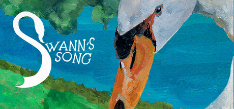
Swann's Song scored 72/100 on Steam Analyzer — Good for a Hand-drawn capsule. Top priority fix: [uniqueness_polish] Clarify the sail or paper plane object with bolder silhouette definition or subtle line work to signal it as a meaningful game element rather than abstract background texture.

Capsule scores by dimension

  • Genre Clarity: 7/10 — Narrative adventure with nature focus. The swan climbing against a blue water background immediately signals a nature or animal-focused narrative game, supported by the contemplative tone and character silhouette. At TINY size, the swan and climbing motif read clearly, though the specific adventure/indie classification requires prior knowledge rather than pure visual language. The pastoral aesthetic aligns with indie narrative games like Venba or Harold Halibut.
  • Title Readability: 8/10 — Clean serif logo, excellent contrast. The 'SWANN'S SONG' title uses a distinctive serif font in solid white positioned firmly in the upper left quadrant against the blue background, ensuring legibility at all sizes. The elegant letterforms and strategic placement on a clear blue region mean the title survives TINY compression without degradation. Letter spacing is generous and the ornamental serif style feels intentional rather than generic.
  • Contrast & Color: 8/10 — Strong value separation, vibrant palette. The composition leverages high-contrast color zones: bright orange swan against teal-blue water, green landform in upper left, and white serif text. At TINY size, the orange swan silhouette pops clearly against the blue, and the grayscale test shows strong value separation between the warm tones and cool background. The limited but purposeful palette avoids muddy midtones and creates a clean, readable icon.
  • Uniqueness & Polish: 7/10 — Polished illustration, thematic cohesion. The watercolor or painterly rendering style conveys premium craft and matches the contemplative, literary tone suggested by the title 'Swann's Song.' The swan-climbing imagery is genuinely distinctive—not a generic scene but a surreal, metaphorical visual that hints at the game's philosophical focus. However, the illustration approach, while well-executed, remains within expected indie game aesthetics rather than pushing into truly memorable territory.
  • Brand Consistency: 6/10 — Coherent art direction, limited identity signals. The painterly watercolor style and nature-focused palette create internal cohesion across the capsule, and the serif typeface feels intentionally paired with the artistic aesthetic. Without access to compare against the five available store screenshots in detail, the capsule establishes a recognizable visual mood but lacks an iconic character, symbol, or distinctive motif that would make it immediately re-identifiable across contexts. The swan itself could become such a signal, but it reads as thematic element rather than brand anchor here.
  • Composition: 7/10 — Clear focal point, balanced elements. The orange swan climbing the paper plane or sail creates a strong primary focal point in the right-center area, with the flowing water and landscape supporting it without competition. The title is anchored top-left in a safe margin, and the composition uses depth layering effectively: green foreground, blue midground water, light background sky. At SMALL and TINY sizes, the swan remains the undeniable focal point, though the paper/sail element becomes harder to parse as a distinct object below thumbnail resolution.

What works

  • Distinctive swan-climbing metaphor. The surreal imagery of an orange swan climbing a sail or paper plane over water immediately communicates a narrative game with philosophical undertones and emotional depth.
  • Elegant, legible typography. The white serif 'SWANN'S SONG' logo maintains perfect readability from full size down to TINY compression with no letter collapse or blur.
  • Vibrant color hierarchy. Strong orange-against-teal contrast ensures the focal subject stands out immediately against the dark Steam background at all viewing sizes.
  • Painterly art quality. The watercolor rendering style conveys premium indie production values and thematic alignment with a literary, introspective game about life and death.

What hurts the capsule

  • Ambiguous secondary object. The white sail or paper plane structure is visually unclear and could be read as abstract form rather than a meaningful game element at TINY size.
  • Limited brand identity anchor. The capsule does not feature a recognizable character, symbol, or icon that would make this game visually distinctive across browsing contexts or store sections.
  • Subtle genre signals. While the mood is clear, the adventure/narrative gameplay is implied rather than visually communicated, meaning the capsule relies on title context rather than pure visual language.

Priority fixes

  1. [uniqueness_polish] Clarify the sail or paper plane object with bolder silhouette definition or subtle line work to signal it as a meaningful game element rather than abstract background texture.
  2. [brand_consistency] Establish a recurring visual motif—such as a distinctive swan shape, ornamental frame, or color accent—that can anchor brand recognition across store presence and social media.
  3. [genre_clarity] Add subtle narrative or gameplay visual cues (e.g., a figure silhouette waiting by the water, or a time-passage indicator) to strengthen the 'contemplative adventure' classification at TINY size.

Store copy priority fixes

  1. [hook_strength] Replace the opening line with a more emotionally resonant verb: e.g., 'Two strangers sit by a dying swan's pond, wrestling with life, death, and time.' instead of 'A boy and an old man stand in front a pond.'
  2. [feature_communication] Add one sentence explicitly clarifying player agency: 'Listen and choose dialogue responses as a boy and old man converse about mortality, legacy, and regret in this linear, 45-minute narrative experience.'
  3. [audience_targeting] Insert a single line after the opening setting up expectation: 'For players seeking intimate, dialogue-driven stories with no branching paths or multiple endings—a meditative theatre piece, not an action game.'
  4. [uniqueness] Add a differentiating hook: 'A meditation on mortality told through hand-drawn art and real conversations—nominated for three major new media writing awards.' to emphasize this is award-recognized execution, not generic conversation.

Related guides

Steam app ID: 3598860 · Tags: Hand-drawn, Emotional, Philosophical, Dialogue Heavy, Relaxing