Scoring genre clarity...

Shoot'n'Shell capsule

Shoot'n'Shell

Do not doubt!

2,99€
ActionLooter ShooterTwin Stick Shooter
Serhii Maletin7 Apr, 2025

Shoot'n'Shell scores 70/100 — better than 29% of Action capsules (n=8,534).

2,99€ · Released 7 Apr, 2025 · By Serhii Maletin

Quick text summary

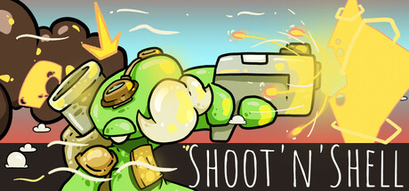
Shoot'n'Shell scored 70/100 on Steam Analyzer — Good for a Action capsule. Top priority fix: [uniqueness_polish] Introduce a distinctive visual quirk or personality to the mech design that differentiates it from generic action game robots and creates immediate brand recognition.

Capsule scores by dimension

  • Genre Clarity: 7/10 — Action shooter clear, RPG elements subtle. The bright yellow mech/robot character with prominent weaponry and explosive effects immediately signals action gameplay, supported by the title 'SHOOT'N'SHELL' which reinforces the shooter focus. At tiny size, the silhouette and yellow color remain legible, though the RPG context is not visually obvious from the capsule alone—the action genre dominates the read.
  • Title Readability: 8/10 — Bold white text, excellent contrast. The title 'SHOOT'N'SHELL' is rendered in a clean, bold white sans-serif font positioned across the lower third on a dark background strip, ensuring strong readability at full and small sizes. At tiny size the letterforms remain distinct and the all-caps styling aids recognition, though the apostrophes may blur slightly.
  • Contrast & Color: 8/10 — Bright yellow mech pops against sky. The vibrant yellow-green protagonist contrasts sharply against the blue-gray sky gradient and dark ground, creating clear silhouette separation at all viewing sizes. In grayscale stress test, the mid-tone yellow maintains good separation from the background, and the white title text provides maximum value contrast against dark areas.
  • Uniqueness & Polish: 6/10 — Competent stylized action, generic mech trope. The art style is clean with bright colors and dynamic pose, but the yellow mech archetype is a familiar indie game trope without a distinctive visual hook or memorable personality that sets it apart from similar action titles. The execution is solid but the concept reads as generic action-game fare rather than uniquely branded.
  • Brand Consistency: 6/10 — Consistent style, no iconic signature. The capsule displays a coherent bright, cartoonish art direction with consistent color palette and rendering across visible elements. However, there are no memorable motifs, character quirks, or distinctive visual signatures that would make this capsule instantly recognizable as Shoot'n'Shell on repeat viewings.
  • Composition: 7/10 — Clear focal point, balanced layout. The yellow mech is centered and dominant, creating a strong primary subject that holds attention at small and tiny sizes, with supporting environmental elements (sky, ground, distant cannon) providing context without competing. The title placement at bottom on a dark bar provides good hierarchy, though the composition feels slightly static and centered in a way that could benefit from more dynamic off-center tension.

What works

  • Strong color contrast against background. The bright yellow-green mech stands out clearly against the blue sky and dark ground even at tiny sizes, ensuring visibility in Steam browsing.
  • Readable, bold title treatment. The white 'SHOOT'N'SHELL' text is legible at all sizes thanks to bold weight, clean sans-serif letterforms, and high contrast dark background placement.
  • Clear action genre communication. The mechanical suit, weaponry, and explosive visual effects immediately convey action shooter gameplay without ambiguity.

What hurts the capsule

  • Generic mech archetype lacks distinction. The yellow robot is a familiar indie game visual that does not communicate what makes Shoot'n'Shell unique compared to other action titles.
  • No memorable brand identity markers. The capsule has no iconic character trait, signature symbol, or distinctive visual hook that would aid brand recall across multiple viewing sessions.
  • Static centered composition. The subject placement in the dead center lacks dynamic tension or compositional sophistication seen in top-tier action game capsules.

Priority fixes

  1. [uniqueness_polish] Introduce a distinctive visual quirk or personality to the mech design that differentiates it from generic action game robots and creates immediate brand recognition.
  2. [brand_consistency] Develop a signature visual motif, color accent, or UI element that appears consistently across future capsule iterations to build recognizable brand identity.
  3. [composition] Reposition the mech off-center using rule-of-thirds framing and add dynamic angling or pose variation to increase visual tension and premium feel.

Store copy priority fixes

  1. [hook_strength] Replace 'Do not doubt!' with a verb-forward hook such as 'Master fast-paced twin-stick combat and build legendary loadouts in this challenging offline looter-shooter.' This immediately communicates genre, core gameplay, and tone.
  2. [uniqueness] Add a concrete differentiator sentence after the opening, such as 'With hand-drawn pixel art, 120+ unique perks, and boss patterns that reward adaptation over luck, every run tests a different strategy.' This explains what makes Shoot'n'Shell distinct.
  3. [feature_communication] Clarify progression structure with one sentence: 'Runs are roguelike-based, but permanent village upgrades ensure meaningful progression across deaths, letting you refine your approach.' This removes ambiguity about progression pacing.
  4. [tone_match] Soften or replace 'NOT EASY, NOT SORRY!' with 'Brutal but Fair: A Mid-Core Challenge' to maintain the confident tone while sounding less hostile to new players.

Related guides

Steam app ID: 3599050 · Tags: Action, Looter Shooter, Twin Stick Shooter, RPG, Action Roguelike