Scoring genre clarity...

Dark Mine capsule

Dark Mine

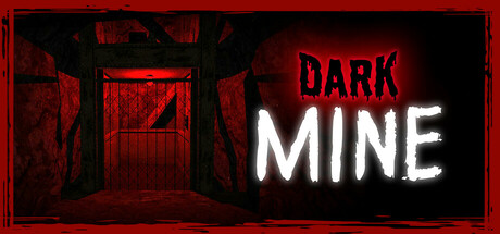
Trapped underground after a collapse, you are the sole survivor of a deadly attack. Armed only with a night vision camera, navigate the darkness, avoid the creature, and find a way out in this retro-style survival horror game.

$2.99Positive(10)
AdventurePsychological HorrorAction
Cyber752Jun 24, 2025

Dark Mine scores 68/100 — better than 22% of Adventure capsules (n=7,922).

Positive (10 reviews) · $2.99 · Released Jun 24, 2025 · By Cyber752

Quick text summary

Dark Mine scored 68/100 on Steam Analyzer — Solid for a Adventure capsule. Top priority fix: [uniqueness_polish] Integrate a subtle visual representation of the night vision camera mechanic (thermal glow, lens flare, or HUD element) to differentiate from generic dark corridors

Capsule scores by dimension

  • Genre Clarity: 7/10 — Survival horror clearly signaled. The red-tinted interior space, mine setting, and ominous neon text establish a horror atmosphere effectively. At tiny size, the confined corridor silhouette and red color palette communicate danger and claustrophobia, though the specific survival mechanic (night vision camera) is not visually apparent without reading descriptive text.
  • Title Readability: 8/10 — High contrast neon reads well. The white neon 'MINE' text paired with red 'DARK' creates strong value separation against the dark background and reads clearly even at tiny size. The letterforms are clean and modern, though at the smallest thumbnail scale the text remains legible due to high contrast and sans-serif simplicity, making this a strong technical choice.
  • Contrast & Color: 8/10 — Bold red and white separation. The deep red environment with white neon text and dark architectural silhouettes create excellent value contrast against the Steam dark background. The glowing neon effect adds visual pop and the red-black interplay maintains clarity in grayscale, though the mid-tone red walls could risk some compression at tiny sizes.
  • Uniqueness & Polish: 6/10 — Competent horror setup, minimal distinction. The neon aesthetic and mine setting are well-executed but lean on familiar survival horror tropes without a distinctive visual hook that separates it from other indie horror titles. The lighting and color treatment are clean and intentional, yet the composition feels like a solid execution of a standard horror template rather than a memorable unique selling point.
  • Brand Consistency: 5/10 — Generic horror visual language. The capsule uses standard survival horror iconography (dark mine, red tint, ominous neon) without establishing a distinctive brand motif or recurring visual symbol that would carry across promotional materials. There is no iconic character, creature silhouette, or signature palette cue that signals 'Dark Mine' specifically rather than any other indie horror game.
  • Composition: 7/10 — Clear focal point with good depth. The composition uses strong linear perspective through the mine corridor to draw the eye toward the background, with the neon title anchored in the right-center creating a natural reading flow. The foreground architectural framing and background depth create a three-layer hierarchy that reads well at small size, though the centered title placement is safe but not distinctively memorable.

What works

  • Neon text contrast. White neon 'MINE' against dark red walls provides excellent legibility and visual pop that survives compression at tiny thumbnail size.
  • Atmospheric perspective. The corridor depth and red lighting create immediate sense of confined horror space that communicates genre intent at full and small sizes.
  • Color palette discipline. Limited red-white-black palette maintains cohesion and prevents visual noise that would fragment attention on small screens.

What hurts the capsule

  • Generic survival horror template. The mine setting and red-lit interior are familiar survival horror clichés that appear across multiple indie horror titles without a distinctive twist or visual signature.
  • No iconic visual hook. Absence of memorable character, creature, or symbol that would create brand recognition beyond the moment of viewing on the store page.
  • Limited storytelling in composition. The capsule shows setting and mood but does not visually hint at the unique night vision camera mechanic or the sole survivor narrative core.

Priority fixes

  1. [uniqueness_polish] Integrate a subtle visual representation of the night vision camera mechanic (thermal glow, lens flare, or HUD element) to differentiate from generic dark corridors
  2. [brand_consistency] Establish a distinctive creature silhouette or repeating symbol element that can anchor brand identity across other promotional materials
  3. [composition] Introduce a focal foreground element (broken equipment, player hand with camera, or environmental hazard) to add narrative depth and reduce reliance on corridor alone

Store copy priority fixes

  1. [feature_communication] Add a sentence describing secondary gameplay systems or constraints beyond the camera mechanic (e.g., limited battery, audio cues, hiding mechanics, puzzle-solving) to clarify the full gameplay loop.
  2. [audience_targeting] Insert a brief indicator of target player type: 'Ideal for players who enjoy tense, story-driven horror over combat' or 'This is a patient, atmospheric experience, not action-focused,' to help self-selection.
  3. [uniqueness] Expand the 'Retro Nightmare' section to explicitly state what the PSX-style aesthetic adds to the horror experience (e.g., 'the visual grain amplifies tension and obscures threats') rather than mentioning it in isolation.
  4. [feature_communication] Specify approximate runtime or game structure (linear campaign, repeated runs, etc.) to set realistic player expectations around commitment and replayability.

Related guides

Steam app ID: 3602880 · Tags: Adventure, Psychological Horror, Action, Dungeon Crawler, Survival