Soviet Survival scores 72/100 — better than 42% of Early Access capsules (n=3,067).

Quick text summary

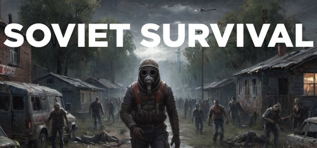
Soviet Survival scored 72/100 on Steam Analyzer — Good for a Early Access capsule. Top priority fix: [uniqueness_polish] Introduce a distinctive visual element—unique character design detail, iconic Soviet motif, or anomalous mechanic visualized—that separates this from generic post-apocalyptic games and signals what makes Soviet Survival mechanically different.

Capsule scores by dimension

  • Genre Clarity: 7/10 — Post-apocalyptic survival clearly signaled. The ruined Soviet architecture, multiple armed figures in tactical gear, foggy desolate landscape, and central character in survival equipment all strongly communicate a post-apocalyptic action-survival setting. At tiny size, the silhouette of the protagonist and surrounding ruins remain readable enough to suggest survival gameplay, though individual character details blur.
  • Title Readability: 9/10 — Bold white sans-serif highly legible. SOVIET SURVIVAL is rendered in clean, bold white sans-serif typography with strong contrast against the dark foggy background and positioned in the upper third with ample breathing room. The title remains fully readable at small and tiny sizes with no degradation, and the word spacing is clean and professional without decorative elements that would collapse at miniature scale.
  • Contrast & Color: 8/10 — Strong light-dark separation with warm tones. The white title text provides excellent value contrast against the dark background, and the warm amber/orange lighting on building details and character elements create visual separation from cool gray-blue tones of the fog and ruins. Grayscale test shows the protagonist and foreground elements maintain clear silhouette definition, though some midtone detail in the crowd figures softens at tiny sizes.
  • Uniqueness & Polish: 6/10 — Competent execution with generic survival tropes. The image is well-shot with professional lighting and atmospheric fog effects, but the visual language—ruined buildings, armed survivors, post-apocalyptic crowd—follows familiar survival game conventions seen in many recent titles. The Soviet setting provides minor thematic specificity, but the capsule lacks a distinctive visual hook or memorable art direction that separates it from other post-apocalyptic action games; it reads as solid craft over standout concept.
  • Brand Consistency: 6/10 — Coherent but generic post-apocalyptic aesthetic. The consistent color grading (cool grays with warm accent lighting), Soviet architectural elements, and tactical survivor presentation align internally and create a cohesive mood, but offer no iconic character, symbol, or unique visual motif that would make the brand instantly recognizable in repeat exposure. The presentation is competent and on-theme but not distinctive enough to build memorable identity recognition.
  • Composition: 7/10 — Clear hierarchy with strong focal point. The central character in tactical gear creates a strong primary focal point that draws the eye immediately, with supporting crowd figures and ruins framing the subject in depth. The title sits cleanly above without competing for attention, and the composition uses foreground, midground, and background effectively; however, the crowd figures in the background create moderate visual noise that softens secondary focus at tiny sizes.

What works

  • Excellent title legibility across all sizes. Bold white sans-serif with generous spacing and strategic placement ensures SOVIET SURVIVAL reads perfectly from full header through tiny thumbnail without any degradation or need for squinting.
  • Strong atmospheric contrast and mood. The warm golden lighting on the protagonist and architecture separates clearly from cool fog tones, creating visual depth and ensuring the image pops against the dark Steam background even at small sizes.
  • Clear genre signaling through environmental design. Ruined Soviet buildings, armed figures, fog, and tactical gear immediately communicate post-apocalyptic survival to viewers within the first second of viewing.

What hurts the capsule

  • Generic post-apocalyptic visual language. The composition relies on familiar survival game tropes (ruined cityscape, armed survivors, atmospheric fog) without a distinctive visual hook that differentiates it from competitors like State of Decay or similar titles.
  • Background crowd creates mid-tone noise. The multiple figures in the background and mid-distance blur into a visually busy secondary layer that reduces clarity at tiny size and softens the silhouette distinction of the main character.
  • Lacks memorable brand identity elements. No distinctive character design, iconic symbol, or signature visual motif emerges that would allow this capsule to be recognized in future marketing or community contexts.

Priority fixes

  1. [uniqueness_polish] Introduce a distinctive visual element—unique character design detail, iconic Soviet motif, or anomalous mechanic visualized—that separates this from generic post-apocalyptic games and signals what makes Soviet Survival mechanically different.
  2. [composition] Reduce background crowd visual weight by increasing atmospheric fog density or adjusting lighting contrast on secondary figures so the protagonist silhouette dominates more clearly at small and tiny sizes.
  3. [brand_consistency] Develop a recognizable visual signature (consistent warm lighting palette, Soviet aesthetic motif, or unique UI/gear design) that can carry across store screenshots and create consistent brand recall.

Store copy priority fixes

  1. [hook_strength] Replace 'find your place' with an action-driven hook such as 'Scavenge, build, and fight to survive the irradiated ruins of the Soviet Union' to immediately signal agency and create urgency.
  2. [uniqueness] Add a sentence that explicitly differentiates Soviet Survival: e.g., 'Experience survival reimagined in an alternative Soviet dystopia where radiation, scarcity, and betrayal define your every choice' or clarify a unique mechanical pillar.
  3. [feature_communication] Expand on progression and endgame: briefly mention whether there are factions, territory control, research trees, or other long-term goals that sustain progression beyond early survival.
  4. [audience_targeting] Add a line that clarifies whether this is balanced for casual co-op groups or hardcore PvP-focused survival veterans, e.g., 'Whether you seek peaceful co-op survival or cutthroat PvP raids, Soviet Survival adapts to your playstyle.'

Related guides

Steam app ID: 3603940 · Tags: Early Access, Survival, Zombies, Open World, Multiplayer