Scoring genre clarity...

I am Football capsule

I am Football

A game of soccer where you’re not the player. You’re not the coach. You’re not even the ref. You... ARE THE BALL!

$1.99
SportsArcadeHack and Slash
Entertainment Software InternationalApr 9, 2025

I am Football scores 78/100 — better than 67% of Sports capsules (n=905).

$1.99 · Released Apr 9, 2025 · By Entertainment Software International

Quick text summary

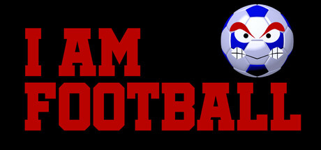
I am Football scored 78/100 on Steam Analyzer — Good for a Sports capsule. Top priority fix: [uniqueness_polish] Add a subtle soccer field or stadium background element to strengthen the sports setting and provide context without overwhelming the character.

Capsule scores by dimension

  • Genre Clarity: 8/10 — Clear sports identity with unique twist. The soccer ball character with expressive face and the bold 'I AM FOOTBALL' text immediately signal a sports game with a personality-driven hook. At tiny size, the ball silhouette and red text remain readable and distinct, though the anthropomorphic angle is subtle. The core mechanic of 'being the ball' is communicated through the character design rather than explicit UI, which reads as creative but requires familiarity to fully grasp.
  • Title Readability: 9/10 — Excellent legibility across all sizes. Bold red sans-serif typography with strong value contrast against the black background ensures the title remains sharp and readable at full, small, and tiny sizes. Letter spacing is generous and the stacked layout maximizes visual impact without cramping. Even at thumbnail scale, 'I AM FOOTBALL' is immediately legible due to thick letterforms and high contrast.
  • Contrast & Color: 9/10 — Strong silhouette with excellent value separation. The bright red text pops decisively against the dark background, and the soccer ball character features white, blue, and red that create clear definition against the black. The grayscale test shows excellent light-dark separation with no muddy mid-tones. At tiny size, both the title and ball graphic remain distinct and readable without blur collapse.
  • Uniqueness & Polish: 7/10 — Charming character concept with clean execution. The anthropomorphic soccer ball with a cheeky expression is a memorable and distinctive hook that sets this apart from typical sports game capsules featuring athletes or coaches. The rendering is clean and the character has personality, though the design feels more indie-playful than premium AAA polish. The concept is strong enough to stand out in genre browsing, positioning it as something unconventional.
  • Brand Consistency: 6/10 — Functional but minimal identity markers. The capsule establishes the soccer ball as a core visual motif and uses consistent red branding, but there are limited signature color palettes or iconic visual language beyond the character itself. Without seeing store screenshots, the internal cohesion appears solid: the ball is the recognizable anchor, and typography is uniform. A stronger palette or repeated graphic device would elevate consistency.
  • Composition: 8/10 — Clear hierarchy with balanced layout. The title occupies the left-center with strong hierarchy, while the character ball sits in the upper right, creating a balanced asymmetric composition. The focal point is clear at all sizes, and safe margins are respected. At tiny size, both elements read distinctly without crowding or edge-hugging issues. The negative space on the left balances the character on the right effectively.

What works

  • Bold typography with maximum impact. Red sans-serif letters are thick, widely spaced, and maintain legibility at thumbnail scale without any collapse or blur.
  • High contrast ensures discoverability. Bright red and white elements stand out sharply against the dark background, ensuring quick recognition in Steam scroll.
  • Unique character hook communicates premise. The expressive anthropomorphic soccer ball immediately differentiates this game from traditional sports titles and hints at the unconventional 'be the ball' mechanic.
  • Clean, uncluttered composition. Two-element layout with generous spacing avoids visual noise and maintains focus across all viewing sizes.

What hurts the capsule

  • Limited visual storytelling of core mechanic. While the ball character is charming, the capsule does not strongly visualize what it means to 'be the ball' in gameplay or show dynamic action.
  • Minimal brand identity beyond the character. The capsule lacks distinctive color palettes, iconic symbols, or signature style cues that would make it instantly recognizable as a franchise or studio.
  • Generic black background lacks context. The solid black void offers no environmental storytelling, field elements, or setting that might reinforce the soccer sport identity.

Priority fixes

  1. [uniqueness_polish] Add a subtle soccer field or stadium background element to strengthen the sports setting and provide context without overwhelming the character.
  2. [brand_consistency] Introduce a secondary color motif or graphic pattern that repeats across marketing materials to build stronger visual identity.
  3. [composition] Consider adding a subtle action element or motion line around the ball to hint at the dynamic gameplay of being an active soccer participant.

Store copy priority fixes

  1. [feature_communication] Restructure the detailed description to lead with 'You control the ball using Arrow Keys or WASD, rolling across the pitch to reach the goal while avoiding player feet and headers that drain your time.' This moves core mechanics to prominence before story.
  2. [feature_communication] Expand the Features section to explain the winning condition more clearly: 'Score enough goals to earn $1 million and escape your curse, completing each match before time runs out.' Clarify whether this is a single campaign or arcade-style progression.
  3. [uniqueness] Replace or condense the team roster list with a single line like 'Face 8 unique soccer teams across a complete campaign' or remove it entirely, as it adds cognitive load without informing gameplay.
  4. [genre_clarity] Add one sentence after the Features list to clarify the match structure and win condition, e.g., 'Each match is a race against time—survive long enough to score the goals you need and advance to the next team.'

Related guides

Steam app ID: 3604010 · Tags: Sports, Arcade, Hack and Slash, Top-Down, Football (Soccer)