Scoring genre clarity...

Pixel Frontier: Tactics capsule

Pixel Frontier: Tactics

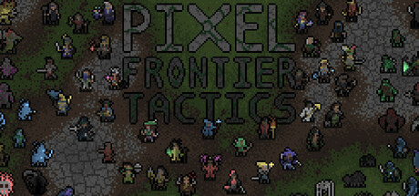
Recruit Heroes, gear up and face the threats of the Pixel Frontier! This engine-building, dice-rolling, turn-based strategy game has 36 Hero classes to choose from – each with their own sets of abilities, upgrades, synergies and strategies for near endless possibilities.

Free to Play2 user reviews
Turn-Based TacticsDifficultStrategy
WaddlerGamesJul 31, 2025

Pixel Frontier: Tactics scores 60/100 — better than 0% of Turn-Based Tactics capsules (n=1,210).

2 user reviews · Free to Play · Released Jul 31, 2025 · By WaddlerGames

Quick text summary

Pixel Frontier: Tactics scored 60/100 on Steam Analyzer — Solid for a Turn-Based Tactics capsule. Top priority fix: [title_readability] Reposition or enlarge title with a bold outline or background bar to ensure legibility at small (231x87) and tiny (120x45) sizes, or integrate it into a cleaner top or bottom band.

Capsule scores by dimension

  • Genre Clarity: 7/10 — Tactical strategy readable at small size. The overhead isometric perspective with scattered character sprites clearly communicates turn-based tactical strategy gameplay. At small and tiny sizes, the grid-like layout and grouped hero characters are still identifiable as a strategy game setting. However, the pixel art style, while thematic, makes individual unit types harder to distinguish at tiny thumbnail size, slightly reducing immediate genre confidence.
  • Title Readability: 5/10 — Title legible full size, fails tiny. The title 'PIXEL FRONTIER TACTICS' is readable at full header size with clear block lettering in dark gray/green tones. At small and tiny sizes, the text becomes increasingly blurred and loses definition; at tiny thumbnail size (120x45), the words collapse into an illegible blur against the noisy battlefield background. The title placement centered over busy sprite activity damages readability across all reduced sizes.
  • Contrast & Color: 6/10 — Moderate contrast, muddy mid-tones. The palette relies on muted greens, browns, and grays typical of pixel art, which creates limited value separation against the dark Steam background #1b2838. Character sprites show some color variation (purple, blue, yellow units) but they lack strong silhouette clarity at tiny size due to small sprite dimensions and relatively close value ranges. The overall composition reads as cohesive but not vibrant or high-contrast.
  • Uniqueness & Polish: 6/10 — Competent pixel art, generic execution. The retro pixel art aesthetic is intentional and well-crafted at full size, but the capsule presents a standard overhead battlefield view with no distinctive hook or unique selling point visible. With 36 hero classes and engine-building mechanics as key features, the image conveys none of these differentiators—it looks like a generic tactics game rather than highlighting the synergy-based, deckbuilding-style strategy that sets Pixel Frontier apart. The polish is clean but the creative choice to use only a plain map view without hero showcasing or ability visualizations limits impact.
  • Brand Consistency: 6/10 — Consistent pixel style, no memorable icon. The pixel art rendering is internally coherent and maintains a uniform aesthetic across all visible sprites and terrain. However, there are no distinctive brand identity markers, signature character, iconic motif, or recognizable color palette that would aid in later recognition of Pixel Frontier specifically. The capsule feels like any competent retro tactics game without a unique visual signature.
  • Composition: 6/10 — Balanced layout, unfocused at small size. The composition distributes characters across the battlefield with decent spatial balance and no major dead zones. However, there is no clear focal point—all units compete for attention equally, making the small and tiny versions feel scattered and unfocused. The title placement centered over clutter and the lack of a hero highlight or framing device means the eye has nowhere specific to land when viewing as a small capsule at quick-scroll speed.

What works

  • Genre-appropriate visual style. The overhead isometric pixel art perspective is thematically correct for a turn-based tactics game and supports audience expectation alignment.
  • Clean internal art consistency. Sprite rendering, terrain, and UI elements maintain a unified pixel art aesthetic without jarring style mismatches or quality variance.
  • Readable at full header size. At maximum resolution, the title text, composition, and individual character sprites are all legible and present a complete game overview.

What hurts the capsule

  • Title illegible at tiny size. The centered text overlay loses all definition below 231px width and becomes an unreadable smudge at 120px thumbnail size.
  • No focal point or hero showcase. With equal emphasis on dozens of small sprites scattered across the field, there is no primary subject to anchor attention or create a memorable silhouette.
  • Generic scene with no unique hook visible. The capsule shows a standard battlefield but does not communicate the engine-building, synergy-focused, or 36-class differentiators that make Pixel Frontier distinctive.
  • Limited color contrast against dark background. Muted earth tones and dark greens do not create strong value separation against Steam's dark UI, reducing visual pop in quick-scroll scenarios.

Priority fixes

  1. [title_readability] Reposition or enlarge title with a bold outline or background bar to ensure legibility at small (231x87) and tiny (120x45) sizes, or integrate it into a cleaner top or bottom band.
  2. [genre_clarity] Highlight 2–3 prominent hero characters or a signature leader in the foreground with larger sprites and distinct silhouettes to create a focal point and emphasize the 36-class roster.
  3. [uniqueness_polish] Add a visual element that hints at engine-building or synergy mechanics—such as visible ability icons, a glowing aura around synergistic units, or a UI overlay—to differentiate from generic tactics games.
  4. [contrast_color] Introduce 1–2 accent colors (bright blue, gold, or warm orange) sparingly on hero highlights or ability effects to increase silhouette pop and contrast against the dark Steam background.

Store copy priority fixes

  1. [hook_strength] Rewrite the opening line to lead with the dice-rolling core mechanic and its strategic depth: e.g., 'Roll the dice every turn to power your Heroes' abilities in this tactical engine-builder where every dice value matters.'
  2. [uniqueness] Add one sentence explicitly comparing the dice-for-action-points system to other strategy games and why it creates a different strategic experience: e.g., 'Unlike action-point systems, dice rolls create unpredictable variables you must adapt to—every turn is a puzzle.'
  3. [genre_clarity] Clarify whether the roguelike structure is permanent or transitional: replace 'Initially, the game will have a structure similar to a roguelike' with a definitive statement about progression modes or permanent mechanics.
  4. [feature_communication] Explain how the 6 areas and 30 bosses mechanically differentiate gameplay rather than just listing them as content; hint at unique enemy abilities or synergy requirements per area.

Related guides

Steam app ID: 3604500 · Tags: Turn-Based Tactics, Difficult, Strategy, Dice, Fantasy