Scoring genre clarity...

Cyber Sentinel: Bullet Hell Breach capsule

Cyber Sentinel: Bullet Hell Breach

A minimalist top-down bullet hell. Weave through dense patterns, unlock new abilities, and craft busted upgrade combos to survive ever faster waves

$0.99
Bullet HeavenAction RoguelikeArena Shooter
Martin EdmaierJun 22, 2025

Cyber Sentinel: Bullet Hell Breach scores 73/100 — better than 44% of Bullet Heaven capsules (n=117).

$0.99 · Released Jun 22, 2025 · By Martin Edmaier

Quick text summary

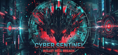
Cyber Sentinel: Bullet Hell Breach scored 73/100 on Steam Analyzer — Good for a Bullet Heaven capsule. Top priority fix: [title_readability] Increase subtitle font size and add subtle text outline or background bar to maintain BULLET HELL BREACH legibility at small sizes without compromising primary title.

Capsule scores by dimension

  • Genre Clarity: 8/10 — Strong cyber action signals. The neon red and cyan color palette, glowing geometric UI elements, and central silhouette of a futuristic entity clearly communicate a sci-fi action game. At tiny size, the concentric circles and glowing red core still read as high-energy action despite some detail loss, though the specific bullet-hell subgenre is not immediately obvious from visuals alone without the subtitle.
  • Title Readability: 7/10 — Clear at full, subtitle struggles small. CYBER SENTINEL reads with strong cyan contrast against the dark background and maintains legibility at small size. The subtitle BULLET HELL BREACH is readable at full size but becomes increasingly soft and loses clarity at tiny size, potentially dropping below acceptable threshold for quick-scroll discovery.
  • Contrast & Color: 8/10 — Excellent neon-dark separation. The bright cyan and hot red neon elements create strong value separation against the dark blue-black background, maintaining clear silhouettes even in grayscale simulation. The core red burst and surrounding cyan rings form a cohesive focal point with crisp edges that pop at all viewing sizes without muddiness.
  • Uniqueness & Polish: 7/10 — Polished cyber aesthetic, slightly templated. The design demonstrates clean craft with intentional geometric layering, glowing effects, and a cohesive cyberpunk visual language. However, the neon-grid-on-dark aesthetic is relatively common in indie action games, and the central burst pattern feels slightly formulaic without a distinctive mechanical or narrative hook unique to this specific game's bullet-hell identity.
  • Brand Consistency: 6/10 — Generic cyber aesthetic, no signature. The capsule uses standard cyberpunk visual language—neon colors, geometric UI, futuristic silhouette—but lacks a memorable character, icon, or signature motif that would distinguish Cyber Sentinel from other neon-action titles. The palette and style feel competent but not uniquely identifiable across multiple marketing touchpoints.
  • Composition: 8/10 — Strong focal hierarchy, well-balanced. The central red burst commands immediate attention with the title positioned directly below it, creating clear visual flow from primary subject to text. Supporting circular elements and side glows guide the eye without competing, and safe margins keep the key elements away from crop zones at all sizes.

What works

  • Vibrant neon contrast. Cyan and red against dark background create immediate visual pop that holds legibility at tiny size without flattening.
  • Clear focal point. Central red burst anchors the composition and pairs well with title placement, ensuring instant genre-appropriate mood recognition.
  • Polished technical execution. Glowing effects, geometric precision, and layered depth demonstrate solid craft and professional finish across the full design.

What hurts the capsule

  • Subtitle readability collapse. BULLET HELL BREACH loses clarity significantly at small and tiny sizes, reducing discoverability of the critical subgenre identifier.
  • Generic cyber trope. The neon-grid-dark aesthetic is heavily used in indie action marketing, making this capsule blend in rather than stand out in genre context.
  • No distinctive brand signature. Lacks a unique character, icon, or visual motif that would make Cyber Sentinel instantly recognizable across store contexts.

Priority fixes

  1. [title_readability] Increase subtitle font size and add subtle text outline or background bar to maintain BULLET HELL BREACH legibility at small sizes without compromising primary title.
  2. [uniqueness_polish] Introduce a signature visual element—iconic character silhouette, unique upgrade symbol, or distinctive pattern—that differentiates this bullet-hell from generic cyber-action templates.
  3. [brand_consistency] Develop a recognizable color or geometric signature (e.g., a specific icon shape or accent motif) that could appear consistently across store screenshots and marketing materials.

Store copy priority fixes

  1. [feature_communication] Expand the detailed description with a paragraph on the upgrade/combo system: explain 2–3 example upgrade combinations and why synergies create emergent playstyles; this directly supports the 'busted combos' hook and answers 'why should I care about progression?'
  2. [uniqueness] Add 1–2 sentences articulating what differentiates Cyber Sentinel from other bullet-hell roguelikes—e.g., 'Unlike X, Cyber Sentinel lets you chain ability synergies across runs' or 'Our combo-first upgrade tree rewards creative stacking over raw stat scaling.'
  3. [tone_match] Replace the closing 'dominate the digital frontier' sentence with tone-consistent copy that matches the minimalist, retro arcade voice of the opening; remove corporate urgency ('Wishlist today') in favor of organic enthusiasm.
  4. [audience_targeting] Add a single sentence explicitly clarifying the intended player type, such as 'Built for roguelike veterans who crave deep synergy crafting' or 'Perfect for players who want arcade thrills without crushing difficulty.'

Related guides

Steam app ID: 3604870 · Tags: Bullet Heaven, Action Roguelike, Arena Shooter, Looter Shooter, Boomer Shooter