Scoring genre clarity...
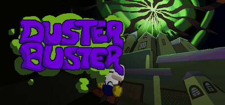
Duster Buster is a short 2D rogue-lite where you clean your way through a stylized pixel art haunted mansion. Fight dusty furniture, survive quick runs on a linear map, unlock upgrades, and uncover the mansion’s secrets in fast, repeatable play sessions.
Free to PlayPositive(34)
AdventureAction RoguelikeRoguelite
FireDogMar 24, 2026