Scoring genre clarity...

Dr. Suun capsule

Dr. Suun

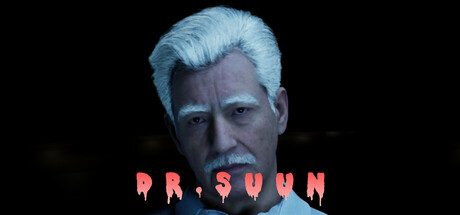
Dr. Suun is a thrilling horror experience that combines intense chases with mind-bending puzzles. Players step into the shoes of James, a man drawn into the mystery of an abandoned hospital with a haunting past. As he uncovers its secrets, the lines between reality and nightmare begin to blur.

Free to PlayMixed(22)
StrategyHidden ObjectPuzzle
BigTank GamesApr 11, 2025

Dr. Suun scores 63/100 — better than 7% of Strategy capsules (n=5,103).

Mixed (22 reviews) · Free to Play · Released Apr 11, 2025 · By BigTank Games

Quick text summary

Dr. Suun scored 63/100 on Steam Analyzer — Solid for a Strategy capsule. Top priority fix: [title_readability] Replace melting/dripping font with clean, bold sans-serif that remains legible at 120x45 thumbnail size; maintain red color but prioritize clarity over decoration.

Capsule scores by dimension

  • Genre Clarity: 7/10 — Horror protagonist clear, genre readable. The pale, intense male character with dramatic lighting and haunted expression clearly signals psychological horror. The character design and atmosphere communicate a mature horror experience effectively at full size, though at tiny size the specific subgenre (hospital-set psychological horror) becomes less distinct and reads as generic 'serious dark game.' The visual strongly avoids action or strategy iconography, which is correct for the horror focus.
  • Title Readability: 5/10 — Title struggles at small sizes. The title 'DR. SUUN' uses a dripping/melting red font effect that reads clearly at full header size but deteriorates significantly at small (231x87) and tiny (120x45) thumbnails where the dripping letterforms blur together and become illegible. The placement centered over the character's torso is reasonable, but the decorative melting effect sacrifices readability for atmosphere—a poor tradeoff for Steam discovery. At tiny size, viewers cannot confidently read the full title without prior knowledge.
  • Contrast & Color: 8/10 — Strong value separation, atmospheric lighting. The pale blue-white character face contrasts sharply against the dark background (#1b2838), creating excellent silhouette clarity and focus. The red dripping title also pops distinctly in value, though the saturation is warm against cool tones. In grayscale mental test, the character remains well-separated with clear edge definition, and the composition maintains strong depth even when color is removed, supporting quick recognition during scroll.
  • Uniqueness & Polish: 6/10 — Competent horror aesthetic, limited novelty. The execution is clean with professional lighting, rendering, and a deliberately unsettling character expression that conveys the horror premise. However, the visual—an intense pale face against black with red title—follows a well-worn aesthetic template common in psychological horror games (Resident Evil, Amnesia, Outlast lineage). The melting text effect adds stylistic personality but the overall presentation lacks a distinctive hook or unique selling point that differentiates it from dozens of similar horror releases. Brand identity signals are minimal; the character could belong to any horror property.
  • Brand Consistency: 5/10 — Limited internal identity, generic horror. The capsule presents a single character portrait with atmospheric styling but establishes no memorable motif, symbol, or signature visual language that would create recognizable brand identity. Without reference to the 5 store screenshots, the visual feels like a stock psychological horror presentation rather than a cohesive branded experience. The pale-faced protagonist and red text treatment are thematic but not unique to Dr. Suun specifically; they could apply to any hospital-horror title.
  • Composition: 7/10 — Clear focal point, safe margins respected. The character's face is positioned as an obvious primary subject dominating the frame, with the title anchored below at a readable position with adequate margin clearance from edges. The black void background creates strong separation and prevents clutter. The composition is resilient across sizes—the character remains recognizable at small and tiny scales, and critical elements avoid dangerous edge-crop zones. The dead-center face positioning is conventional but effective for portrait-based character reveals.

What works

  • Strong silhouette and facial contrast. The pale character face pops distinctly against dark background with clear edge definition that survives tiny size.
  • Clear primary focal point. The character dominates the composition unambiguously, guiding immediate attention without competing secondary elements.
  • Safe margin composition. Title and character positioning respect edge safety zones and avoid Steam crop hazards across all viewing sizes.

What hurts the capsule

  • Decorative title font collapses at small size. The melting/dripping red letterforms become illegible blur at 231x87 and tiny 120x45 sizes, harming discoverability.
  • Generic horror visual presentation. The pale-face-dark-background-red-text aesthetic is a common template across horror games with no distinctive brand hooks.
  • No memorable brand identity cues. The capsule lacks a signature motif, symbol, or unique visual language that would allow recognition of Dr. Suun specifically versus similar horror titles.
  • Limited uniqueness and polish differentiation. The execution is competent but the concept and styling feel derivative of established psychological horror franchises without innovative selling points.

Priority fixes

  1. [title_readability] Replace melting/dripping font with clean, bold sans-serif that remains legible at 120x45 thumbnail size; maintain red color but prioritize clarity over decoration.
  2. [uniqueness_polish] Develop a distinctive visual signature—introduce a unique symbol, color accent, or character trait (e.g., hospital-specific motif, or supernatural visual effect) that differentiates Dr. Suun from generic horror competitors.
  3. [brand_consistency] Reference the 5 store screenshots to identify recurring visual themes (setting, lighting, UI style) and weave signature elements into the capsule to create recognizable internal identity.
  4. [genre_clarity] Consider adding subtle environmental context (hospital architecture, medical elements, or atmospheric effect) that clarifies the specific hospital-horror setting and distinguishes it from other psychological horror subgenres.

Store copy priority fixes

  1. [feature_communication] Expand the 'Solve' section with one concrete example of a puzzle type or logic challenge (e.g., 'solve environmental riddles,' 'match symbols to unlock mechanisms,' 'decipher codes from documents') to prove depth beyond key-hunting.
  2. [uniqueness] Add a 1-2 sentence explanation of what makes the enemy AI or hospital exploration uniquely unsettling—e.g., a specific mechanic like 'the pursuer adapts to your hiding spots' or 'abandoned rooms hold clues that reshape your understanding of what happened.'
  3. [audience_targeting] Clarify target difficulty and playstyle with one sentence addressing whether puzzles are logic-heavy, exploration rewards curiosity, or whether the game favors stealth, speed, or knowledge to succeed.
  4. [feature_communication] Move the network disclaimer to a separate 'TECHNICAL' section after the description so gameplay content leads instead of legal warnings.

Related guides

  • Steam page optimisationCapsule, copy, screenshots, tags — the full Steam page conversion stack.
  • Steam tags guideTag selection, ordering, and how it shapes Steam's recommendation rails.

Steam app ID: 3606030 · Tags: Strategy, Hidden Object, Puzzle, PvE, 3D