The Bloody Cross scores 75/100 — better than 77% of Dark capsules (n=2,362).

Quick text summary

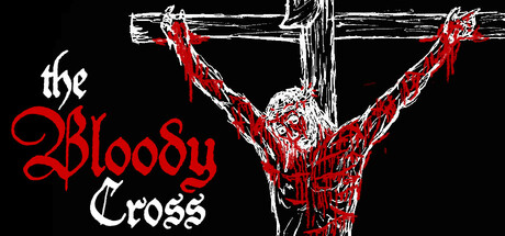
The Bloody Cross scored 75/100 on Steam Analyzer — Good for a Dark capsule. Top priority fix: [title_readability] Simplify or remove the italic 'the'—either use consistent serif weight across the entire title or apply a subtle outline to preserve legibility at TINY size.

Capsule scores by dimension

  • Genre Clarity: 8/10 — Strong religious horror action vibes. The crucified figure in skeletal/demonic form with raised arms, combined with red chains and gothic cross imagery, clearly signals dark action-adventure with horror and religious themes. At TINY size, the silhouette of the bound figure and bold red accents still read as supernatural conflict. The visual language matches the stated Christian-inspired, sin-focused narrative without ambiguity.
  • Title Readability: 7/10 — Bold serif readable at all sizes. The Bloody Cross title uses clean white serif typography with red gothic lettering for 'Bloody' and maintains strong contrast against the black background. At SMALL size it reads clearly; at TINY size the word grouping remains identifiable though fine serifs soften slightly. The italic 'the' is less readable at tiny scale but the core brand name holds.
  • Contrast & Color: 8/10 — High value separation, red pops well. White figure outline and white title text create strong luminosity contrast against pure black background; red chains and lettering add saturated focal points that stand out in quick scroll. Grayscale test shows clear silhouette separation. The black background is optimal for Steam dark UI, and the red-white-black palette maintains clarity even at TINY thumbnail size without muddy mid-tones.
  • Uniqueness & Polish: 7/10 — Distinctive religious horror identity. The art direction is cohesive and intentional—hand-drawn or ink-style rendering of the crucified demon/skeleton with occult chain detail conveys a specific creative vision around Christian suffering themes. It avoids generic action imagery and communicates a unique selling point (spiritual horror gameplay). Polish is solid with consistent line work, though the execution feels indie-scoped rather than AAA-premium.
  • Brand Consistency: 7/10 — Consistent gothic horror palette. The red-white-black palette, medieval/religious iconography, and skeletal demonic rendering are internally cohesive and likely recognizable across store assets. The gothic serif typography and occult symbolism create a memorable identity tied to the game's sin-and-suffering narrative. Without seeing all 5 screenshots, consistency appears strong based on visual language choices.
  • Composition: 8/10 — Clear focal point, strong hierarchy. The crucified figure dominates the center as the primary subject, with the wooden cross structure and chains creating depth and framing. Title is positioned upper-left in a controlled region away from the busy center, maintaining readability. At SMALL and TINY sizes, the central figure silhouette remains the clear focal point and the composition does not collapse—margins are safe and no critical elements hug edges.

What works

  • Strong silhouette at small sizes. The crucified figure's outline and raised-arm pose remain instantly recognizable even at TINY thumbnail scale, creating immediate visual impact.
  • Excellent color harmony for Steam. Red-white-black palette pops aggressively against the #1b2838 Steam background without requiring desaturation or muddy blending.
  • Thematic clarity and uniqueness. The religious horror imagery and skeletal demon aesthetic clearly differentiate this from generic action games and communicate the game's core identity.
  • Smart title placement. Upper-left positioning on controlled black region ensures legibility at all scales without competing with the central focal point.

What hurts the capsule

  • Italic 'the' loses clarity at TINY. The decorative italic lowercase 'the' becomes harder to parse at thumbnail size due to thin letterforms.
  • Indie rendering may feel niche. Hand-drawn ink-style execution, while distinctive, may read as lower-budget compared to AAA benchmarks and could limit mainstream discoverability.
  • No gameplay UI or context cues. The capsule shows narrative mood but does not hint at top-down mechanics, game perspective, or core gameplay loop that buyers may expect to see.

Priority fixes

  1. [title_readability] Simplify or remove the italic 'the'—either use consistent serif weight across the entire title or apply a subtle outline to preserve legibility at TINY size.
  2. [genre_clarity] Consider adding a subtle top-down perspective element or UI hint (HUD corner, grid, or camera angle indicator) to signal gameplay type more directly at small sizes.
  3. [uniqueness_polish] Refine the ink rendering to feel more intentional and premium—tighten line weight consistency and ensure no stray artifacts at SMALL scale.

Store copy priority fixes

  1. [feature_communication] Replace 'Fight through' in the short description with 'Climb through' or 'Journey through' to align with the walking simulator / climbing allegory mechanic described in detail, and clarify that this is a reflective, narrative-driven experience rather than action-combat focused.
  2. [feature_communication] Add 1-2 sentences to the detailed description explaining core interactions: 'You navigate through encounters, make moral choices, and witness the weight of others' struggles' or similar, to help players understand the gameplay loop.
  3. [audience_targeting] Add a specific playtime indicator (e.g., '60-90 minutes' or 'roughly 1 hour') early in the detailed description to set expectations for free-to-play players who may expect a quick experience.

Related guides

Steam app ID: 3606450 · Tags: Dark, Faith, Stylized, Emotional, Top-Down