Scoring genre clarity...
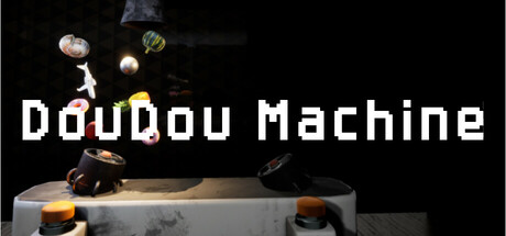
This fun simulator brings the nostalgia of ring toss machines. Use two buttons to create an air stream and clear the screen of objects! With full controller support, realistic 3D environments, and a smooth, jazzy soundtrack, it's a relaxing and nostalgic arcade-style experience.
$0.99
CasualSimulationSoftware
BgameApr 8, 2025