Scoring genre clarity...
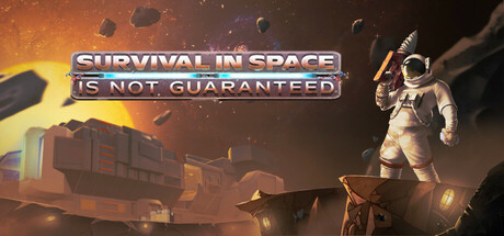
Survive and Escape! Crash-landed on an asteroid, your oxygen is running out. Explore, mine precious resources, build a base, and repair your ship to survive the dangers of space. Do you have what it takes to escape?
$4.997 user reviews
ExplorationImmersive SimSandbox
Wondersoft StudioJul 23, 2025