Scoring genre clarity...
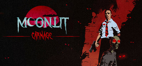
Moonlit Carnage is a fast-paced bullet heaven survival game where you battle endless hordes of zombies in short, action-packed matches. Slay the undead, collect souls to level up, and choose powerful upgrades to push your survival to the limit. How long can you last before the horde overwhelms you?
$3.991 user reviews
ActionCasualAction RPG
JoyforgeApr 26, 2025