Graviscape scores 72/100 — better than 48% of Adventure capsules (n=7,922).

Quick text summary

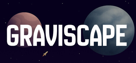
Graviscape scored 72/100 on Steam Analyzer — Good for a Adventure capsule. Top priority fix: [uniqueness_polish] Replace the generic rocket icon with a distinctive visual representation of gravitational mechanics—such as curved orbital paths, a gravity-warped ship silhouette, or a signature art style element—to create memorable brand identity.

Capsule scores by dimension

  • Genre Clarity: 7/10 — Space physics puzzle evident. The celestial backdrop with planets, stars, and a small rocket icon clearly signals a space-themed game with physics mechanics. At TINY size, the planets and rocket remain visible enough to communicate the genre, though the rocket icon becomes quite small and may lose impact during quick scroll.
  • Title Readability: 9/10 — Bold, legible across all sizes. GRAVISCAPE uses a strong sans-serif typeface in pure white with excellent contrast against the dark navy background. The title remains fully readable at FULL, SMALL, and TINY sizes with no letterform collapse, strategic horizontal centering, and no competing elements obscuring the text.
  • Contrast & Color: 8/10 — Strong value separation, clean silhouettes. The white title pops decisively against the dark navy space background, and the planets create clear circular silhouettes with warm and cool tones that add visual interest. The grayscale test shows excellent separation between all major elements, though the small rocket icon lacks strong contrast and visibility at tiny sizes.
  • Uniqueness & Polish: 6/10 — Competent but visually generic. The design is clean and functional with a cohesive space theme, but relies on stock celestial imagery (planets, stars, rocket) without distinctive art direction or memorable visual hook. The approach feels professional but lacks the signature style, narrative implication, or unique mechanic visualization that would elevate it above competent baseline.
  • Brand Consistency: 6/10 — Minimal but internally coherent. The capsule maintains consistent cool-toned space aesthetic and uses the title as primary identity anchor, but offers limited iconic motifs, character presence, or distinctive palette cues that would enable instant brand recognition. Without reference to store screenshots, this design feels generic enough that it could represent multiple space games.
  • Composition: 7/10 — Clear hierarchy with minor balance issues. The title dominates the center with two planet spheres bracketing it left and right, creating readable focal hierarchy at all sizes. However, the composition feels slightly top-heavy with the planets and title clustered in the upper-middle register, leaving the lower third underutilized, and the small rocket icon contributes minimal visual weight at tiny scales.

What works

  • Excellent title contrast and legibility. Bold white sans-serif on dark navy ensures GRAVISCAPE reads perfectly at FULL, SMALL, and TINY sizes without any letterform degradation.
  • Clear space genre communication. Planets, stars, and rocket immediately signal a space-themed physics game, supporting the indie adventure positioning.
  • Clean, professional craft. The design is well-executed with no distracting artifacts, proper spacing, and a cohesive dark theme appropriate for deep space context.

What hurts the capsule

  • Generic visual identity. Planets and rocket are stock celestial imagery with no distinctive art style or memorable brand motifs to separate this from similar space games.
  • Weak rocket icon visibility. The small rocket in the middle-left becomes nearly invisible at TINY size and adds minimal compositional weight or gameplay-mechanic clarity.
  • Underutilized lower composition. The bottom third of the capsule is mostly empty dark space, missing an opportunity for layered visual interest or gameplay-hint elements.

Priority fixes

  1. [uniqueness_polish] Replace the generic rocket icon with a distinctive visual representation of gravitational mechanics—such as curved orbital paths, a gravity-warped ship silhouette, or a signature art style element—to create memorable brand identity.
  2. [composition] Add a secondary visual element or gradient accent to the lower third to create better balance and fill prime real estate without cluttering the title hierarchy.
  3. [genre_clarity] Strengthen the physics-puzzle hook by incorporating visual cues like orbital arcs or gravity field lines around the planets to hint at the core mechanic beyond generic space setting.

Store copy priority fixes

  1. [uniqueness] Add a sentence explaining what makes the gravitational puzzle mechanic novel—e.g., 'Graviscape is the only physics-based puzzle game where you must choreograph multiple celestial bodies to create safe passage' or similar concrete differentiation.
  2. [feature_communication] Expand the AI companion description from vague mystery fragments to a specific narrative function—e.g., 'Your AI companion guides you through the mystery with cryptic clues' or 'gradually reveals what happened to your ship's crew.'
  3. [feature_communication] Briefly mention progression or level structure—e.g., 'handcrafted levels escalate from serene tutorials to mind-bending gravitational arrangements' to hint at scope and replayability.

Related guides

Steam app ID: 3608000 · Tags: Adventure, Puzzle, Exploration, 2D, Cinematic