Scoring genre clarity...
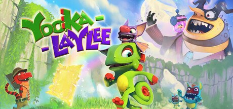
Yooka-Laylee capsule

Yooka-Laylee

Yooka-Laylee is an all-new open-world platformer from genre veterans Playtonic! Explore huge, beautiful worlds, meet an unforgettable cast of characters and horde a vault-load of collectibles as buddy-duo Yooka and Laylee embark on an epic adventure to thwart corporate creep Capital B!

$19.99Mostly Positive(2,002)
3D PlatformerCollectathonAdventure
Playtonic GamesApr 11, 2017

Yooka-Laylee scores 88/100 — better than 99% of 3D Platformer capsules (n=1,428).

Mostly Positive (2,002 reviews) · $19.99 · Released Apr 11, 2017 · By Playtonic Games

Quick text summary

Yooka-Laylee scored 88/100 on Steam Analyzer — Excellent for a 3D Platformer capsule. Top priority fix: [title_readability] Remove or enlarge tagline text to ensure all readable text remains legible at small capsule size, or consolidate messaging into the main title area only.

Capsule scores by dimension

  • Genre Clarity: 9/10 — Vibrant platformer adventure instantly recognizable. The lime-green buddy character Yooka in the center foreground with bright collectible orbs, whimsical cartoony art style, and colorful world scenery immediately communicate a 3D collectathon platformer. At tiny size, the central character silhouette and vibrant warm-cool color contrast maintain clear platformer genre identity without ambiguity.
  • Title Readability: 8/10 — Bold title legible at all sizes. The 'YOOKA-LAYLEE' text uses thick, playful lettering in bold purple and green positioned prominently in the upper-left quadrant against relatively clear background space. The title remains readable at small and tiny sizes due to strong saturation, good letter spacing, and sufficient outline weight, though the tagline text below is too small to read at tiny size.
  • Contrast & Color: 9/10 — Excellent pop with vibrant warm-cool palette. Lime-green protagonist, hot-pink orbs, purple title text, and orange-warm background create strong value separation against the Steam dark background. The character silhouette is crystal clear with bold color edges; the grayscale conversion maintains excellent separation between subject, mid-ground enemies, and background even at tiny size.
  • Uniqueness & Polish: 9/10 — Distinctive art direction with premium craft. The capsule showcases Playtonic's signature whimsical cartoon 3D art style with intentional character design, expressive enemy variety (red imp, floating cube, round boss), and dynamic lighting that communicates personality and craft. The visual storytelling feels cohesive and premium—not a generic template—with clear care in rendering quality and color intentionality that sets it apart from typical platformer fare.
  • Brand Consistency: 9/10 — Iconic character and signature style. Yooka's distinctive lime-green color, round-headed silhouette, and central placement establish immediate character recognition and brand identity. The vibrant carnival-like color palette (purples, greens, oranges, pinks) and playful cartoon rendering style are consistent with the Yooka-Laylee IP and would be recognizable in future materials.
  • Composition: 9/10 — Strong focal hierarchy with balanced layering. Yooka dominates center-stage as the clear primary focal point, supported by secondary characters and collectibles that guide the eye without competing. The composition uses depth effectively—foreground character, mid-ground enemies, background world—with title and branding in safe margins; at tiny size, the composition remains clear and uncluttered with no critical elements at risk of cropping.

What works

  • Iconic character presence. Yooka's distinctive lime-green color and expressive pose create immediate character recognition and memorability.
  • Color and contrast mastery. Vibrant warm-cool palette pops dramatically against the Steam dark background with excellent silhouette clarity even at tiny size.
  • Clear visual hierarchy. Single focal point with supporting secondary elements creates intuitive eye flow without visual noise or competing attention.
  • Readable title with strong typography. Bold, thick lettering in strategic placement with sufficient outline weight maintains legibility across all viewing sizes.

What hurts the capsule

  • Tagline text too small at tiny size. Subtitle text below the main title becomes illegible at small and tiny sizes, reducing messaging completeness.
  • Minor mid-ground clutter. The scattered collectibles and secondary characters add visual interest but could slightly dilute focus from the primary protagonist at ultra-small scales.

Priority fixes

  1. [title_readability] Remove or enlarge tagline text to ensure all readable text remains legible at small capsule size, or consolidate messaging into the main title area only.
  2. [composition] Verify critical secondary character positions (purple boss, blue cube) don't sit at extreme edges where Steam may crop them during responsive layout shifts.

Store copy priority fixes

  1. [hook_strength] Lead the detailed description with a single sentence that captures the core fantasy and unique hook—e.g., 'Embark on a platforming adventure where you unlock and customize your own path through vibrant worlds, using a dynamic buddy-duo and collectible-driven progression.' This delays deluxe edition material.
  2. [feature_communication] Move the 'About the Game' section above the Digital Deluxe Edition content so the core gameplay pitch appears before peripheral product offerings.
  3. [uniqueness] Add a sentence articulating what makes Yooka-Laylee's approach to the collectathon genre distinct—e.g., a specific mechanic, design philosophy, or scope claim that elevates it beyond spiritual succession.
  4. [audience_targeting] Include a brief line addressing difficulty scaling or accessibility (e.g., 'Tonics allow you to customize challenge to your skill level, making this adventure accessible to all platformer fans') to clarify audience inclusivity.

Related guides

Steam app ID: 360830 · Tags: 3D Platformer, Collectathon, Adventure, Kickstarter, Indie