Scoring genre clarity...
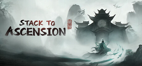
The beasts have ravaged your ancestral sect, leaving you as the sole survivor. With your cultivation regressed to Qi Condensation stage, you must start anew. Rebuild strength, recruit disciples, and uncover the dark truth behind the disaster.
$12.99Mixed(16)
XianxiaWuxiaCard Game
Stack to AscensionApr 23, 2026