Hatters scores 78/100 — better than 84% of Early Access capsules (n=3,067).

Quick text summary

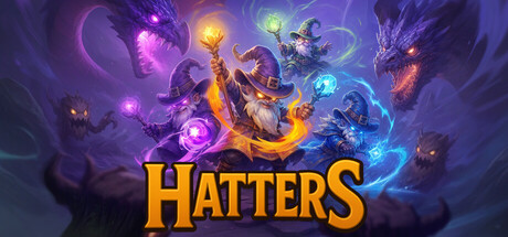
Hatters scored 78/100 on Steam Analyzer — Good for a Early Access capsule. Top priority fix: [brand_consistency] Introduce an iconic character pose or silhouette that anchors the visual identity and becomes recognizable across marketing materials.

Capsule scores by dimension

  • Genre Clarity: 8/10 — Magical action chaos clearly read. The capsule immediately communicates a magical action game through vibrant spell effects, elemental energy bursts in purple, orange, and cyan, and dynamic character silhouettes engaged in combat. At tiny size, the colorful magic orbs and chaotic energy patterns still read as a high-fantasy action experience with clear visual gameplay hooks. The bullet hell and roguelike elements are less obvious from visuals alone, but the cooperative combat intent is evident from the multi-character composition.
  • Title Readability: 9/10 — Bold yellow title perfectly legible. The HATTERS logo uses a thick, bold yellow sans-serif font with strong contrast against the dark purple background, positioned in the lower third of the composition. The letterforms remain perfectly readable at small and tiny sizes due to generous stroke weight and high saturation. Excellent strategic placement avoids overlap with busy magical effects in the upper regions.
  • Contrast & Color: 9/10 — Vibrant elemental palette pops distinctly. Strong value and color separation creates excellent pop against the dark Steam background; bright magenta, cyan, orange, and yellow spell effects contrast sharply against deep purples and blacks. The warm-to-cool color balance (orange and magenta on left, cyan on right) creates visual rhythm and depth that remains distinct even in grayscale. Silhouettes of characters are clearly separated from background through lighting and color saturation.
  • Uniqueness & Polish: 7/10 — Polished magical theme, competent execution. The capsule demonstrates solid craft with clean particle effects, well-integrated character models, and purposeful elemental theming that supports the five-element magic system mentioned in the description. The composition feels intentional rather than generic, with magical aura layers creating depth and visual storytelling around cooperative gameplay. However, the core concept of magical chaos with colorful spells is somewhat expected within the roguelike genre, placing it at good rather than standout territory.
  • Brand Consistency: 6/10 — Consistent magical theme, limited identity. The elemental magic visual language is internally coherent with the game's core mechanic of five-element spells, and the yellow title treatment appears distinctive. Without reference to the nine store screenshots, the capsule establishes a magical action identity but lacks a clear iconic character, motif, or signature palette element that would be immediately recognizable on future marketing materials. The design communicates the game concept well but doesn't establish a strong brand fingerprint.
  • Composition: 8/10 — Balanced focal point with strong hierarchy. The composition features clear layering with magical effects forming a dynamic focal point in the upper-center region, framed by character silhouettes on both sides, and the yellow title anchoring the lower third. This creates strong top-to-bottom hierarchy and prevents dead space while maintaining focus at small and tiny sizes. Safe margins keep the core visual elements away from typical Steam crop areas, and the symmetrical balance of magic effects left-to-right supports visual stability.

What works

  • Excellent title contrast and legibility. Thick yellow sans-serif HATTERS logo maintains perfect readability from full size down to tiny thumbnails with no collapse or loss of clarity.
  • Vibrant elemental color palette. Strong saturated colors (magenta, cyan, orange, yellow) create distinct separation from dark background and pop effectively in quick-scroll viewing.
  • Clear gameplay communication. Dynamic spell effects and multi-character positioning immediately suggest action-oriented magical gameplay with cooperative potential.
  • Strong visual hierarchy and depth. Layered composition with foreground characters, midground magic effects, and background auras creates professional visual storytelling without clutter.

What hurts the capsule

  • Limited brand identity distinctiveness. Magical chaos theme is competent but generic within the roguelike genre; lacks a memorable iconic character or signature visual motif for brand recognition.
  • Roguelike subgenre markers unclear. While action is evident, specific bullet hell or roguelike progression elements are not visually communicated; could be confused with standard fantasy action games.
  • Character individuality subdued. Multiple character silhouettes blend into the magical effects background rather than standing out as distinct playable heroes with personality.

Priority fixes

  1. [brand_consistency] Introduce an iconic character pose or silhouette that anchors the visual identity and becomes recognizable across marketing materials.
  2. [genre_clarity] Add subtle roguelike progression UI elements (treasure chests, rune symbols, or ascension markers) to clarify the roguelike structure beyond generic magic action.
  3. [uniqueness_polish] Increase character definition and personality by giving one hero a distinct highlight color or unique spell aura that stands out from the general chaos.

Store copy priority fixes

  1. [uniqueness] Add a specific mechanical or thematic claim that differentiates Hatters from other co-op roguelikes (e.g., 'the only co-op bullet hell where random spells force real-time team coordination' or 'five-element spell fusion creates infinite spell combinations').
  2. [audience_targeting] Explicitly state early in the detailed description whether solo play is fully supported or co-op-focused, and what the experience differs between solo and multiplayer.
  3. [feature_communication] Clarify the equipment system: rewrite 'staves, swords or shields in two equipment slots' to explicitly state quantity and mechanical role (e.g., 'Choose one weapon from two slots to pair with your spell set').
  4. [hook_strength] Consider opening the detailed description with a more specific action hook (e.g., 'Dodge waves of enemy spells while summoning your own chaos' instead of the current metaphor-heavy opening).

Related guides

Steam app ID: 3612660 · Tags: Early Access, Shoot 'Em Up, Bullet Hell, Action Roguelike, Online Co-Op