Sheep vs Tiger scores 62/100 — better than 3% of Casual capsules (n=10,153).

Quick text summary

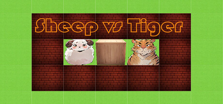
Sheep vs Tiger scored 62/100 on Steam Analyzer — Solid for a Casual capsule. Top priority fix: [uniqueness_polish] Replace generic grid background with a stylized jungle or game environment that visually communicates the core 'sheep vs tiger' survival premise and creates a memorable scene.

Capsule scores by dimension

  • Genre Clarity: 7/10 — Puzzle game with animal theme clear. The sheep vs tiger imagery immediately signals a puzzle or strategy game with animal characters, and the crate grid layout reinforces turn-based puzzle mechanics. At tiny size, the three character tiles (sheep, crate, tiger) remain recognizable and establish the core concept, though the grid structure becomes less distinct.
  • Title Readability: 6/10 — Title readable but ornate styling. The orange neon-style text 'Sheep vs Tiger' reads clearly at full size with strong contrast against the dark brick background. However, at tiny size the decorative serif serifs and thin stroke weight cause some letter forms to blur; the title remains functional but loses crispness.
  • Contrast & Color: 7/10 — Strong value separation, warm palette. The bright orange title and vivid character tiles (pale sheep, orange tiger) contrast well against the dark red-brown brick background and dark grid. The warm color scheme pops against Steam's dark #1b2838 background, though the mid-tone brick texture creates slight visual noise in the background area.
  • Uniqueness & Polish: 5/10 — Competent but generic puzzle presentation. The capsule uses a straightforward grid layout with character portraits arranged horizontally, which is functional but lacks a distinctive visual hook or storytelling element that differentiates it from other indie puzzle games. The neon text styling is a mild attempt at personality but feels like a common trope rather than a signature identity.
  • Brand Consistency: 5/10 — Limited iconic identity elements. The sheep and tiger characters are present but rendered in simple tile format without strong art direction that would make them immediately recognizable as this game's signature style. The brick and grid layout are generic puzzle-game visual language without memorable brand cues that distinguish Sheep vs Tiger specifically.
  • Composition: 7/10 — Clear hierarchy with centered focus. The three character tiles are centered and create a clear focal point, with the title anchored at top and grid structure providing visual framing. At small size the composition reads well, though the dark brick background takes up substantial empty space on the left and right edges, and at tiny size the individual character details collapse into indistinct boxes.

What works

  • Strong title contrast. Orange neon text pops clearly against dark brick background and reads legibly at full and small sizes.
  • Immediate game type recognition. The grid layout, character tiles, and 'vs' framing quickly communicate a turn-based puzzle or strategy mechanic.
  • Warm color harmony. The orange and brown palette feels cohesive and stands out against Steam's dark interface without clashing.

What hurts the capsule

  • Generic visual language. The grid, brick texture, and tile layout are standard puzzle-game aesthetics with no distinctive artistic signature.
  • Minimal detail at small sizes. Character tiles become vague squares at tiny size; facial features and personality of sheep and tiger are lost in compression.
  • Wasted background space. Large areas of dark brick texture on left and right edges serve no narrative or design purpose and dilute focus.
  • Limited brand identity. No memorable icon, motif, or art style cue that would help players recognize this game later among other indie titles.

Priority fixes

  1. [uniqueness_polish] Replace generic grid background with a stylized jungle or game environment that visually communicates the core 'sheep vs tiger' survival premise and creates a memorable scene.
  2. [title_readability] Simplify the neon serif styling to a bold, cleaner sans-serif font with thicker strokes to maintain readability at tiny sizes without decorative loss.
  3. [brand_consistency] Develop an iconic character variant or visual motif (e.g., expressive sheep face, distinctive crate style, or signature color accent) that becomes recognizable across marketing materials.
  4. [composition] Reduce or replace the dark brick background on outer edges with a complementary environment or gradient that improves depth perception and focuses attention on the central character tiles.

Store copy priority fixes

  1. [hook_strength] Complete the final sentence in the short description with a proper question mark and consider rewriting to end with a more compelling gameplay promise: "Can you outsmart the jungle's apex predators?" instead of "Can you survive the jungle"
  2. [uniqueness] Add 1-2 sentences to the detailed description that explicitly state what differentiates this game from standard Sokoban or turn-based puzzle games—e.g., emphasis on asymmetric AI gameplay, dynamic map manipulation, or speed of decision-making
  3. [tone_match] Rewrite the detailed description's opening paragraphs to maintain the conversational tone of the short description rather than switching to bullet-point exposition—lead with gameplay feel and player agency
  4. [feature_communication] Add a 1-sentence summary of difficulty progression or level variety to clarify how the game scales challenge over time

Related guides

Steam app ID: 3613480 · Tags: Casual, Sokoban, Puzzle, 2D, Relaxing