Scoring genre clarity...

Mr Magpie's Harmless Card Game capsule

Mr Magpie's Harmless Card Game

A surreal corporate horror deckbuilder where you gamble your life for cash, dodge murderous JERRY cards, and “maximise synergies” to climb the company ladder in Mr Magpie’s office nightmare.

Card GameHorrorStrategy
Giant Light StudiosTo be announced

Mr. Magpie’s Harmless Card Game scores 62/100 — better than 3% of Card Game capsules (n=1,067).

Released To be announced · By Giant Light Studios

Quick text summary

Mr. Magpie’s Harmless Card Game scored 62/100 on Steam Analyzer — Solid for a Card Game capsule. Top priority fix: [genre_clarity] Introduce a visual element that communicates 'Minesweeper deckbuilder' at tiny size—either integrate card grid mockup into composition or add a clear hint/deduction visual metaphor that reads even at 120x45.

Capsule scores by dimension

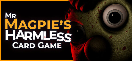
  • Genre Clarity: 5/10 — Confused card game identity. The capsule prominently features a quirky 3D character (Mr. Magpie) that reads as adventure or comedy rather than strategy card game. At tiny size, the character dominates and suggests party game or narrative experience, not the Minesweeper deckbuilder gameplay described. The card elements are visible but heavily subordinate to the character, creating mixed messaging about the core mechanic.
  • Title Readability: 7/10 — Title clear at full, struggles tiny. At full header size, 'MR. MAGPIE'S HARMLESS CARD GAME' reads clearly with strong yellow-to-white contrast and clean sans-serif type. However, at tiny thumbnail size (120x45), the multi-line stacked layout compresses severely and 'HARMLESS CARD GAME' becomes difficult to parse. The title placement avoids the character but relies on size that may compress on Steam's responsive layouts.
  • Contrast & Color: 7/10 — Strong warm palette pops well. Bright orange, yellow, and warm purple tones create clear separation from the dark background (#1b2838). The character's vibrant orange-red coloring and glowing eyes stand out immediately. However, at tiny size the mid-tone details blur together slightly, and the purple shadows lose definition, reducing the silhouette sharpness that's critical for thumbnails.
  • Uniqueness & Polish: 6/10 — Quirky character, generic layout. Mr. Magpie is distinctive and memorable with expressive eyes and a comedic design that suggests personality. The card game elements (visible cards at bottom right) feel like an afterthought tacked beneath the character rather than a core visual hook. The overall composition feels like 'character trailer' rather than strategy game, missing the chance to showcase the Minesweeper deckbuilder hook that differentiates it.
  • Brand Consistency: 6/10 — Character-driven but not iconic yet. Mr. Magpie is a recognizable character anchor with consistent orange and purple coloring. The playful, slightly unsettling aesthetic creates a memorable tone. However, without reference to the 6 store screenshots, the internal visual language is unclear—no recurring motifs, symbols, or palette cues that scream 'this is Mr. Magpie's universe' beyond the character's presence alone.
  • Composition: 6/10 — Character centered, title awkwardly stacked. The character dominates center-right, creating clear focal point and good depth with background spiral design. The title stacks vertically on the left with uneven line breaks that create visual tension at small sizes. Cards at bottom-right compete for attention and sit dangerously close to Steam crop zones. At tiny size, the composition collapses into a cluttered character portrait with illegible text.

What works

  • Vibrant color palette stands out. Warm orange, yellow, and purple create immediate visual pop against dark Steam background and read well at full size.
  • Distinctive character design. Mr. Magpie's expressive features and quirky style create personality and memorability that lifts it above generic card game fare.
  • Clear primary focal point. The character's centered position and eye-catching design immediately draws attention and creates obvious hierarchy.

What hurts the capsule

  • Genre messaging contradicts gameplay. Whimsical 3D character suggests adventure or party game, not the strategic Minesweeper deckbuilder core experience.
  • Title stacking fails at thumbnail. Multi-line text layout compresses illegibly at 120x45 size, obscuring key words like 'CARD GAME' in the smallest viewing condition.
  • Card elements feel secondary. Game mechanics are represented weakly in tiny bottom corner, making the deck-building identity almost invisible compared to the character prominence.
  • Composition imbalance at small sizes. Vertical text on left and character on right create uneven tension; cards at bottom edge risk Steam's standard crop on responsive displays.

Priority fixes

  1. [genre_clarity] Introduce a visual element that communicates 'Minesweeper deckbuilder' at tiny size—either integrate card grid mockup into composition or add a clear hint/deduction visual metaphor that reads even at 120x45.
  2. [title_readability] Condense title to single or two-line format with 'MR. MAGPIE'S CARD GAME' as primary; move 'HARMLESS' or consider a secondary tagline that fits tighter, ensuring full readability at thumbnail.
  3. [composition] Reposition cards to a more central supporting role in midground, not background; remove bottom-edge placement and anchor key game elements where they won't compress or crop on responsive layouts.
  4. [uniqueness_polish] Add a distinctive 'quota' or 'JERRY card' visual element (e.g., stylized card back, money, or threat icon) that telegraphs the unique selling point beyond quirky character alone.

Store copy priority fixes

  1. [feature_communication] Expand the backrooms office space bullet point to clarify its mechanical or narrative role: is it a purely cosmetic hub, a progress tracker, or will it unlock new features? Replace "nothing there yet" with specific intent.
  2. [uniqueness] Add a dedicated 1-2 sentence statement after the short description that articulates the core differentiator: e.g., 'Unlike traditional deckbuilders, Mr. Magpie combines minesweeper deduction with push-your-luck card flipping—every card reveal is a calculated risk.'
  3. [audience_targeting] Insert a brief difficulty/pacing note in the Features section to set proper expectations: e.g., 'Designed for players who love discovery-based learning and high replayability; expect 30-90 minute runs.'
  4. [feature_communication] Reframe the single character class callout as 'Master one deep, synergy-rich character design before we expand the roster' rather than admitting limitation, to reduce the impression of incompleteness.

Related guides

Steam app ID: 3616280 · Tags: Card Game, Horror, Strategy, 3D, Gambling