Scoring genre clarity...

Nietzsche's Shadow capsule

Nietzsche's Shadow

A philosophical horror experience in the Alps: As Friedrich Nietzsche confronts his own shadow, he becomes lost between layers of reality.

$3.99Mixed(16)
ExplorationAdventurePhilosophical
Philosophica GamesSep 26, 2025

Nietzsche's Shadow scores 72/100 — better than 48% of Exploration capsules (n=4,872).

Mixed (16 reviews) · $3.99 · Released Sep 26, 2025 · By Philosophica Games

Quick text summary

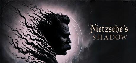
Nietzsche's Shadow scored 72/100 on Steam Analyzer — Good for a Exploration capsule. Top priority fix: [composition] Add a subtle secondary visual element (e.g., Alpine landscape, shadow motif) in the lower-right void to improve balance and fill unused space without cluttering the focal point.

Capsule scores by dimension

  • Genre Clarity: 7/10 — Philosophical horror atmosphere clear. The silhouette profile and fractured, surreal texture treatment immediately signal psychological or existential horror rather than action or adventure. The monochromatic palette with eerie lighting and disintegrating hair effect communicate an introspective, unsettling tone. At tiny size, the dark profile and atmospheric glow still read as contemplative dread, though the specific Nietzsche connection is lost.
  • Title Readability: 8/10 — Title legible across all sizes. The serif font 'Nietzsche's' and sans-serif 'SHADOW' are clearly separated and positioned in the upper-right safe zone with strong contrast against the dark background. The two-line hierarchy makes the title parse well even at small sizes. At tiny size, while fine details blur slightly, the text block remains readable and centered in the right portion of the frame.
  • Contrast & Color: 8/10 — Strong silhouette and lighting separation. The profile silhouette stands out sharply against the pale purple-gray background glow, creating clear value separation that holds at all viewing sizes. The white text and the light circular halo around the profile create distinct luminous contrast against the dark Steam background. The grayscale squint test confirms excellent separation—the profile and text remain defined even when detail collapses.
  • Uniqueness & Polish: 7/10 — Distinctive philosophical horror identity. The concept of visualizing Nietzsche's psyche through a fragmented, dissolving portrait is a memorable and original hook that signals intellectual depth and artistic intention. The execution—textured hair breaking into wisps, subtle rim lighting, and classical portraiture style—feels deliberate and refined rather than generic. However, the composition remains relatively static and introspective, which may feel slightly less visually dynamic than top-tier genre peers like DREDGE or Hades II.
  • Brand Consistency: 6/10 — Coherent but limited identity markers. The aesthetic is internally consistent: monochromatic palette, classical portraiture, subtle psychological distortion, and contemplative mood form a cohesive visual language. Without access to store screenshots, the profile and serif/sans-serif typography pairing could serve as recognizable brand touchstones. However, there are no bold symbolic motifs, color codes, or distinctive iconography that would make this capsule instantly recognizable among other indie horror titles.
  • Composition: 7/10 — Clear focal point with balanced layout. The profile head occupies the center-left with strong visual weight, while the title anchors the upper-right in a complementary asymmetrical balance. The lighting halo guides the eye naturally to the subject, creating depth between foreground (profile), midground (glow), and background (dark void). At small and tiny sizes, the focal hierarchy holds, though the bottom-right area becomes dead space—safe from cropping but visually underutilized.

What works

  • Excellent contrast against Steam dark background. The pale profile and luminous halo create strong value separation and silhouette clarity that persists at tiny thumbnail size.
  • Title placement and legibility. Two-line hierarchy in the safe upper-right zone with sufficient contrast ensures readability across full header, small, and tiny viewing conditions.
  • Thematic visual cohesion. The fractured, dissolving portraiture effectively communicates psychological dissolution and philosophical introspection without requiring text to explain the concept.

What hurts the capsule

  • Limited brand identity markers. No bold color palette, distinctive symbols, or iconic motifs that would make the capsule immediately recognizable in future marketing or comparisons.
  • Compositional asymmetry wastes space. The lower-right quadrant remains empty and visually inert, reducing overall visual impact and balance, particularly noticeable at smaller sizes.
  • Static, inward-focused mood. The introspective, still portraiture lacks dynamic visual energy or action cues that might grab attention during a fast scroll compared to peers like DREDGE or Lethal Company.

Priority fixes

  1. [composition] Add a subtle secondary visual element (e.g., Alpine landscape, shadow motif) in the lower-right void to improve balance and fill unused space without cluttering the focal point.
  2. [genre_clarity] Introduce a subtle color accent or atmospheric effect (e.g., cool blue fog, warm philosophical firelight) to strengthen the philosophical horror genre signal at tiny sizes.
  3. [brand_consistency] Develop and prominently feature a repeatable visual motif or symbolic element (e.g., a shadow silhouette, circular halo pattern, or fracture effect) that becomes the brand signature across all marketing materials.

Store copy priority fixes

  1. [hook_strength] Clarify upfront that this is a short, single-session experience in the short description or very early in the detailed copy to set duration expectations.
  2. [genre_clarity] Elevate the psychological horror element in the opening paragraphs (e.g., 'becomes increasingly disturbing' or 'descends into psychological horror') to balance the philosophical exploration framing.
  3. [feature_communication] Remove the redundant repetition of the short description at the start of the detailed description and use that space to tease the narrative payoff (e.g., 'Discover who—or what—Nietzsche really is').
  4. [uniqueness] Strengthen the differentiator by explicitly contrasting this with comp titles: 'Unlike walking simulators that merely reflect on philosophy, this game embodies Nietzschean concepts through your choices and shadow encounters.'

Related guides

Steam app ID: 3620180 · Tags: Exploration, Adventure, Philosophical, Interactive Fiction, Psychological Horror