Scoring genre clarity...
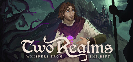
Two Realms: Whispers from the Rift capsule

Two Realms: Whispers from the Rift

Fantasy Point & Click Horror Drama: A burst of light - a crystal devours your little brother's life force. Desperate to save him, you seek the truth of magic’s birth, while a dread mage closes in to tear the crystal from your hands - and with it, all hope.

Point & ClickAdventurePixel Graphics
MOD42 Studio2027

Two Realms: Whispers from the Rift scores 72/100 — better than 42% of Point & Click capsules (n=1,752).

Released 2027 · By MOD42 Studio

Quick text summary

Two Realms: Whispers from the Rift scored 72/100 on Steam Analyzer — Good for a Point & Click capsule. Top priority fix: [title_readability] Increase subtitle scale or reduce character shadow behind it to ensure 'WHISPERS FROM THE RIFT' remains readable at 120x45 thumbnail size.

Capsule scores by dimension

  • Genre Clarity: 7/10 — Dark fantasy horror adventure clear. The central character in distress, gothic castle silhouette, purple magical energy, and shadowy tentacle-like forms clearly signal dark fantasy horror. At tiny size, the threatening atmosphere and character focus read as adventure-horror without ambiguity. The visual language aligns well with the point-and-click drama genre, though the exact mechanic (adventure game) is implied rather than explicit.
  • Title Readability: 8/10 — Strong serif logo, readable at all sizes. The 'Two Realms' title uses a distinctive serif serif typeface with elegant flourishes that remains legible at small and tiny sizes due to high contrast against the dark background. The subtitle 'WHISPERS FROM THE RIFT' is proportional and readable at small size but becomes challenging at tiny size due to reduced scale. Strategic white positioning on the character's body area provides clean contrast separation.
  • Contrast & Color: 8/10 — Strong value separation, dark palette cohesion. Warm cream-white title pops distinctly against the cool teal-green-purple background, creating excellent value contrast. The character's warm skin tones and purple clothing create mid-tone separation layers. At tiny size, the light title remains readable and the silhouettes hold against #1b2838 Steam background, though some fine detail in the tentacles softens in grayscale.
  • Uniqueness & Polish: 7/10 — Cohesive dark fantasy aesthetic, competent craft. The composition balances character emotion with supernatural threat through layered magical elements and atmospheric lighting. The art direction feels intentional with muted, desaturated tones and gothic architecture, avoiding generic template design. However, the emotional expression and character focus are more character-driven drama than mechanically distinctive—polished but not instantly iconic compared to DREDGE or Slay the Princess.
  • Brand Consistency: 6/10 — Consistent gothic mood, limited iconic identity. The palette, lighting, and dark fantasy tone are internally cohesive and likely consistent with store screenshots based on the atmospheric direction. However, there are no immediately recognizable motifs, character icons, or signature visual hooks that would make this capsule memorable upon return visits. The style is competent but relies on genre conventions rather than a distinctive brand signature.
  • Composition: 7/10 — Clear hierarchy, character focal point centered. The character in distress occupies the visual center with castle and tentacles framing the edges, creating clear depth layers: foreground character, midground magic/tentacles, background architecture. The title sits cleanly over the character's shoulder without obscuring key expression. At small size the composition reads well, but at tiny size the supporting elements (tentacles, castle) compress into visual noise that competes slightly with the title placement.

What works

  • Excellent title contrast and legibility. White serif letterforms stand out clearly against dark backgrounds at all viewing sizes due to strong value separation and strategic positioning.
  • Clear dark fantasy horror tone. The character's emotional expression combined with purple magic, tentacles, and gothic setting immediately communicates the game's dark fantasy adventure genre without confusion.
  • Atmospheric layered composition. Foreground character, magical midground elements, and background castle create visual depth that guides the eye naturally through the scene.

What hurts the capsule

  • Generic gothic fantasy presentation. While well-executed, the visual language relies heavily on familiar dark fantasy tropes without a distinctive hook or memorable identity cue that sets it apart from similar games.
  • Subtitle readability at tiny size. The 'WHISPERS FROM THE RIFT' text becomes difficult to parse at thumbnail size due to reduced scale, potentially losing story context in quick scrolls.
  • Supporting elements visual noise at small sizes. Tentacles and castle details compress into softer visual chaos at tiny size, slightly competing with the central character and title for attention.

Priority fixes

  1. [title_readability] Increase subtitle scale or reduce character shadow behind it to ensure 'WHISPERS FROM THE RIFT' remains readable at 120x45 thumbnail size.
  2. [brand_consistency] Add a recognizable visual motif—such as a distinctive crystal design or magical rune—to create a memorable brand signature that differentiates from generic gothic fantasy capsules.
  3. [contrast_color] Enhance tentacle silhouettes with slightly more saturation or edge definition so they read as a cohesive threat element rather than soft background blur at tiny scale.

Store copy priority fixes

  1. [feature_communication] Replace 'modern mechanics' with a specific, concrete mechanic description (e.g., 'streamlined inventory system and context-sensitive hotspots for faster puzzle-solving' or similar detail already present later).
  2. [uniqueness] Add one 1-2 sentence comparison or unique hook in the short description to clarify why this point-and-click stands apart (e.g., 'Blends emotional character-driven narrative with British voice talent and hand-animated pixel horror' or highlight the sibling-rescue angle more prominently).
  3. [audience_targeting] Insert a brief note about puzzle difficulty or story-emphasis level (e.g., 'Ideal for narrative-first players who value atmosphere over challenge' or 'Puzzles enhance story rather than gate progress') to help casual vs. hardcore players self-select.
  4. [tone_match] Move or reframe the poetic verse into the short description or marketing context rather than the mechanical feature list, or replace it with one concrete gameplay call-to-action to maintain clarity.

Related guides

Steam app ID: 3620350 · Tags: Point & Click, Adventure, Pixel Graphics, Dark, Mystery