Quick text summary
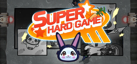
Super Hard Game scored 83/100 on Steam Analyzer — Good for a Casual capsule. Top priority fix: [genre_clarity] Add subtle directional arrows, hazard indicators, or top-down perspective framing to hint at the escape/dodge core mechanic beyond just 'arcade' aesthetic
Capsule scores by dimension
- Genre Clarity: 8/10 — Clear arcade casual gameplay. The bold 'SUPER HARD GAME' text with explosive orange star burst immediately signals an arcade or action-focused casual title. The cute moon rabbit character 'Dalddo' with large ears positioned center-bottom adds charm and personality typical of indie arcade games. At TINY size, the star burst and character silhouette remain readable, clearly communicating a high-energy casual arcade experience rather than a complex strategy or narrative game.
- Title Readability: 9/10 — Excellent legibility across all sizes. The title 'SUPER HARD GAME' uses a thick, bold sans-serif font with strong red-to-orange gradient fill and a dark outline, creating outstanding contrast against the dark background. The text sits on a clean black horizontal banner that isolates it from the noisy background elements. Even at TINY size, the large letterforms and high value contrast ensure the title remains instantly readable with no collapse or blur.
- Contrast & Color: 9/10 — Strong value separation and vibrant palette. The warm orange-red gradient title pops powerfully against the cool dark gray background, with the bright yellow starburst adding additional visual punch and depth layering. The white and purple character head at center maintains clear silhouette separation from the background texture. In grayscale test, the title's dark outline and light fill create strong value separation that survives the squint test and TINY scaling without muddy collapse.
- Uniqueness & Polish: 8/10 — Distinctive character with polished craft. The cute moon rabbit 'Dalddo' with expressive purple ears and simple white face is a memorable and distinctive protagonist that differentiates this from generic arcade clones. The graphic design quality is clean, with well-executed typography, intentional color grading, and a cohesive retro-arcade aesthetic that feels intentional rather than template-based. The starburst effect and layered composition show attention to polish and visual hierarchy uncommon in lower-budget indie titles.
- Brand Consistency: 8/10 — Cohesive identity with iconic character. The capsule establishes a clear brand identity through the distinctive 'Dalddo' character design, warm orange-red color palette, and bold sans-serif branding that would be recognizable across marketing assets. The retro arcade aesthetic with modern polish creates a consistent visual language. The character's simple silhouette and unique color scheme (white face, purple ears) establish an iconic motif that likely carries through store screenshots and other brand touchpoints.
- Composition: 8/10 — Clear hierarchy with balanced focal points. The composition uses strong depth layering: dark background, mid-tone arcade interface elements on sides, bright orange title band as secondary anchor, and the character centered as primary focal point. The character placement at center-bottom creates a natural eye path from title to mascot. At SMALL and TINY sizes, the starburst-title-character triangle hierarchy reads cleanly without scattered attention or edge-hugging elements that risk Steam cropping.
What works
- Outstanding title contrast and legibility. The bold red-orange gradient with dark outline ensures the 'SUPER HARD GAME' text remains instantly readable at all sizes including TINY thumbnail views.
- Memorable character branding. Dalddo's distinctive silhouette with large purple ears and simple white face creates a recognizable and charming visual identity unique to this title.
- Coherent color and design direction. The warm orange-red palette paired with clean retro-arcade typography and polished effects creates a premium, intentional aesthetic that stands out against generic casual titles.
- Effective visual hierarchy and composition. The starburst-title-character arrangement guides the eye naturally with clear primary and secondary focal points that don't compete or clutter the design.
What hurts the capsule
- Background detail noise. The gray arcade machine texture and interface elements on the left and right sides add visual complexity that slightly competes with the primary focal points, though not severely.
- Limited contextual gameplay hints. While the arcade aesthetic is clear, there are no obvious top-down perspective, escape mechanics, or failure-state visual cues that hint at the specific 'one mistake = instant death' core mechanic.
Priority fixes
- [genre_clarity] Add subtle directional arrows, hazard indicators, or top-down perspective framing to hint at the escape/dodge core mechanic beyond just 'arcade' aesthetic
- [composition] Reduce visual noise from background arcade elements on the sides to push the character and title forward as the singular dominant focus
- [uniqueness_polish] Consider adding a small tagline or icon callout emphasizing the 'one wrong move' hardcore difficulty hook to strengthen unique positioning against other cute casual games
Store copy priority fixes
- [hook_strength] Replace 'An escape like no other!' with a verb-forward, specific hook such as 'Dodge endless missiles as a moon rabbit in this one-hit arcade challenge—quick reflexes only'—leading with the core action and immediate stakes.
- [genre_clarity] Add a 1-2 sentence description of the play environment immediately after the opening to clarify if this is a corridor-dodging, arena-based, or scrolling movement game.
- [uniqueness] Insert a concrete differentiator such as 'Unlike pattern-memorization games, randomized missile spawns mean every run is unpredictable' or 'One of the few arcade games where cute design masks uncompromising difficulty without difficulty modes'.
- [audience_targeting] Clarify whether this game is designed primarily for hardcore skill-chasers or casual players who enjoy a fun challenge, and adjust marketing language to match—currently positioning is muddled by the 'Casual' tag conflicting with 'hardcore' and 'brutal' language.
Related guides
Steam app ID: 3620750 · Tags: Casual, Simulation, Arcade, 2D Platformer, 2D