Scoring genre clarity...

RAIN;CHECK capsule

RAIN;CHECK

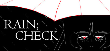
RAIN;CHECK tells a short story set in a small, remote town about a girl just trying to get by in the middle of a rainy, tumultuous night. On this special occasion, an unexpected storm of events brews ever closer.

$1.99Positive(11)
AdventureInteractive FictionVisual Novel
Meow Meow MeadowsMay 25, 2025

RAIN;CHECK scores 75/100 — better than 74% of Adventure capsules (n=7,922).

Positive (11 reviews) · $1.99 · Released May 25, 2025 · By Meow Meow Meadows

Quick text summary

RAIN;CHECK scored 75/100 on Steam Analyzer — Good for a Adventure capsule. Top priority fix: [genre_clarity] Add a subtle UI element, object, or pose that hints at the core mechanic (e.g., dialogue choice icon, inventory item, or gesture) to narrow genre expectations and improve discoverability.

Capsule scores by dimension

  • Genre Clarity: 7/10 — Atmospheric indie adventure clear. The anime-style girl character with glowing red eyes, rain streaks, and moody black palette strongly signal a story-driven indie game with atmospheric, possibly psychological tension. At tiny size, the character silhouette and rain motif read as indie adventure, though the exact tone remains ambiguous. The visual language suggests introspection and unease rather than action or puzzle gameplay.
  • Title Readability: 8/10 — Title legible at all sizes. RAIN;CHECK uses clean, centered serif typography with excellent contrast against the black background and white letterforms. The semicolon punctuation is readable at full and small sizes, though at tiny size the full text begins to compress slightly. Strategic placement in the upper left quadrant keeps it off the noisy character details and maintains clarity even at 120x45 scale.
  • Contrast & Color: 8/10 — Strong dark-light separation. White text and character red eyes create sharp value contrast against the pure black background, ensuring excellent pop on Steam's dark interface. Rain streaks in white and red outlines provide additional visual texture without muddying the silhouette. The color palette is deliberately limited and high-contrast, maintaining clarity at tiny size and passing the grayscale test with distinct light and dark zones.
  • Uniqueness & Polish: 7/10 — Distinctive anime aesthetic indie. The capsule demonstrates a cohesive, intentional art style with hand-drawn anime character rendering and strategic use of red accent color that suggests emotional weight or supernatural elements. The rain visual motif and girl's haunting expression communicate mood and story promise rather than generic scenery. However, anime-style indie adventure is a populated category, and while this execution is polished, it lacks a singular hook that would distinguish it from similar titles like Slay the Princess or The Invincible at a glance.
  • Brand Consistency: 7/10 — Consistent atmospheric anime style. The character design, color palette (black, white, red), rain motif, and hand-drawn anime aesthetic create recognizable internal cohesion that would likely align with store screenshots. The red eyes and rain are memorable identity cues specific to this game's story of a girl in a tumultuous night. The style is distinctive enough to be recognizable in future marketing, though not iconic or signature enough to stand apart across the full indie portfolio.
  • Composition: 8/10 — Balanced focal point and depth. The character's face (center-right) anchors attention as the primary focal point, while rain streaks and geometric lines create visual depth and guide the eye upward and outward. The title placement in the upper left does not compete with the character, creating a clear hierarchy. At small and tiny sizes, the composition remains readable with no awkward cropping or wasted space, and the character's proportions ensure safe margins on all edges.

What works

  • Excellent title contrast and readability. White serif text on black background maintains perfect legibility from full size down to tiny 120x45 thumbnail without collapse or blur.
  • Cohesive moody atmosphere. Rain streaks, glowing red eyes, and black palette work together to communicate a specific emotional tone and story promise of unease and introspection.
  • Strong visual hierarchy at small sizes. Character face remains the clear focal point at all scales, and title placement avoids competing with the subject.
  • Memorable color and design cues. Red eyes and rain motif are distinctive enough to signal this game specifically rather than a generic indie adventure.

What hurts the capsule

  • Genre specificity remains ambiguous. While the mood is clear, it is difficult to discern from the capsule alone whether this is a visual novel, adventure, horror, or narrative-puzzle hybrid.
  • Limited uniqueness in crowded category. Anime-style indie adventure with atmospheric tone is a saturated subgenre; this capsule is well-executed but not distinctive enough to immediately stand out versus Slay the Princess or The Invincible at a glance.
  • Minimal context or gameplay hint. The capsule communicates mood and character but does not hint at core mechanics, story hook, or what makes RAIN;CHECK play differently from similar titles.

Priority fixes

  1. [genre_clarity] Add a subtle UI element, object, or pose that hints at the core mechanic (e.g., dialogue choice icon, inventory item, or gesture) to narrow genre expectations and improve discoverability.
  2. [uniqueness_polish] Introduce a distinctive visual motif or art detail specific to the game's setting or story (beyond rain and eyes) that would be recognizable across marketing materials and stand out at tiny size.
  3. [title_readability] Consider a subtle glow or outline around the semicolon punctuation to ensure it remains a memorable brand marker at all scales and does not disappear at tiny size.

Store copy priority fixes

  1. [hook_strength] Rewrite the short description to open with a specific emotional hook or core decision rather than setting alone. Example: 'A girl discovers an impossible stranger on a rainy night. Who are they—and what do they want?' This creates curiosity and urgency.
  2. [feature_communication] Expand the detailed description to include 1–2 concrete examples of what 'choosing how Maria deals with' threats actually means. Mention whether choices affect ending, relationships, or plot outcomes.
  3. [uniqueness] Add a sentence that articulates what distinguishes RAIN;CHECK—e.g., 'blending psychological mystery with surreal humor' or 'a short narrative exploring [specific theme] through branching choices.'
  4. [audience_targeting] Insert a sentence identifying the intended player: e.g., 'Perfect for fans of choice-driven indie narratives and subtle storytelling' to help self-selection.

Related guides

Steam app ID: 3621860 · Tags: Adventure, Interactive Fiction, Visual Novel, Choose Your Own Adventure, Abstract