Scoring genre clarity...

Green Pond Town capsule

Green Pond Town

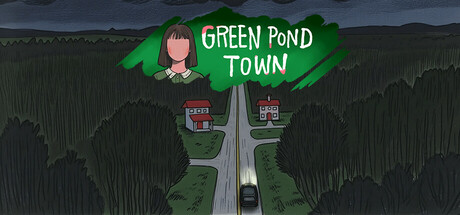
You've received a strange letter, and inside, a chilling black and white photograph – the people in the picture are eerily faceless! A powerful intuition compels you to journey to the location in the photo: Greenwater Town...

$1.39Positive(45)
AdventurePuzzleIndie
Cotton GameJan 27, 2026

Green Pond Town scores 72/100 — better than 48% of Adventure capsules (n=7,922).

Positive (45 reviews) · $1.39 · Released Jan 27, 2026 · By Cotton Game

Quick text summary

Green Pond Town scored 72/100 on Steam Analyzer — Good for a Adventure capsule. Top priority fix: [genre_clarity] Emphasize the mystery or eerie tone with visual cues such as fog, shadow, or unsettling silhouettes to better communicate the narrative hook at TINY size.

Capsule scores by dimension

  • Genre Clarity: 7/10 — Clear adventure, mystery tone. The top-down road perspective, small buildings, and isolated town setting clearly signal an adventure or exploration game with a rural/small-town focus. At TINY size, the green forest, road, and buildings remain readable and evoke a location-based narrative game. The mysterious faceless character hint and eerie letter context don't fully read at scale, so genre leans toward casual adventure rather than horror-specific.
  • Title Readability: 8/10 — Readable white text, clear hierarchy. The title 'GREEN POND TOWN' uses a clean white sans-serif font placed centrally over the green leaf shape, which provides strong contrast against the dark sky background. At SMALL and TINY sizes, the letter forms remain distinct and legible without blurring or collapse. The layout avoids cluttering with extra text, making it one of the cleanest readable elements across all viewing scales.
  • Contrast & Color: 8/10 — Strong value separation, readable silhouette. White title text pops sharply against the dark stormy sky and green foliage. The light road cutting through dark forest creates a clear focal path, and the red building roofs provide warm accent color that distinguishes from the cool green and gray palette. At TINY size, the road and main structures still separate clearly from background, though fine texture detail in the forest lessens impact.
  • Uniqueness & Polish: 6/10 — Competent art style, generic concept. The illustrated top-down town view has a consistent hand-drawn aesthetic with layered perspective that feels intentional and craft-aware. However, the small-town mystery genre is well-trodden, and the capsule reads as a solid execution of familiar imagery (forest, buildings, road) without a distinctive hook or memorable visual storytelling moment that sets it apart from comparable indie titles.
  • Brand Consistency: 6/10 — Consistent art style, limited identity. The color palette (greens, warm reds, cool grays) and hand-drawn illustration style appear unified and intentional. Without reference to other brand materials, the capsule does not yet communicate a strong recognizable motif or signature identity element beyond 'small town aesthetic'—the style is competent but not distinctly memorable as a branded mark.
  • Composition: 8/10 — Clear focal point, strong depth layering. The composition uses foreground forest, midground road with car and buildings, and background sky to create clear depth and guide the eye down the road toward the town. The character head in the top-left corner is a subtle accent that doesn't compete with the central road perspective. Safe margins protect the title, and the layout remains resilient at SMALL and TINY sizes without critical elements being cut or becoming illegible.

What works

  • Strong vertical focal path. The road receding into the distance creates a natural eye guide that leads toward the town, establishing a sense of journey and mystery.
  • Clean, readable title placement. White text on the green leaf shape provides excellent contrast and sits safely away from edges, remaining legible even at TINY size.
  • Consistent illustrative style. Hand-drawn aesthetic is uniform across all elements—forest, buildings, road, and character—creating a cohesive visual identity.

What hurts the capsule

  • Generic small-town mystery trope. The isolated forest, road, and buildings concept is familiar within adventure/casual indie games and doesn't communicate a unique hook or memorable twist.
  • Character detail barely reads at scale. The small faceless figure in the top-left corner, which hints at the mysterious photograph narrative, is too small to register as meaningful at SMALL and TINY sizes.
  • Limited use of brand iconography. No distinctive symbol, motif, or palette signature that would make this capsule recognizable as a returning brand or franchise.

Priority fixes

  1. [genre_clarity] Emphasize the mystery or eerie tone with visual cues such as fog, shadow, or unsettling silhouettes to better communicate the narrative hook at TINY size.
  2. [uniqueness_polish] Introduce a distinctive visual element or signature detail—such as a unique building design, color accent, or character pose—that sets the capsule apart from generic small-town adventure imagery.
  3. [brand_consistency] Develop and reinforce a recognizable branded motif or color signature that could serve as a visual identifier across future marketing materials and store screenshots.

Store copy priority fixes

  1. [hook_strength] Clarify the town name in the short description—use 'Greenwater Town' consistently or explain why the protagonist travels there if the location differs, removing the brief confusion that undercuts the hook.
  2. [uniqueness] Add a differentiating sentence after 'Interconnected Puzzle Design' explaining what makes this game's puzzle logic or narrative structure distinct (e.g., 'puzzles reveal character backstories,' 'each puzzle unlocks a new perspective on the truth,' 'solutions change based on player observation choices').
  3. [feature_communication] Replace 2–3 marketing adjectives ('Meticulously Detailed,' 'Thrilling') with concrete examples of puzzle types or scene environments (e.g., 'Decode a stalled car's dashboard,' 'Reconstruct a faceless figure's identity from fragments,' 'Decipher handwritten diary entries').
  4. [audience_targeting] Add one sentence explicitly addressing the game's difficulty level and player type (e.g., 'Perfect for players who love slow-burn mysteries and logic-based deduction,' or 'No timed sequences—solve puzzles at your own pace') to align casual and horror tags.

Related guides

Steam app ID: 3622920 · Tags: Adventure, Puzzle, Indie, Point & Click, Psychological Horror