Bullet Force scores 68/100 — better than 17% of Action capsules (n=8,534).

Quick text summary

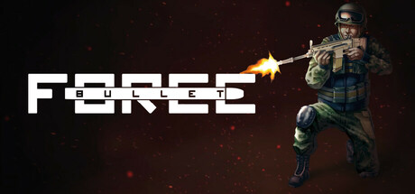
Bullet Force scored 68/100 on Steam Analyzer — Solid for a Action capsule. Top priority fix: [uniqueness_polish] Introduce a distinctive visual hook—such as a signature weapon design, unique soldier silhouette, or branded color accent—that differentiates Bullet Force from competing FPS titles and establishes memorable brand identity.

Capsule scores by dimension

  • Genre Clarity: 8/10 — Clear FPS action positioning. A soldier in tactical gear firing a weapon with muzzle flash instantly communicates first-person shooter combat. The pixel art style and military loadout are unmistakable genre cues that read clearly even at tiny size. The weapon discharge effect reinforces the action-shooter identity without ambiguity.
  • Title Readability: 7/10 — Readable retro font with minor issues. The white pixelated 'FORCED' title has strong contrast against the dark background and remains legible at small sizes due to bold letterforms. However, at tiny thumbnail size the individual pixels begin to blur together slightly, and the decorative blocky style sacrifices some sharpness. The title placement on the left side over darker space aids readability.
  • Contrast & Color: 8/10 — Strong light-dark separation. White title text and bright soldier character create excellent value separation against the dark maroon-brown background and black areas. The golden muzzle flash adds a warm accent that pops without overwhelming the composition. In grayscale, the soldier silhouette and text remain clearly distinguished from background, with good edge definition maintained at small sizes.
  • Uniqueness & Polish: 6/10 — Competent but generic FPS presentation. The capsule executes the military FPS formula competently with a soldier pose and weapon discharge, but lacks a distinctive hook or memorable visual identity that sets it apart from dozens of similar tactical shooters. The pixel art retro aesthetic is intentional and functional, yet doesn't communicate a unique mechanic or core appeal beyond 'online multiplayer shooting.' There is no art style signature or brand-differentiating element that would make this memorable compared to the genre benchmarks.
  • Brand Consistency: 5/10 — Generic military aesthetic no signature. The capsule uses standard tactical soldier iconography and pixelated FPS styling without establishing a recognizable brand identity or motif unique to Bullet Force. No distinctive character, color palette, or visual symbol emerges that would allow player recognition in future marketing materials. The presentation feels interchangeable with other free-to-play browser/mobile FPS titles, lacking the iconic visual markers of top-performing competitors.
  • Composition: 7/10 — Clear hierarchy with solid balance. The soldier character anchors the right side as the clear focal point while the title occupies the left third, creating an effective left-to-right reading flow. The composition avoids clutter and dead space, with the muzzle flash and background particles providing visual interest without competing for attention. At tiny size, the soldier silhouette remains the primary subject and the title stays readable in its designated safe area.

What works

  • Strong contrast readability. White text and bright soldier elements pop decisively against the dark background, maintaining clarity even at thumbnail sizes.
  • Clear genre communication. Tactical soldier firing a weapon unambiguously signals FPS action to players in under one second of scanning.
  • Balanced focal hierarchy. Right-anchored character and left-anchored title create effective composition with no competing elements.

What hurts the capsule

  • Generic military aesthetic. The standard soldier pose and tactical gear lack distinctive visual identity compared to genre benchmarks with iconic characters or unique art styles.
  • No brand signature element. Missing a memorable motif, color palette, or visual symbol that would enable recognition of this title in future marketing.
  • Pixel font loses sharpness tiny. The decorative blocky lettering begins to blur at extreme thumbnail sizes, slightly compromising legibility of individual letters.

Priority fixes

  1. [uniqueness_polish] Introduce a distinctive visual hook—such as a signature weapon design, unique soldier silhouette, or branded color accent—that differentiates Bullet Force from competing FPS titles and establishes memorable brand identity.
  2. [brand_consistency] Establish and consistently apply a signature color palette or visual motif across all future capsule iterations to build instant recognition and cohesive brand presence.
  3. [title_readability] Thicken the pixel font outline or add a subtle glow effect around letters to preserve sharpness and readability at the smallest thumbnail sizes without losing the retro aesthetic.

Store copy priority fixes

  1. [hook_strength] Rewrite the opening to lead with a specific gameplay hook, not the genre: e.g., 'Master fast-paced gunplay across 60+ weapons and custom-built maps in intense team battles or free-for-all showdowns.'
  2. [uniqueness] Expand the custom editor mention with 1–2 sentences explaining how it differentiates the game: 'Create and share your own maps, or battle on designs crafted by the community.'
  3. [feature_communication] Add 1–2 sentences describing progression, cosmetics, or what makes rounds rewarding beyond just 'playing modes': e.g., 'Unlock weapons, skins, and perks as you rank up, or jump straight into Gun Game for instant loadout variety.'
  4. [audience_targeting] Insert a sentence that clarifies the intended player type: e.g., 'Whether you want quick, skill-based matches or longer tactical campaigns, Bullet Force scales to your playstyle.'

Related guides

Steam app ID: 3624370 · Tags: Action, Shooter, FPS, 3D, First-Person