Scoring genre clarity...
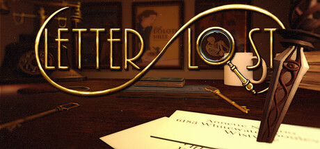
Letter Lost capsule

Letter Lost

You’re the sole employee at the Kharnym Isle post office, stamping, sorting, and delivering mail. But the job hides secrets, and the office itself holds mysteries you must uncover. This will be the only job you’ll ever need to work… unless you can escape.

$19.99Very Positive(127)
MysteryHorrorStory Rich
FlatNine GamesJun 10, 2026

Letter Lost scores 75/100 — better than 78% of Mystery capsules (n=2,266).

Very Positive (127 reviews) · $19.99 · Released Jun 10, 2026 · By FlatNine Games

Quick text summary

Letter Lost scored 75/100 on Steam Analyzer — Good for a Mystery capsule. Top priority fix: [genre_clarity] Incorporate a visible postal element such as a stamp, envelope with 'post office' markings, or mail stack to clearly communicate the unique job-based mechanic and differentiate from generic mystery games.

Capsule scores by dimension

  • Genre Clarity: 7/10 — Mystery adventure with office setting. The capsule clearly communicates a narrative-driven, puzzle or mystery adventure through warm-toned office décor, a magnifying glass (investigation), and a desk environment with papers and objects. At tiny size the magnifying glass remains the strongest genre cue, though the specific 'post office mystery' mechanic is not immediately obvious without context. The overall feel reads as indie adventure mystery rather than action or other genres.
  • Title Readability: 8/10 — Strong outline lettering, clear at small sizes. The title 'LETTER LOST' uses a gold outline font with elegant curved connectors between words, creating a cohesive visual logo. At small and tiny sizes the letterforms remain clearly legible due to the outlined stroke technique and generous spacing. The title sits on a controlled warm background zone that isolates it well from the busy desk details behind, preventing text collapse into background noise.
  • Contrast & Color: 8/10 — Warm gold against dark brown creates strong separation. The gold-outlined title and magnifying glass frame pop distinctly against the dark brown desk wood and shadowed background, providing clear value separation in both color and grayscale. The cream-colored paper and bright brass magnifying glass create warm focal points that stand out even when squinting. At tiny size the gold outline maintains silhouette clarity and the overall warm-dark contrast reads immediately.
  • Uniqueness & Polish: 7/10 — Stylized deco aesthetic, intentional craft. The capsule employs a deliberate art deco or vintage mystery aesthetic with the elegant gold outline typography, warm sepia tones, and carefully arranged desk still life. This signals a premium indie experience with thoughtful visual direction rather than generic asset placement. However, the 'detective's desk' trope is familiar within mystery games, limiting how distinctive it feels compared to other indie adventure capsules that also use similar vintage mystery aesthetics.
  • Brand Consistency: 7/10 — Cohesive vintage mystery palette and motifs. The capsule establishes a consistent warm gold and sepia color palette with clear visual motifs (magnifying glass, handwritten letter, wooden desk, brass accents) that signal 'mystery investigation' across all elements. The outlined gold typography style could become a recognizable brand signature. Internal rendering and lighting are coherent, though without access to the 11 referenced screenshots it is difficult to confirm whether these visual elements consistently appear throughout marketing materials.
  • Composition: 8/10 — Clear focal hierarchy, well-balanced depth layers. The magnifying glass is positioned as the primary focal point in the upper right, drawing the eye immediately, while the title anchors the upper third with strong visual weight. The composition uses clear depth layering—warm-lit wooden desk in foreground, papers and objects in midground, shadowed background creating recession. At small and tiny sizes the magnifying glass and title remain the dominant readable elements without clutter or competing focal points.

What works

  • Elegant outlined typography. The gold outline font for 'LETTER LOST' maintains full legibility at all sizes from full header to tiny thumbnail, with distinctive curved connectors that suggest sophistication and the game's mysterious tone.
  • Strong value contrast against background. Warm gold and cream elements separate clearly from the dark brown desk and shadow, ensuring quick visual parsing even at tiny size during a fast Steam scroll.
  • Cohesive vintage mystery aesthetic. The sepia tones, brass magnifying glass, handwritten papers, and wooden desk create a unified visual language that immediately communicates the game's theme and mystery-investigation core mechanic.
  • Clear focal point and hierarchy. The magnifying glass anchors attention at the top, the title sits below it, and supporting desk elements guide without competing, creating a well-ordered composition that reads at all scales.

What hurts the capsule

  • Generic detective desk trope. While executed well, the 'mystery investigator's desk' setup is a familiar visual cliché in indie adventure games, reducing the capsule's distinctiveness compared to top-performing titles in the genre.
  • Post office mechanic not visually apparent. The game's core unique hook—that you work at a post office stamping and sorting mail—is not clearly communicated; a magnifying glass and generic desk could apply to any mystery game without hinting at the specific job gameplay.
  • Limited color palette variation. The warm sepia and gold tones are cohesive but narrow in range, which works for mood but offers less visual variety to stand out among other warm-toned indie adventure capsules at a glance.

Priority fixes

  1. [genre_clarity] Incorporate a visible postal element such as a stamp, envelope with 'post office' markings, or mail stack to clearly communicate the unique job-based mechanic and differentiate from generic mystery games.
  2. [uniqueness_polish] Add a subtle detail that signals the 'secrets hidden in the office' theme—such as a cryptic symbol on a letter, mismatched address, or environmental anomaly—to elevate uniqueness beyond the standard detective desk.
  3. [composition] Ensure that any added postal element maintains the existing clean focal hierarchy and does not clutter the magnifying glass or title prominence at small sizes.

Store copy priority fixes

  1. [feature_communication] Add a bullet point explicitly stating 'Solve environmental puzzles and decrypt clues hidden in mail to uncover the truth and escape' to make the escape-room mechanics unmissable.
  2. [genre_clarity] Include one sentence in the short description that explicitly names 'puzzle-solving' or 'escape' to eliminate any ambiguity that this is primarily a job simulator.
  3. [uniqueness] Strengthen the differentiation by adding a line like 'Uncover Lovecraftian secrets through mundane postal work, where every letter is a clue and your freedom is the prize.'

Related guides

Steam app ID: 3624790 · Tags: Mystery, Horror, Story Rich, Dark, Adventure