Scoring genre clarity...
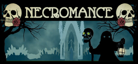
A brave hero and a bound lich rescue a legendary warrior from a forgotten tomb and put the romance back in necromancy. Necromance is a dark fantasy comedy visual novel with light puzzle elements, 3 endings, and 15 ways to die!
$8.991 user reviews
Visual NovelChoose Your Own AdventureDark Humor
Subversionary StudiosFeb 15, 2026