Scoring genre clarity...
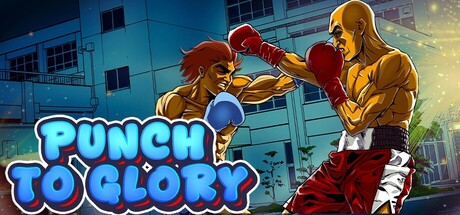
Start your journey as a boxer from the ground up, fighting your way to glory. Develop your character, collect fight cards, and face the challenges life throws your way. Train hard, manage stress, and give everything you've got to turn your championship dreams into reality.
$6.99Positive(41)
Life SimCard BattlerTurn-Based Tactics
Musa GUNGORSep 2, 2025