Scoring genre clarity...
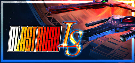
Ever played a difficult shmup wishing for just one more bomb? Blast to your heart’s content in Blast Rush LS, a fresh explosive experience with infinite bombs, other powerful abilities, and extra challenges that demand more than just big booms. Escaping an exploding mothership isn't easy, after all!
$7.49Positive(13)
Bullet HellShoot 'Em UpTop-Down Shooter
Bipedal DogAug 21, 2025