Scoring genre clarity...
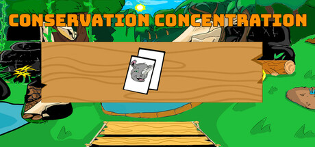
Conservation Concentration The dynamic memory-matching card game featuring multiple boards, diverse regions, collectibles, and timed challenges. Perfect for players with a completionist mindset, it offers endless fun and strategic gameplay as you race to conquer every level!
$2.991 user reviews
Match 3StrategyPuzzle
Inline Genius Game StudiosMay 19, 2025