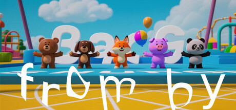
from by scores 63/100 — better than 5% of Cute capsules (n=4,529).

Quick text summary

from by scored 63/100 on Steam Analyzer — Solid for a Cute capsule. Top priority fix: [title_readability] Increase title font weight and size so 'from by' remains legible at 120x45 thumbnail size, or add a semi-transparent background shape to protect text clarity.

Capsule scores by dimension

  • Genre Clarity: 7/10 — Playful casual action, transformation mechanic clear. The capsule clearly communicates a colorful, family-friendly action game through the lineup of cute animal characters and vibrant playground setting with slides and balloons. At tiny size, the animal silhouettes and bright environment immediately signal a casual, lighthearted experience, though the specific transformation mechanic and action focus are less obvious without reading the title. The competitive element (suggested by the stage-like environment) reads as secondary to the charming aesthetic.
  • Title Readability: 5/10 — Title readable at full, struggles at tiny. The 'from by' text is rendered in a clean, modern white sans-serif font with reasonable spacing, readable at full header size and small capsule size. However, at tiny thumbnail size (~120x45), the text becomes thin and difficult to parse quickly due to the lowercase letterforms and minimal letter weight, requiring conscious effort to read rather than instant recognition. The positioning across the middle-ground competes with character elements for attention.
  • Contrast & Color: 8/10 — Strong vibrant palette, excellent separation. The bright turquoise sky, yellow platform, and saturated character colors (orange fox, pink pig, brown bear, white panda) create excellent value separation against both the capsule background and the assumed Steam dark #1b2838. The clean, high-chroma color palette maintains silhouette clarity even at tiny size, and the grayscale contrast between light characters and sky versus the darker platform remains distinct. The composition avoids muddy mid-tones that would blur at small scales.
  • Uniqueness & Polish: 6/10 — Competent craft, generic cheerful aesthetic. The capsule demonstrates solid 3D rendering quality with well-lit characters and clean environment design, but the overall visual presentation—cute animal characters in a colorful playground—follows a familiar casual game template without a distinctive hook or memorable artistic signature. The rendering is professional and the asset quality is good, but the concept and execution lack the visual storytelling or unique visual identity that would make it stand out in a genre dominated by more stylistically distinct indie and casual titles. It reads as competent rather than premium or distinctive.
  • Brand Consistency: 5/10 — Generic cute characters, no recognizable motif. The capsule features five generic cute animal characters without a clear iconic protagonist or signature visual identity that could be recognized across marketing materials or future promotional work. The color palette is vibrant but not distinctive—bright primary colors and pastels are standard for casual games and don't form a cohesive brand signature. Without additional context from the 10 store screenshots, the capsule communicates 'cute casual game' rather than 'this specific game's identity.'
  • Composition: 7/10 — Clear focal point, good depth layering. The five characters form a strong horizontal focal band at the composition's visual center, with the sky and clouds in the background, the stage platform in the midground, and playground equipment framing the scene—creating clear depth layering that reads well at all sizes. The title placement below the characters is logical and doesn't interfere with character silhouettes. At tiny size, the character lineup remains the clear primary element, though the title competes slightly for attention due to reduced font weight.

What works

  • Vibrant color contrast against dark background. Saturated turquoise, yellow, and bright character colors create excellent value separation from Steam's dark interface and maintain silhouette clarity at tiny thumbnail size.
  • Clear subject hierarchy with character lineup. The five animal characters form an immediately recognizable focal point that guides attention and communicates the game's playful, casual nature at all viewing sizes.
  • Logical composition with depth layering. Sky background, platform midground, and equipment framing create visual depth that prevents flatness and supports quick visual parsing during fast scrolling.

What hurts the capsule

  • Title barely readable at tiny size. The 'from by' text in thin lowercase sans-serif collapses into a blur at thumbnail size (~120x45), requiring conscious effort rather than instant recognition during quick browsing.
  • Generic aesthetic lacks distinctive visual identity. The cheerful animal character lineup and colorful playground follow familiar casual game templates without a memorable brand motif, signature palette, or unique visual hook that distinguishes it from other family-friendly titles.
  • No clear gameplay differentiation communicated. While the transformation mechanic is mentioned in the game description, the capsule visuals don't specifically telegraph the action, evasion, or competition elements—instead emphasizing a generic cute aesthetic.

Priority fixes

  1. [title_readability] Increase title font weight and size so 'from by' remains legible at 120x45 thumbnail size, or add a semi-transparent background shape to protect text clarity.
  2. [uniqueness_polish] Introduce a signature visual element—an iconic character silhouette, distinctive color accent, or transformation effect visual—that creates memorable brand identity separate from generic cute game conventions.
  3. [genre_clarity] Add a subtle visual cue of action or transformation (e.g., motion blur, animal transformation in progress, or competitive stage lighting) to better communicate the action-adventure gameplay beyond the cheerful aesthetic.

Store copy priority fixes

  1. [hook_strength] Replace the opening line with a verb-forward, specific hook: 'Become a wolf, a bird, a frog—each with wildly different physics—and race through obstacle-filled arenas with up to 4 friends.' This leads with the core differentiator (animal transformation) and multiplayer appeal.
  2. [feature_communication] Add a short, bulleted feature list to the detailed description: 'Shapeshift between animals with unique movement mechanics / Physics-based puzzles and obstacles / Local and online co-op for 1-4 players / Leaderboard competitions.' This transforms vague claims into concrete mechanics.
  3. [audience_targeting] Move multiplayer language into the short description: Revise to 'From by is a multiplayer action-adventure where you and friends transform into animals...' This immediately signals the core audience in the most-read section.

Related guides

Steam app ID: 3630600 · Tags: Cute, Funny, Cartoony, Local Multiplayer, Abstract