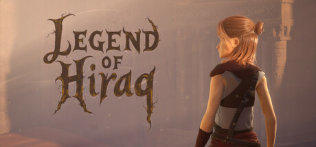
Legend of Hiraq scores 65/100 — better than 9% of Action capsules (n=8,534).

Quick text summary

Legend of Hiraq scored 65/100 on Steam Analyzer — Solid for a Action capsule. Top priority fix: [title_readability] Replace ornate serif font with a bolder, simpler sans-serif or serif variant that maintains legibility at 120x45px—test rendering at tiny size to confirm letter separation.

Capsule scores by dimension

  • Genre Clarity: 7/10 — Desert adventure with action hints. The character silhouette, combat-ready stance, and desert environment clearly signal action-adventure gameplay. The ornate title treatment with branch-like motifs suggests fantasy and ancient mysticism aligned with the djinn and ruins premise. At tiny size, the character pose and warm desert palette remain readable enough to imply action, though the specific 'trap-puzzle' or 'dungeon-crawl' subgenre is not immediately obvious without context.
  • Title Readability: 6/10 — Readable but ornate serif treatment. The title 'LEGEND OF HIRAQ' uses a stylized serif font with organic, branch-like letterforms that fits the fantasy theme and reads clearly at full size. At small size, the ornate serifs lose some definition and begin to feel crowded, and at tiny size the title degrades noticeably—the delicate linework collapses and individual letters blur slightly. The left-aligned placement on a controlled background region helps, but the decorative nature of the font penalizes legibility at scale.
  • Contrast & Color: 7/10 — Warm tones with good figure separation. The warm orange and golden-brown desert palette contrasts well against the Steam dark background (#1b2838), and the character model silhouette reads clearly with distinct edge separation from the hazy background. The title text in dark brown-gray sits comfortably on the lighter background region, maintaining legibility. However, the overall mid-tone richness of the scene means fine detail can soften slightly at tiny size, and a grayscale squint test shows moderate but not exceptional contrast—the character and title do not pop as aggressively as top-tier capsules.
  • Uniqueness & Polish: 6/10 — Competent fantasy scene, derivative tone. The capsule presents a technically clean render of a character in a desert environment with professional lighting and material work. The ornate title font and mystical aesthetic feel intentional and thematic, but the overall composition—character pose, desert setting, warm backlighting—aligns closely with common action-adventure and fantasy game capsules, including several benchmarks like Chants of Sennaar and Lies of P. There is no immediately distinctive hook or unique visual mechanic that sets it apart; it executes the archetype well but does not exceed expectations.
  • Brand Consistency: 6/10 — Thematic but not distinctly iconic. The ornate serif branding and desert-mystical aesthetic are internally coherent and align with the ancient ruins and djinn lore described in the premise. The warm color palette and character design feel consistent with the game's stated themes, and without contradictions across visible elements. However, there are no strongly memorable motifs, signature character markings, or distinctive color anchors that would allow recognition of this brand at a glance across varied contexts—it reads as thematically appropriate rather than visually iconic.
  • Composition: 7/10 — Clear focal point with safe hierarchy. The character occupies the right third of the frame in a natural contrapposto pose, drawing the eye and establishing a clear primary subject, while the title anchors the left side in balanced visual weight distribution. The depth layering—misty background, mid-ground environment, character in focus—creates readable spatial separation even at small size. The composition holds well across sizes and respects safe margins; however, the right shoulder and bow edge sit close to the frame boundary, risking minor crop issues on some display contexts, and the expansive empty sky above the title could be tightened for stronger top-to-bottom balance.

What works

  • Character silhouette clarity. The protagonist pose and model definition remain recognizable and engaging even when scaled to small and tiny sizes, providing a strong focal point.
  • Thematic atmosphere. The warm desert lighting, ornate title font, and overall visual presentation cohere strongly with the ancient ruins and mystical djinn premise.
  • Layout balance and safe margins. The title-left, character-right composition creates intentional visual weight distribution and avoids dead center clutter.

What hurts the capsule

  • Title font legibility at scale. The ornate serif letterforms lose definition and readability when compressed to tiny size, with delicate linework collapsing into visual noise.
  • Generic action-adventure execution. The desert setting, character pose, and warm backlighting align closely with common fantasy-action benchmarks, offering no distinctive visual hook or memorable unique selling point.
  • Lack of iconic brand signifier. No distinctive character marking, signature motif, or memorable color anchor creates lasting recognition or differentiates the brand from similar titles.

Priority fixes

  1. [title_readability] Replace ornate serif font with a bolder, simpler sans-serif or serif variant that maintains legibility at 120x45px—test rendering at tiny size to confirm letter separation.
  2. [uniqueness_polish] Add a distinctive visual element—character-specific tattoo, unique weapon detail, or djinn-inspired glyph—that communicates the game's core identity and differentiates it from genre benchmarks.
  3. [contrast_color] Increase title text contrast by applying a dark outline or shadow to the letterforms, ensuring the text reads clearly against the lighter background region at all scales.

Store copy priority fixes

  1. [uniqueness] Add a sentence in the short description that articulates the specific hook—e.g., 'Inspired by 1001 Nights' or 'combines Souls-like combat with precision platforming' to signal what sets this apart from generic action-adventures.
  2. [hook_strength] Replace the opening line's vague 'epic adventure' and 'heart-pounding action' with a more specific verb-driven pitch that leads with the core hook, such as 'Master deadly platforming and tactical combat to uncover Mount Qaf's secrets in this 1001 Nights-inspired action game.'
  3. [audience_targeting] Add clarity on difficulty and intended audience—e.g., mention stamina-management challenge, learning curve, or note that it rewards pattern memorization for players familiar with Souls-like or Metroidvania genres.
  4. [feature_communication] Trim atmospheric passages like 'A Glimpse of Mount Qaf' and replace with concrete gameplay progression info—e.g., how many environments or acts, whether there are upgrades or New Game+ modes, or how exploration unlocks new areas.

Related guides

Steam app ID: 3630620 · Tags: Action, Adventure, Action RPG, Action-Adventure, Platformer