Scoring genre clarity...
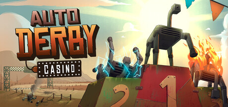
1-4 players gamble on robot horse races at this casino without rules. Sabotage the horses, manipulate bets, or even blow up the track. Outplay your friends, or at the very least make sure they lose too. All that matters is the payout.
$4.994 user reviews
MultiplayerOnline Co-OpGambling
numberonescientistMay 25, 2026