Scoring genre clarity...
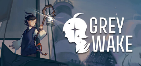
Grey Wake capsule

Grey Wake

In an intimate narrative-driven exploration game, wake up on a forgotten island between life and death equipped with only a compass, a telescope, and a weathered sailboat. Chart the haunted archipelago, relive faded memories, and uncover the truth about what, and who, you came here to find.

Dialogue HeavyStory RichAdventure
Second Fiddle StudioComing soon

Grey Wake scores 73/100 — better than 60% of Dialogue Heavy capsules (n=685).

Released Coming soon · By Second Fiddle Studio

Quick text summary

Grey Wake scored 73/100 on Steam Analyzer — Good for a Dialogue Heavy capsule. Top priority fix: [contrast_color] Increase character silhouette definition by adding subtle rim light or outline to separate the figure from background shadow, improving tiny-size readability.

Capsule scores by dimension

  • Genre Clarity: 7/10 — Narrative adventure with exploration cues. The capsule communicates an intimate, atmospheric adventure through the character pose holding a compass/telescope and the moody nautical setting with lighthouse and sailboat silhouettes. At tiny size, the lonely figure and maritime elements read as exploration-driven narrative game rather than action or puzzle focus. The pale, contemplative aesthetic aligns with indie narrative adventure expectations.
  • Title Readability: 8/10 — Clean, readable title with strong hierarchy. GREY WAKE appears in large, sans-serif white text with generous spacing on the right side, positioned over a controlled background region away from busy detail. The title remains clearly legible at small and tiny sizes due to high contrast and uncluttered placement. No tagline competes for attention, keeping focus sharp.
  • Contrast & Color: 7/10 — Good value separation with cool palette. The white title and character silhouette create strong light-to-dark contrast against the muted blue-grey background, reading clearly even at tiny thumbnail size. The cool color palette and soft lighting create cohesion but lack the vibrancy that would make it pop instantly in a crowded Steam browse. Grayscale test shows adequate silhouette clarity, though mid-tones in the character blend somewhat with background shadow.
  • Uniqueness & Polish: 7/10 — Polished indie aesthetic, distinctive character portrait. The side-profile character portrait with compass and telescope is a memorable visual hook that signals the game's core mechanic and narrative focus. Art direction is clean and intentional with consistent soft lighting and a cohesive melancholic mood. While the aesthetic is well-executed, it falls within familiar indie narrative-adventure visual language rather than breaking new ground stylistically.
  • Brand Consistency: 7/10 — Consistent melancholic tone, recognizable visual identity. The pale figure, muted cool palette, nautical elements, and introspective composition create a memorable identity consistent with intimate narrative-driven experiences. The character silhouette and lighthouse form an iconic pairing that would be recognizable across marketing materials. Internal cohesion is strong; all elements reinforce theme without tonal contradiction.
  • Composition: 8/10 — Strong focal point with effective space balance. The character occupies left-center with clear hierarchical weight, while the title anchors the right side, creating balanced asymmetry that guides the eye naturally. Background lighthouse and sailboat provide atmospheric depth without competing for attention. At tiny size, the composition remains legible with no critical elements at dangerous edges, and the negative space around the title prevents cramping.

What works

  • Legible title placement. White sans-serif text positioned on a calm background region ensures readability at all sizes including tiny thumbnails.
  • Memorable character hook. The side-profile silhouette with compass and telescope clearly communicates exploration narrative and serves as a distinctive visual anchor.
  • Cohesive mood and palette. Muted cool tones, soft lighting, and melancholic atmosphere create consistent brand identity aligned with intimate indie narrative games.
  • Balanced asymmetric composition. Character on left and title on right create natural visual flow with supporting lighthouse detail adding depth without clutter.

What hurts the capsule

  • Muted color vibrancy. The cool grey-blue palette, while atmospheric, lacks saturation punch to make the capsule stand out in fast-scrolling Steam browse versus more vivid genre peers.
  • Character-background blend in mid-tones. The character's clothing and some facial details merge slightly with background shadow, reducing silhouette crispness at smaller sizes.
  • Limited genre visual distinctiveness. While well-executed, the melancholic indie aesthetic and maritime setting align with common narrative-adventure conventions rather than unique visual positioning.

Priority fixes

  1. [contrast_color] Increase character silhouette definition by adding subtle rim light or outline to separate the figure from background shadow, improving tiny-size readability.
  2. [uniqueness_polish] Consider introducing a signature color accent or distinctive element that lifts the palette while maintaining mood—warm amber from lighthouse or compass detail could differentiate from similar titles.
  3. [genre_clarity] Ensure compass and telescope remain readable at tiny size by slightly enlarging or brightening these mechanic-signaling props.

Store copy priority fixes

  1. [feature_communication] Add a sentence explicitly stating this is a low-stakes, relaxation-focused experience with no fail states or time pressure, to align the copy with the Casual and Relaxing tags.
  2. [hook_strength] Clarify the central narrative goal in the short description: instead of ending on 'who you came here to find,' add a hint at the emotional or personal stakes of that reunion.
  3. [feature_communication] Expand the dream sequence and conversation mechanics with one sentence: explain how conversations drive story progression or if they unlock narrative branches.

Related guides

Steam app ID: 3631930 · Tags: Dialogue Heavy, Story Rich, Adventure, Narrative, Sailing