Scoring genre clarity...
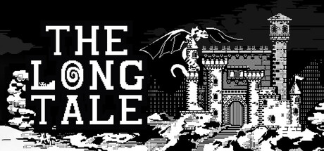
The princess is gone, but the dragon stayed. Jump, die, rage, repeat — The Long Tale is a brutal black & white pixel platformer with deadly traps and no handholding. Each step is a decision. Warning: may cause obsession, retries beyond reason, and minor damage to keyboards.
$2.995 user reviews
AdventureActionCasual
Syrnik InteractiveMay 15, 2025