Fingerdance scores 62/100 — better than 4% of Typing capsules (n=214).

Quick text summary

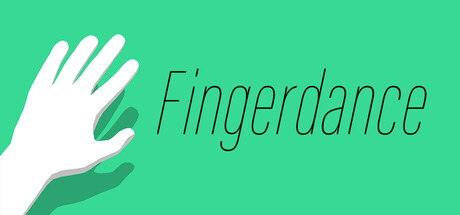
Fingerdance scored 62/100 on Steam Analyzer — Solid for a Typing capsule. Top priority fix: [title_readability] Increase font weight and reduce italic stress in 'Fingerdance' to maintain legibility at small and tiny capsule sizes.

Capsule scores by dimension

  • Genre Clarity: 4/10 — Unclear gameplay type messaging. The capsule shows a minimalist hand gesture against a bright teal background, but this visual does not clearly communicate action, indie, or simulation gameplay. At tiny size, it reads as an abstract wellness or productivity app rather than a game that confuses your fingers through mechanical challenge. The hand pose is generic and could represent many unrelated concepts.
  • Title Readability: 7/10 — Title readable at full size only. The word 'Fingerdance' is rendered in a thin, italicized serif font positioned to the right of the hand icon. At full header size it reads cleanly, but at small (231×87) and tiny (120×45) sizes the thin letterforms and italic stress cause noticeable degradation. The font weight is too delicate to maintain legibility when the capsule shrinks during quick scrolling.
  • Contrast & Color: 8/10 — Strong value separation against dark background. The bright mint-green background (#2dd7b8 or similar) creates excellent contrast against Steam's dark interface (#1b2838). The white hand and darker green gesture element both pop with clear silhouettes. In grayscale, the hand maintains strong separation from background, ensuring the icon remains readable even when squinting or at thumbnail size.
  • Uniqueness & Polish: 5/10 — Clean but generic hand interaction visual. The flat design and minimal aesthetic are competently executed with smooth gradients and clean outlines, but the hand-on-hand gesture is a common UI metaphor that does not distinguish this game's unique mechanical identity. At tiny size, it becomes indistinguishable from a generic touch-based app and fails to communicate the 'confusion' or 'finger challenge' core concept. The capsule prioritizes minimalism over conveying gameplay novelty.
  • Brand Consistency: 6/10 — Consistent minimal style, no memorable identity. The capsule employs a cohesive flat design language with a controlled teal palette and simple geometric forms. However, without reference to the 6 store screenshots, there are no iconic character motifs, signature symbols, or distinctive visual hooks that signal brand recognition. The style is internally consistent but generic enough that it could apply to dozens of mobile or web apps.
  • Composition: 7/10 — Clear focal point with safe spacing. The hand icon is centered-left and anchors the composition effectively, with the title text positioned to the right in a balanced layout. The large empty teal expanse does not feel wasted because it reinforces the minimalist aesthetic and ensures the hand remains the primary focal point. At small and tiny sizes, the icon-text pairing remains legible and the hand does not bleed into unsafe margins.

What works

  • Excellent contrast against dark Steam background. Bright mint-green and white elements create strong value separation that persists in grayscale and remains visible during quick scroll.
  • Clean, balanced layout with clear hierarchy. Hand icon anchors the left, title sits in controlled white space to the right, and no elements compete for attention or crowd edges.
  • Polished flat design execution. Smooth gradients, clean outlines, and intentional color choices signal professional craft without visual clutter.

What hurts the capsule

  • Title font too thin for small sizes. Delicate italicized serif letterforms degrade noticeably at small (231×87) and tiny (120×45) sizes, reducing readability during quick scrolling.
  • Generic hand gesture obscures game identity. The hand-on-hand pose does not communicate action, simulation, or the 'finger confusion' mechanic, reading instead as a generic productivity or wellness app icon.
  • No memorable brand visual hook. The minimalist aesthetic is competent but interchangeable with dozens of other indie apps, offering no iconic character, motif, or signature element for recognition.
  • Fails to convey gameplay challenge. The visual does not hint at mechanical difficulty, finger manipulation mechanics, or the core 'confuse your fingers' selling point that differentiates the game.

Priority fixes

  1. [title_readability] Increase font weight and reduce italic stress in 'Fingerdance' to maintain legibility at small and tiny capsule sizes.
  2. [genre_clarity] Redesign the hand icon to incorporate gameplay cues such as multiple fingers in rapid motion, abstract puzzle elements, or visual indicators of challenge and rhythm to clarify this is an action/simulation game.
  3. [uniqueness_polish] Add a secondary visual element or signature color accent that creates a memorable brand hook and differentiates Fingerdance from generic hand-icon apps.

Store copy priority fixes

  1. [hook_strength] Rewrite the short description to lead with a gameplay verb and value: 'Master finger patterns at lightning speed—test your keyboard dexterity in this playful rhythm-action hybrid.'
  2. [uniqueness] Add 1–2 sentences explaining what is unique: mention the pattern variety, whether there are themes or progressive difficulty, or what makes this different from traditional rhythm games or typing tests.
  3. [audience_targeting] Clarify the intended player in the opening of the detailed description: 'Perfect for players who love quick reflexes and hand-eye coordination challenges' or similar.
  4. [feature_communication] Expand briefly on content scope: add a sentence mentioning approximate stage count, whether there are daily challenges, or multiplayer/leaderboard features if present.

Related guides

Steam app ID: 3633450 · Tags: Typing, Action, Simulation, Difficult, Rhythm