Scoring genre clarity...
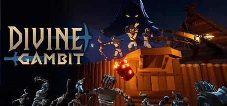
Divine Gambit capsule

Divine Gambit

Defy the Gods alone or with friends and defend your village in a unique blend of action and strategy. Gather resources, place traps and fortify your land by day. At night, wield mighty weapons and spells to repel the invading armies. Overcome impossible odds and become the Protector of your people!

ActionAction-AdventureOnline Co-Op
Gazing PupTo be announced

Divine Gambit scores 72/100 — better than 45% of Action capsules (n=8,856).

Released To be announced · By Gazing Pup

Quick text summary

Divine Gambit scored 72/100 on Steam Analyzer — Good for a Action capsule. Top priority fix: [genre_clarity] Add a clear tower defense visual element—e.g., glowing defensive runes, fortified perimeter, or village buildings with visible defensive barriers—to communicate the hybrid mechanic at thumbnail size.

Capsule scores by dimension

  • Genre Clarity: 7/10 — Action gameplay evident, tower defense unclear. The capsule clearly communicates action through the dynamic character pose, glowing magical effects, and combat-ready stance of the central figure against an enemy silhouette. However, the tower defense hybrid mechanic is not visually apparent—the wooden structures on the left read as environmental props rather than defensive buildings, making the dual-genre nature ambiguous at small and tiny sizes. At tiny size, it reads primarily as action-adventure rather than the strategic tower defense blend.
  • Title Readability: 8/10 — Title clear at full and small, strong lettering. The 'DIVINE GAMBIT' title uses bold metallic gray letterforms with clean outlines that maintain legibility at small size and remain readable at tiny size. The horizontal placement across mid-frame avoids clutter and sits on a relatively controlled background of sky and silhouettes. The outline and weight support survival through size reduction, though tiny testing shows slight compression of letter forms but no loss of recognition.
  • Contrast & Color: 8/10 — Strong warm-cool separation, clean silhouettes. The design leverages rich contrast between warm orange-gold character and magical effects against cool blue-purple night sky and dark silhouettes, creating excellent value separation against the Steam dark background. The glowing effects and bright costume colors pop clearly even when squinting or viewing at tiny size. The silhouettes of enemies and structures maintain clear edges and don't blend into the background atmospheric gradient.
  • Uniqueness & Polish: 7/10 — Polished aesthetic, familiar action tropes. The capsule demonstrates solid craft with clean VFX, coherent lighting, and a dynamic composition that feels intentional and premium. The magical effects and character animation pose suggest high production value, but the core visual—action hero against dark enemies in mystical setting—echoes common action-game templates without a strongly distinctive hook that separates it from God of War, Warhammer Space Marine 2, or similar titles. The tower defense identity needed stronger visual communication to push uniqueness higher.
  • Brand Consistency: 6/10 — Competent but generic action fantasy identity. The capsule establishes a consistent fantasy-action art direction with warm-toned character rendering and cool night sky that likely aligns across the 10 available screenshots. However, there are no clear iconic character traits, signature symbols, or memorable visual motifs that would make this recognizable as 'Divine Gambit' specifically rather than a generalized action-fantasy game. The title itself is the primary brand anchor; visual elements lack distinctive identity cues.
  • Composition: 7/10 — Clear focal point, good depth layering, safe margins. The composition uses effective foreground-midground-background layering with the glowing character as the clear primary focal point, supporting silhouettes and structures guiding the eye without competing for attention. Title placement is strategic and doesn't crowd edges or interfere with the character. At small and tiny sizes, the hierarchy remains intact, though the wooden tower structures on the left edge become less distinguishable and could risk cropping depending on Steam platform variance.

What works

  • Strong contrast and visual pop. Warm gold-orange character and magical effects separate decisively from cool blue-purple sky and dark silhouettes, ensuring strong presence against dark Steam backgrounds and clarity at small sizes.
  • Title legibility and placement. Metallic gray 'DIVINE GAMBIT' lettering with clean outlines remains readable at tiny size and sits strategically on controlled background without competing with focal point.
  • Clear primary focal point. The dynamic glowing character pose immediately draws the eye and maintains hierarchy across all viewing sizes without scattered competing elements.

What hurts the capsule

  • Tower defense mechanic not visually communicated. Wooden structures read as environmental dressing rather than defensive buildings, leaving the hybrid tower defense identity completely invisible to players unfamiliar with the game.
  • Generic action-fantasy presentation. The capsule relies on common tropes—mystical hero, dark enemies, magical effects—without distinctive visual identity cues that would make Divine Gambit memorable or recognizable beyond the title text.
  • Left-edge structures lack visual clarity at small sizes. The wooden structures on the left edge lose definition and purpose when scaled down, becoming muddy environmental noise rather than meaningful compositional elements.

Priority fixes

  1. [genre_clarity] Add a clear tower defense visual element—e.g., glowing defensive runes, fortified perimeter, or village buildings with visible defensive barriers—to communicate the hybrid mechanic at thumbnail size.
  2. [uniqueness_polish] Develop a distinctive visual motif or character silhouette that differentiates Divine Gambit from generic action-fantasy templates and creates a memorable brand icon.
  3. [composition] Clarify or remove left-edge structures to reduce visual clutter at small sizes, or replace with more distinct strategic defense UI elements that reinforce the tower defense identity.

Store copy priority fixes

  1. [feature_communication] Add a structured sentence or bullet list describing the action phase mechanics: 'Control your Protector with [mechanic X], wield [weapon types], and coordinate with teammates to [specific tactical goal].' This clarifies what 'frantic action' means mechanically.
  2. [uniqueness] Insert a differentiator statement: 'Unlike traditional tower defense, you command your Protector directly during invasions, blending real-time combat with base management' or similar—explicitly contrast with genre peers.
  3. [audience_targeting] Add a sentence clarifying difficulty and player type: 'Perfect for strategy enthusiasts who want hands-on action' or 'accessible to newcomers but deep for veterans' to help self-selection.
  4. [feature_communication] Specify progression and replayability hooks: mention whether there are unlocks, upgrades, map modifiers, or difficulty tiers that explain why 'no perfect plan' leads to high replayability.

Related guides

Steam app ID: 3633690 · Tags: Action, Action-Adventure, Online Co-Op, Tower Defense, Third Person