Scoring genre clarity...
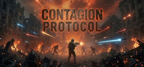
Contagion Protocol capsule

Contagion Protocol

Survive an endless undead horde in this brutal auto-battling roguelike. Slash, upgrade, and evolve your arsenal as chaos unfolds to the pulse of an industrial metal soundtrack. Contagion Protocol is fast, bloody, and built for replayability.

Bullet HellAuto BattlerAction Roguelike
Para InteractiveQ4 2027

Contagion Protocol scores 75/100 — better than 65% of Bullet Hell capsules (n=1,312).

Released Q4 2027 · By Para Interactive

Quick text summary

Contagion Protocol scored 75/100 on Steam Analyzer — Good for a Bullet Hell capsule. Top priority fix: [uniqueness_polish] Introduce a distinctive character silhouette or iconic visual motif (e.g., a signature weapon design, player glyph, or mutation marker) that sets this capsule apart from generic action-survival templates.

Capsule scores by dimension

  • Genre Clarity: 8/10 — Clear action combat survival vibes. The silhouetted figures in aggressive combat stances against an undead-infested urban backdrop immediately communicate action gameplay with zombie/infected enemies. At tiny size, the central player figure with weapon and surrounding hostile silhouettes remain legible and genre-specific. The orange apocalyptic lighting and architectural decay reinforce survival action tone effectively.
  • Title Readability: 8/10 — Bold sans-serif reads well at all sizes. CONTAGION PROTOCOL uses a strong, wide sans-serif typeface in golden-orange that contrasts sharply against the warm-orange gradient background. The stacked two-line layout with ample letterspacing maintains clarity even at tiny size, though the background gradient introduces subtle texture that doesn't impede reading. At small and tiny sizes the title remains the dominant focal point without collapse.
  • Contrast & Color: 8/10 — Strong warm-orange value separation. The golden title text and bright orange gradient create excellent value contrast against the darker orange and deep teal-green architectural elements in the mid and background. The silhouetted figures read as solid dark shapes against the warm gradient, creating clear visual separation. A grayscale conversion would show good tonal separation, though the overall palette skews warm and could risk slight mud at very small sizes if the gradient becomes a single tone.
  • Uniqueness & Polish: 7/10 — Polished execution, somewhat familiar approach. The composition is craft-heavy with intentional lighting, silhouette hierarchy, and thematic coherence that communicates industrial apocalypse aesthetic. The layered depth from background buildings through mid-ground figures to foreground protagonist shows visual storytelling discipline. However, the silhouette-against-gradient approach is a familiar pattern in action game marketing; the execution is clean but the core concept doesn't feel distinctly proprietary compared to top-tier action game capsules.
  • Brand Consistency: 6/10 — Functional but lacks memorable identity markers. The warm orange and architectural decay palette aligns with an industrial-undead theme, and the silhouette style is consistent with the game's brutalist action identity. Without reference to the six store screenshots, there are no clear iconic character symbols, signature motifs, or visual hooks that would make this capsule immediately recognizable as Contagion Protocol specifically; it could fit several similar indie action-survival titles. The aesthetic is thematically appropriate but not distinctly branded.
  • Composition: 8/10 — Clear hierarchy with strong focal point. The center-stage protagonist in an action pose commands immediate attention, with surrounding figures creating directional guides that reinforce threat and chaos without competing for focus. The background buildings frame the action and create depth layering. Safe margins are well-maintained; the title sits cleanly at top without edge interference, and no critical elements approach crop danger zones at standard capsule dimensions.

What works

  • Title contrast and readability. Golden-orange sans-serif title maintains sharp legibility across full, small, and tiny sizes with no font collapse or background interference.
  • Genre clarity through silhouettes. Weapon-wielding figures in combat stances against zombie-like enemy shapes immediately signal action-combat survival gameplay at any size.
  • Depth layering and composition. Clear foreground-midground-background structure with protagonist focal point prevents visual chaos and guides eye naturally across the frame.
  • Value separation and pop. Warm-orange gradient and golden text create strong contrast against the dark architecture and teal tones, standing out on Steam's dark background.

What hurts the capsule

  • Generic silhouette-gradient formula. The execution is competent but the overall visual approach lacks distinctive identity hooks that would differentiate it from similar action game capsules.
  • Limited unique branding cues. No iconic character, logo symbol, or signature visual motif that would make this immediately recognizable as Contagion Protocol specifically on repeat Steam browsing.
  • Palette risks at extreme small sizes. The warm-orange gradient may flatten into a single muddy tone at 120x45 thumbnail resolution, potentially reducing visual pop in quick-scroll conditions.

Priority fixes

  1. [uniqueness_polish] Introduce a distinctive character silhouette or iconic visual motif (e.g., a signature weapon design, player glyph, or mutation marker) that sets this capsule apart from generic action-survival templates.
  2. [brand_consistency] Add a visual anchor or logo treatment that becomes recognizable across store screenshots and builds lasting brand memory beyond the gradient-and-silhouettes formula.
  3. [contrast_color] Test the capsule at 120x45 pixel size and adjust the gradient's mid-tone saturation to ensure the title and figure silhouettes maintain separation in extreme thumbnail view without flatness.

Store copy priority fixes

  1. [uniqueness] Add a sentence explicitly contrasting the extraction mechanic to other roguelikes—e.g., 'Unlike endless-run games, every successful extraction unlocks permanent character upgrades, rewarding tactical retreat over pure endurance.'
  2. [feature_communication] Replace 'watch chaos unfold' with specific on-screen consequences: 'Stack upgrades to trigger chain reactions—axes spin while bullets ricochet, enemies explode on bleed procs, and screen-filling visuals escalate with each power spike.'
  3. [uniqueness] Clarify the character death penalty and rediscovery system—e.g., 'Lose a survivor mid-run and they're gone permanently; only new playthroughs let you rediscover and rebuild them from scratch'—to highlight the roguelike stakes.
  4. [feature_communication] Add 1–2 specific map examples with hazard details—e.g., 'Urban ruins force tight quarters and line-of-sight spawns, while rural wastelands offer open fields but attract horde summoners'—to show how environment drives strategy.

Related guides

Steam app ID: 3634300 · Tags: Bullet Hell, Auto Battler, Action Roguelike, Top-Down, Arena Shooter