1234 connect puzzle scores 77/100 — better than 81% of Puzzle capsules (n=4,408).

Quick text summary

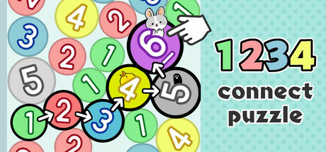
1234 connect puzzle scored 77/100 on Steam Analyzer — Good for a Puzzle capsule. Top priority fix: [title_readability] Increase 'connect puzzle' tagline weight or size, or relocate it to a more spacious region to maintain legibility at tiny sizes.

Capsule scores by dimension

  • Genre Clarity: 8/10 — Clear casual number puzzle game. The colorful numbered circles with sequential 1-2-3-4 progression immediately signal a number-matching casual puzzle game, reinforced by the bright pastel palette and playful bunny mascot. At tiny size, the numbered circles remain legible enough to convey the core mechanic, though individual numbers blur slightly at extreme reduction.
  • Title Readability: 8/10 — Bold readable title, minor tagline issues. The large '1234' in bright green-yellow with black outline reads clearly at all sizes and is positioned on a controlled light cyan background. The 'connect puzzle' tagline in dark text below remains readable at small size but loses clarity at tiny size due to font weight and size reduction.
  • Contrast & Color: 8/10 — Strong pastel contrast against dark background. The bright turquoise background with saturated candy-colored circles (pink, yellow, blue, purple, green) creates excellent separation from Steam's dark #1b2838 backdrop. The title's lime green with black stroke pops distinctly, and the overall palette maintains strong value differentiation even at tiny size.
  • Uniqueness & Polish: 7/10 — Polished casual design, somewhat familiar template. The composition features clean vector art with consistent styling, a friendly mascot bunny, and intentional visual hierarchy that communicates the game's playful nature. However, the aesthetic follows familiar casual puzzle game conventions—colorful circles and numeric sequences—without a distinctive signature visual hook that sets it apart from similar genre titles.
  • Brand Consistency: 7/10 — Cohesive pastel aesthetic, light brand identity. The capsule maintains a consistent soft palette (pastel pinks, blues, yellows, greens) with a unified vector art style and the recognizable bunny mascot as a brand anchor. The design feels coherent internally, though the bunny and pastel palette are relatively common in casual gaming, limiting strong brand distinctiveness.
  • Composition: 8/10 — Clear hierarchy with balanced focal points. The numbered circles form a strong central visual cluster that draws the eye, with the bunny mascot providing a secondary focal point on the right. Title placement in the upper right avoids competition and maintains safe margins; the layout reads effectively at small size with clear depth between game elements and background, though at tiny size the circle cluster becomes slightly less distinct.

What works

  • Vibrant pastel palette. The soft, saturated colors create immediate visual appeal and stand out strongly against Steam's dark background at all sizes.
  • Clear core mechanic communication. The sequential 1-2-3-4 numbering and bright circles immediately convey the game's number-matching puzzle premise without ambiguity.
  • Strong title contrast and legibility. The large green-yellow '1234' with black outline remains readable from full size down to small thumbnails.

What hurts the capsule

  • Generic casual puzzle aesthetic. The colorful circles and pastel style follow well-worn casual game design conventions without a distinctive visual signature.
  • Tagline clarity at small sizes. The 'connect puzzle' text becomes difficult to read at tiny thumbnail size due to reduced font weight and scale.
  • Limited brand identity distinctiveness. The bunny mascot and pastel palette are familiar casual gaming tropes that don't strongly differentiate this title from competitors.

Priority fixes

  1. [title_readability] Increase 'connect puzzle' tagline weight or size, or relocate it to a more spacious region to maintain legibility at tiny sizes.
  2. [uniqueness_polish] Introduce a more distinctive visual element—a signature icon, bolder art style variation, or unique mascot trait—to elevate premium perception above generic casual templates.
  3. [brand_consistency] Develop stronger internal brand cues, such as a signature color accent or mascot pose, that would be instantly recognizable across other marketing materials.

Store copy priority fixes

  1. [uniqueness] Replace 'physics puzzles' in the short description with a concrete differentiator (e.g., 'Connect numbers in sequence to merge them, building higher numbers in a puzzle that rewards strategy and rhythm'), or explain how physics systems integrate into the matching mechanic in the detailed description.
  2. [hook_strength] Rewrite the short description opening to lead with the core satisfying action (e.g., 'Trace numbers 1, 2, 3 to merge them into 4—a relaxing yet challenging puzzle that grows harder with every move') rather than relying on 'addictive experience.'
  3. [audience_targeting] Add a sentence early in the detailed description that explicitly clarifies the player type (e.g., 'Perfect for players seeking a stress-free, no-pressure experience' or 'For casual puzzlers who enjoy climbing leaderboards at their own pace'), to remove ambiguity around core player motivation.

Related guides

Steam app ID: 3635060 · Tags: Puzzle, Casual, Match 3, 2D, Relaxing