I Offered You the Crown scores 72/100 — better than 48% of Adventure capsules (n=7,922).

Quick text summary

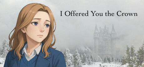
I Offered You the Crown scored 72/100 on Steam Analyzer — Good for a Adventure capsule. Top priority fix: [uniqueness_polish] Add a distinctive visual hook or UI element that signals the 'blizzard survival + relationship drama' premise specifically—consider incorporating a visual motif (crown, snowflake pattern, or environmental framing) that differentiates this from generic romance VN capsules.

Capsule scores by dimension

  • Genre Clarity: 7/10 — Visual novel narrative focus clear. The character portrait and contemplative expression immediately signal a story-driven, character-focused experience typical of visual novels and narrative adventures. The wintry castle backdrop reinforces a dramatic, high-stakes setting. At tiny size, the character silhouette and emotional pose remain readable, though the castle detail becomes abstract.
  • Title Readability: 8/10 — Clean serif typography, good placement. The title 'I Offered You the Crown' uses a clear serif font positioned in the upper right on a neutral background with excellent contrast against the light gray. The letterforms remain legible at small size, and the poetic phrasing is fully readable even at tiny zoom. Text placement avoids the character's face, which is strategically smart for safety margins.
  • Contrast & Color: 8/10 — Strong value separation, warm skin tone. The character's warm tan/copper hair and peachy skin tones create clear separation from the cool blue-gray castle and snow background, reading well against Steam's dark background. The dark blue outfit provides additional silhouette definition. The contrast holds at small and tiny sizes, with the character remaining the clear focal point through value difference alone.
  • Uniqueness & Polish: 7/10 — Polished anime-influenced character art. The illustration demonstrates consistent character rendering, soft shading, and careful attention to facial expression and hair detail that conveys emotional weight appropriate to the drama/romance premise. The melancholic expression and wintry atmosphere feel intentional rather than generic. However, the composition itself—single character portrait on scenic background—is a familiar visual novel template, limiting distinctiveness.
  • Brand Consistency: 6/10 — Coherent style, limited iconic identity. The character art style, color palette (warm copper/cool blue), and wintry aesthetic are internally consistent and likely carry through the game's visual identity based on a visual novel format. The soft anime-influenced rendering and contemplative mood align with the narrative tone. However, without additional visual motifs or a memorable symbol beyond the character, brand recall potential is moderate.
  • Composition: 7/10 — Strong focal point, safe margins respected. The character occupies the left-center area with the title balanced in the upper right, creating clear hierarchy and visual breathing room. The castle fades into soft focus in the background, establishing depth without competing for attention. The composition remains stable and readable at all sizes, though at tiny dimensions the castle detail becomes merely atmospheric texture rather than readable environmental storytelling.

What works

  • Readable serif title with emotional weight. The poetic phrasing and clean typography convey narrative sophistication and maintain legibility from full size down to tiny thumbnail.
  • Character expression communicates emotional stakes. The contemplative, slightly melancholic expression on the character's face immediately signals a story-driven experience with relational/emotional conflict.
  • Excellent value contrast separation. Warm character tones against cool background tones ensure clear silhouette definition and focus that persists even at tiny size.

What hurts the capsule

  • Generic visual novel portrait composition. The single-character-on-scenic-background layout is a common visual novel trope that offers limited distinctiveness compared to top-performing indie titles.
  • Limited brand identity beyond character. There are no memorable symbols, motifs, or signature visual elements beyond the character portrait itself that would enable recognition or recall.
  • Castle backdrop becomes unreadable at tiny size. The architectural detail in the background dissolves into soft gray noise at small/tiny zoom levels, reducing environmental storytelling impact.

Priority fixes

  1. [uniqueness_polish] Add a distinctive visual hook or UI element that signals the 'blizzard survival + relationship drama' premise specifically—consider incorporating a visual motif (crown, snowflake pattern, or environmental framing) that differentiates this from generic romance VN capsules.
  2. [brand_consistency] Introduce a memorable secondary visual element or color accent that could serve as an iconic brand marker across thumbnails and store page imagery.
  3. [composition] Consider repositioning or enhancing the castle silhouette with stronger value contrast so it remains visually distinct and atmospheric even at tiny resolution, rather than fading to gray noise.

Store copy priority fixes

  1. [feature_communication] Add a sentence clarifying the core interaction loop: e.g., 'Navigate branching dialogue choices, manage trust with other characters, and uncover secrets as the storm traps you all together.'
  2. [uniqueness] Strengthen the differentiator by adding a specific detail about what sets this story apart, such as a unique narrative mechanic, art style distinction, or thematic boldness.
  3. [audience_targeting] Add an explicit sentence addressing the intended player type, such as: 'Perfect for fans of character-driven narratives and relationship dynamics over action.'

Related guides

Steam app ID: 3635280 · Tags: Adventure, Casual, Action-Adventure, Interactive Fiction, Visual Novel