Scoring genre clarity...
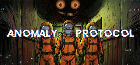
You step through the doors of a bunker from which no one has ever returned, together with your team. The goal is to explore labyrinth-like rooms and corridors to collect valuable loot, and after grinding this loot,send it to our base in space via rocket.The greater the danger, the greater the reward
HK$ 33.00Mostly Positive(30)
Early AccessHorrorAdventure
Oriland27 Jun, 2025