Scoring genre clarity...
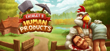
Chiklet's Human Products capsule

Chiklet's Human Products

This is a "Reverse Farming" game, where you play as a chicken and harvest human products. Hunt wild humans, harvest their Meat, Bones, Hair, Skin etc to craft bizarre recipes. Sell them for Profit and Expand your farm.

Open World Survival CraftSandboxCrafting
YK Game StudioComing soon

Chiklet's Human Products scores 83/100 — better than 96% of Open World Survival Craft capsules (n=144).

Released Coming soon · By YK Game Studio

Quick text summary

Chiklet's Human Products scored 83/100 on Steam Analyzer — Good for a Open World Survival Craft capsule. Top priority fix: [title_readability] Verify any secondary text or taglines are either enlarged or removed, as supporting text becomes illegible below small capsule size.

Capsule scores by dimension

  • Genre Clarity: 8/10 — Darkly comedic farming concept clear. The capsule immediately communicates a twisted farming/harvest game through the reversed human-as-livestock premise. The anthropomorphic chicken character in work clothes, wooden farm structures, pastoral landscape, and the title 'HUMAN PRODUCTS' with a wooden sign aesthetic all signal a simulation game with dark humor. At tiny size, the chicken protagonist and farm setting remain readable enough to infer this is not a standard farming sim.
  • Title Readability: 9/10 — Bold title excellent at all sizes. The title 'CHIKLET'S HUMAN PRODUCTS' uses a thick, all-caps serif font with strong yellow-gold fill and red banner framing that maintains excellent contrast against both the pastoral background and the dark Steam background. The wooden sign treatment reinforces the farming theme while keeping letterforms crisp and legible even at tiny thumbnail size where the text remains instantly readable.
  • Contrast & Color: 8/10 — Strong value separation and silhouettes. The composition uses a bright, warm pastoral scene with distinct sky-to-ground separation that contrasts well against Steam's dark background. The white-furred chicken character and red barn elements pop clearly against the green landscape. In grayscale, the value hierarchy remains intact with the character silhouette and title banner reading as distinct light elements against mid-tone foliage.
  • Uniqueness & Polish: 8/10 — Polished dark comedy premise distinctive. The core concept of a chicken farming humans for products is visually distinctive and immediately memorable compared to standard farming sims. The art quality is professional with detailed texturing on the barn, fluid character design, and a cohesive painterly style. The dark premise is conveyed through visual storytelling rather than overt gore, maintaining polish while communicating the game's unique satirical hook.
  • Brand Consistency: 8/10 — Iconic chicken character strong identity. The red-combed chicken in work clothes establishes an immediately recognizable character identity that should be consistent across marketing materials. The warm earth-tone palette with primary-color accents (red, yellow) creates a cohesive brand feel that balances whimsy with dark undertones. The character's pose and expression project personality that differentiates this from generic farm sims.
  • Composition: 9/10 — Excellent hierarchy and focal point. The chicken character occupies the right side of frame as a clear primary focal point with strong eye contact and dynamic posture, while the title banner anchors the left side with perfect balance. Background elements (barn, fencing, landscape) layer naturally to create depth without clutter. The composition survives cropping well across sizes with the character and title remaining prominent at small and tiny scales.

What works

  • Title readability at all scales. The bold serif font with thick strokes and strong color contrast ensures 'CHIKLET'S HUMAN PRODUCTS' remains instantly legible from full size down to tiny thumbnail.
  • Clear focal point and character design. The chicken protagonist with distinctive red comb and work clothes commands immediate visual attention while conveying personality and the game's twisted premise.
  • Professional art execution. The painterly style, detailed texturing, and polished rendering across all elements elevates this beyond generic asset quality and reinforces premium positioning.
  • Strong concept communication. The reversed farming premise is conveyed purely through visual storytelling without needing text explanation, making it immediately distinctive in the simulation genre.

What hurts the capsule

  • Minor tagline obscurity. The small text elements below the main title are not reliably readable at tiny size and may not communicate additional game info effectively during quick scrolling.
  • Pastoral backdrop lacks edge distinction. The bright sky and green foliage transition softly without sharp edges, which slightly reduces silhouette separation for the background barn and fence elements at tiny sizes.

Priority fixes

  1. [title_readability] Verify any secondary text or taglines are either enlarged or removed, as supporting text becomes illegible below small capsule size.
  2. [composition] Test the capsule at exact Steam small (231×87) and tiny (120×45) thumbnail sizes to confirm no important details are lost to cropping or blur artifacts.

Related guides

Steam app ID: 3643250 · Tags: Open World Survival Craft, Sandbox, Crafting, Exploration, Farming Sim