Scoring genre clarity...
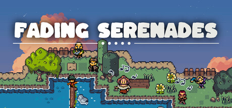
Hike, jump, and climb to traverse the treacherous terrain of the island to help villagers deliver parcels and complete their tasks and requests. Experience a story of vanishing traditions, a missing scientist, and an unfolding mystery. Serenading a quieter life, the island calls!
$9.99Positive(30)
2DCasualAction-Adventure
Bernie WickOct 23, 2025