Scoring genre clarity...

Night of the Living Skurre capsule

Night of the Living Skurre

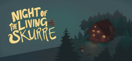
A 3D, third person action-platformer. Explore and set up various pranks. Hide and avoid detection, get chased under the couch, watch and laugh as people trip down the stairs, throw pinecones to annoy someone until they snap in this comedic game about a squirrel protecting their home!

Free to PlayPositive(11)
Exploration3D PlatformerSandbox
Mugged by SkurresMay 15, 2025

Night of the Living Skurre scores 72/100 — better than 48% of Exploration capsules (n=4,872).

Positive (11 reviews) · Free to Play · Released May 15, 2025 · By Mugged by Skurres

Quick text summary

Night of the Living Skurre scored 72/100 on Steam Analyzer — Good for a Exploration capsule. Top priority fix: [genre_clarity] Add a visible squirrel character in the foreground or near the cottage to immediately communicate the protagonist and prank-focused gameplay loop.

Capsule scores by dimension

  • Genre Clarity: 7/10 — Comedy adventure clear, tone readable. The cozy cottage, forest setting, and whimsical yellow title font clearly signal a lighthearted adventure rather than action-horror despite the 'Living' title. At TINY size, the warm house and pine trees remain identifiable as a domestic comedic setting. The squirrel protagonist and prank-focused gameplay are not directly visible, making the specific 'squirrel platformer' subgenre slightly ambiguous, though the overall vibe reads as indie adventure-comedy.
  • Title Readability: 8/10 — Bold yellow title, readable at all sizes. The 'NIGHT OF THE LIVING SKURRE' text uses a thick, golden-yellow serif font with strong contrast against the teal-gray background. At SMALL and TINY sizes, the title remains legible and maintains its character-driven charm. The intentional misspelling 'SKURRE' is preserved and readable, strengthening brand memorability without sacrificing clarity.
  • Contrast & Color: 8/10 — Strong warm-cool contrast, vibrant accent. The golden-yellow title pops sharply against the cool teal-green forest background, creating excellent value separation and visual hierarchy. The red cottage adds a secondary warm accent that breaks up the cool palette effectively. In grayscale, the title maintains strong luminance separation, and the cottage silhouette remains distinct against the darker tree masses at all viewing sizes.
  • Uniqueness & Polish: 7/10 — Charming indie aesthetic, competent execution. The capsule feels intentionally crafted with a cohesive diorama-like composition and careful color choices that evoke indie adventure games like DAVE THE DIVER or Viewfinder. The misspelled 'SKURRE' and cottagecore-meets-mischief theme communicate a unique comedic tone. However, the visual hook—a squirrel character or clear prank element—is absent from the capsule, which slightly limits its distinctiveness compared to top-tier indie releases that lead with their protagonist or core mechanic.
  • Brand Consistency: 6/10 — Cohesive scene, no character anchor. The warm cottage, forest silhouettes, and color palette form an internally consistent brand identity focused on cozy-mischief atmosphere. However, without a visible squirrel mascot or repeated visual motif across the capsule, the brand identity lacks a memorable anchor point. The whimsical serif font and warm-cool palette offer some recognizability, but would benefit from a signature character or icon visible at TINY size.
  • Composition: 7/10 — Balanced scene, clear focal hierarchy. The cottage occupies the right-center focal area with the forest framing it naturally, creating depth layering from distant tree line to mid-ground cottage to foreground trees. The title sits in the upper-left with breathing room, avoiding edge clutter and Steam cropping hazards. At SMALL and TINY sizes, the composition reads as a single cohesive scene without distracting competing elements, though the absence of a prominent character in the foreground slightly weakens the primary focal point.

What works

  • Excellent title contrast and readability. Golden-yellow serif font reads clearly at TINY size with strong value separation against the cool teal background.
  • Warm-cool color harmony. Red cottage and golden title create intentional warm accents that draw the eye and prevent the palette from feeling flat or monotonous.
  • Atmospheric composition with depth. Foreground trees, cottage midground, and distant forest create a natural sense of space and layering without clutter.
  • Cohesive indie aesthetic. The overall diorama-like presentation and cottagecore-meets-mischief tone establish a distinctive comedic adventure vibe.

What hurts the capsule

  • Missing protagonist visibility. The squirrel character—central to the game's hook and prank mechanics—is completely absent from the capsule, reducing immediate character recognition.
  • Weak genre-to-gameplay connection. While the cozy setting reads well, there are no visual hints of the platformer, action, or prank mechanics that define the core gameplay.
  • Limited brand iconography. Beyond the misspelled title, there are no recurring visual symbols or character design elements that would anchor brand memory across multiple store assets.

Priority fixes

  1. [genre_clarity] Add a visible squirrel character in the foreground or near the cottage to immediately communicate the protagonist and prank-focused gameplay loop.
  2. [uniqueness_polish] Include a signature visual element or motif (e.g., pinecone, mischievous pose, or a recurring icon) that can appear consistently across store screenshots to strengthen brand identity.
  3. [composition] Consider repositioning or enlarging the cottage slightly to create a stronger singular focal point that reads at TINY size and balances the title weight.

Store copy priority fixes

  1. [hook_strength] Add one sentence to the short description clarifying the overall goal or narrative arc—e.g., 'Stop the lumberjacks from logging your forest' to deepen the emotional investment beyond pranks alone.
  2. [feature_communication] Expand the detailed description to list 3-4 specific trap or prank types with brief descriptions to illustrate the variety and creativity available to players.
  3. [uniqueness] Add a sentence explaining what makes the puzzle or evasion design distinct—e.g., emphasize emergent humor or dynamic NPC reactions that reward creativity and experimentation.

Related guides

Steam app ID: 3645280 · Tags: Exploration, 3D Platformer, Sandbox, PvE, Platformer