Scoring genre clarity...
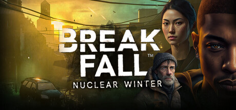
A strategic survival game where you play a group of survivors fighting to stay alive in the aftermath of a nuclear disaster. Expand your shelter during the day and try to find supplies at night to ensure your survival.
$17.996 user reviews
Early AccessAdventureSurvival
Dominik GeuerOct 25, 2025