Scoring genre clarity...

The last throne capsule

The last throne

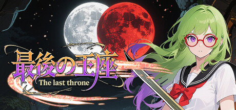
Roll the dice to shape your fate. Each throw triggers events as you explore and leap across tiles. Battle with cards, build your deck, and manage scarce resources. Time is limited—plan wisely and defeat the Demon King before darkness consumes all.

$3.991 user reviews
RacingCard BattlerTraditional Roguelike
SLW Game StudioNov 8, 2025

The last throne scores 62/100 — better than 2% of Racing capsules (n=762).

1 user reviews · $3.99 · Released Nov 8, 2025 · By SLW Game Studio

Quick text summary

The last throne scored 62/100 on Steam Analyzer — Solid for a Racing capsule. Top priority fix: [title_readability] Replace decorative font with bold, clean sans-serif or stylized font that remains legible at 120×45; increase letter spacing and outline contrast.

Capsule scores by dimension

  • Genre Clarity: 7/10 — Mixed signals, anime RPG reads. The anime character, magical girl aesthetic, and card/battle hints point toward JRPG or tactical RPG, which aligns with the game's card-battle and dice-roll mechanics. However, at TINY size the dual moons and character silhouette alone don't clearly communicate the dice-rolling/board game hybrid nature—it reads as standard anime adventure. The visible sword and magical aura help but aren't enough to distinguish this from dozens of similar titles.
  • Title Readability: 5/10 — Title loses clarity at tiny. The main title uses a decorative purple/gold font with Japanese characters that collapses significantly at TINY size (120×45), becoming a blurry purple shape rather than readable text. The English tagline 'The last throne' beneath it is even smaller and nearly illegible at thumbnail scale. At FULL size the title is readable, but the ornate style and small tagline fail the critical small-size stress test.
  • Contrast & Color: 7/10 — Strong character pop, busy sky. The bright lime-green hair, pink glasses, and white outfit of the character create excellent silhouette separation against the dark space background. The red moon adds warmth and draws attention. However, the starfield and multiple celestial elements (white moon, blue streaks, red moon) create visual noise in the upper region that competes with the focal point, reducing overall clarity at SMALL and TINY sizes where detail collapses.
  • Uniqueness & Polish: 6/10 — Competent anime style, generic layout. The character illustration is well-rendered with clean linework and appealing design, but the composition—anime girl on left, moons and stars on right, decorative title center—follows a very familiar J-RPG template. The dual-moon concept and magical-girl silhouette are pleasant but not distinctive enough to stand out among top-tier indie RPGs like Persona 3 Reload or Metaphor, which have stronger visual hooks.
  • Brand Consistency: 6/10 — Coherent magical girl aesthetic. The color palette (lime green, pink, purple, warm gold) is internally consistent and the anime art style is cohesive throughout. However, without reference to store screenshots, the capsule doesn't communicate a uniquely recognizable brand identity—the magical-girl-with-moons motif could apply to many games. The visual identity is polished but not iconic enough to be memorable on second viewing.
  • Composition: 6/10 — Clear focal point, cluttered background. The character is the obvious primary focal point on the right side with strong contrast, and the title is centered below. However, the background is crowded with three celestial bodies, streaks, and particles that create visual competition and don't serve gameplay clarity. The composition is functional but the busy starfield wastes prime real estate and the title placement leaves awkward empty space in the upper-left quadrant.

What works

  • Character silhouette clarity. The lime-green hair and bright outfit create excellent separation from the dark background and remain readable even at TINY size.
  • Warm color accent on cool space. The red moon and golden text add warmth and visual interest without overwhelming the palette.
  • Clean character illustration quality. The anime rendering is smooth, professional, and shows intentional art direction rather than asset-flip appearance.

What hurts the capsule

  • Title legibility collapse at small sizes. The decorative purple font becomes unreadable at SMALL and TINY sizes, failing the core readability test.
  • Cluttered starfield background. Multiple moons, streaks, and particles compete for attention and obscure the focal clarity needed for quick-scroll recognition.
  • Generic layout template. The anime-girl-plus-celestial-background composition is extremely common in J-RPG capsules and doesn't communicate the unique dice-rolling board-game mechanic.
  • Ambiguous genre signals. The visual presentation reads as standard magical-girl JRPG rather than highlighting the card-battle and dice-roll hybrid mechanics.

Priority fixes

  1. [title_readability] Replace decorative font with bold, clean sans-serif or stylized font that remains legible at 120×45; increase letter spacing and outline contrast.
  2. [composition] Remove or significantly reduce the starfield and decorative elements; create a cleaner background region that emphasizes the character and lets the title breathe without visual noise.
  3. [genre_clarity] Add a subtle visual cue—dice icon, card suit symbol, or game board motif—integrated into the design to differentiate this from standard magical-girl RPGs and hint at the unique dice-rolling mechanic.

Store copy priority fixes

  1. [genre_clarity] Clarify or remove the Racing tag—if racing is a core mechanic, add explicit description of how it integrates with dice rolling and tile exploration; if it is not central, consider removing the tag to prevent misalignment.
  2. [feature_communication] Add 1-2 sentences explaining how dice rolls trigger specific event types and how players respond to events mechanically (e.g., 'dice outcomes trigger encounters, obstacles, or rewards that shape your path').
  3. [uniqueness] Insert a differentiating statement such as 'where every dice roll writes your story' or 'the only roguelike where dice outcomes determine both exploration and card battle encounters' to clarify why this game stands out.
  4. [audience_targeting] Reference roguelike structure explicitly if permadeath, runs, or procedural generation exist (e.g., 'survive multiple runs in this roguelike adventure') to signal the intended hardcore player base.

Related guides

Steam app ID: 3646970 · Tags: Racing, Card Battler, Traditional Roguelike, Turn-Based Tactics, Exploration