Scoring genre clarity...

What Lies Frozen capsule

What Lies Frozen

A Psychological Horror game. Featuring puzzles, immersive environment, a tense atmosphere, and a unique hand-drawn art style.

$2.99Positive(33)
Hidden ObjectPuzzleSimulation
Ryphil, NoV8rs, Kickycaptain, Qi Liu, Abby JonesApr 30, 2025

What Lies Frozen scores 72/100 — better than 53% of Hidden Object capsules (n=1,334).

Positive (33 reviews) · $2.99 · Released Apr 30, 2025 · By Ryphil

Quick text summary

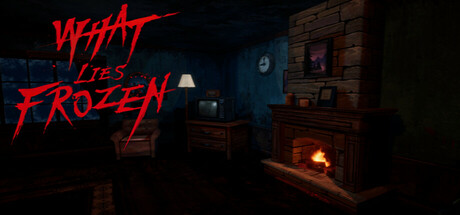
What Lies Frozen scored 72/100 on Steam Analyzer — Good for a Hidden Object capsule. Top priority fix: [uniqueness_polish] Introduce a subtle visual hook—character silhouette, signature object, or unique environmental detail—that differentiates from standard horror cabins and creates brand memory.

Capsule scores by dimension

  • Genre Clarity: 7/10 — Horror atmosphere clear, mechanics obscured. The dimly lit interior with fireplace, warm amber glow, and shadowed furniture immediately signal psychological horror and dread. At tiny size, the dark environment and ominous mood remain legible, but the puzzle and simulation mechanics are not visually apparent from the scene alone. The genre reads as horror-first, with simulation elements remaining implicit.
  • Title Readability: 8/10 — Bold red title readable at all sizes. The bright red 'WHAT LIES FROZEN' text in aggressive, scratchy lettering has strong contrast against the dark blue-toned environment and stands out immediately even at tiny size. The all-caps treatment and jagged stroke style create visual impact, though the heavy distortion effect makes individual letterforms slightly harder to parse at full size. The tagline placement on the left side avoids competing with the scene.
  • Contrast & Color: 8/10 — Strong red-to-dark value separation. The crimson title pops dramatically against the cool dark blue background, with clear silhouette separation in both color and grayscale mental tests. The fireplace glow provides warm orange accents that break the cool monotone and guide the eye, creating visual interest without muddiness. At tiny size, the red-dark contrast remains the dominant read and holds legibility.
  • Uniqueness & Polish: 7/10 — Stylish horror mood, somewhat familiar setup. The hand-drawn art style and distressed title treatment signal intentional craft and indie identity distinct from AAA horror aesthetics. The cozy-horror contradiction—a warm home interior paired with dread—is an effective hook that communicates psychological tension over jump scares. However, the isolated cabin interior is a well-worn horror visual trope, limiting how fresh or surprising the capsule feels against competitors like DREDGE or DAVE THE DIVER which have more distinctive visual hooks.
  • Brand Consistency: 6/10 — Mood consistent, no iconic character. The environmental design and color palette align with psychological horror expectations and the stated hand-drawn aesthetic, creating internal cohesion. However, without a visible protagonist, signature motif, or recognizable character, there is no strong brand anchor that would be memorable on repeat exposure or in a lineup of other horror titles. The capsule communicates genre competently but lacks a distinctive identity marker beyond mood.
  • Composition: 7/10 — Clear hierarchy, balanced focal point. The title anchors the top left with the interior scene filling the frame behind it, creating a natural layered depth and clear primary focus on the typography. The fireplace and furniture guide secondary attention without competing. At small and tiny sizes, the composition holds together well with no critical elements cut off by safe margins. The right side bookshelf remains slightly underutilized space that could reinforce the scene's immersion.

What works

  • Bold readable title at all scales. Red scratchy typography maintains clarity even at tiny thumbnail size and pops immediately against dark background.
  • Strong atmospheric mood setup. Fireplace warmth against dread creates psychological tension that communicates the core game feeling without requiring mechanics visible on screen.
  • Effective color contrast strategy. Cool dark interior + warm orange accents + saturated red title creates visual hierarchy that guides eye naturally.

What hurts the capsule

  • Generic horror interior setting. Cozy cabin with fireplace is familiar visual territory in indie horror, offering no distinctive visual hook against competitors like DREDGE.
  • No visible character or signature motif. Absence of protagonist or iconic symbol limits brand memorability and recognition potential on repeat Steam browsing.
  • Simulation mechanic invisible in composition. The capsule reads as pure horror atmosphere with no visual hint of puzzle or simulation systems, potentially misleading players unfamiliar with the game.

Priority fixes

  1. [uniqueness_polish] Introduce a subtle visual hook—character silhouette, signature object, or unique environmental detail—that differentiates from standard horror cabins and creates brand memory.
  2. [genre_clarity] Add a small visual indicator of puzzle or simulation mechanics—e.g., UI elements, tools, or interactive object highlights—to communicate the full scope of gameplay beyond atmosphere.
  3. [brand_consistency] Define and emphasize one iconic visual motif or character design across all marketing materials to build recognition and reinforce identity in competitive indie horror space.

Store copy priority fixes

  1. [hook_strength] Rewrite the short description to lead with a specific scenario or inciting incident (e.g., 'A couple's retreat to a snowy cabin unravels into nightmare') rather than feature list, and add a concrete reason to care (emotional or mystery-driven).
  2. [feature_communication] Add a sentence explicitly describing the core gameplay loop—e.g., 'Solve environmental puzzles and uncover hidden clues to piece together what happened'—so players understand how they interact with the world.
  3. [uniqueness] Expand on the hand-drawn art style with a brief description of its visual impact, or highlight what the robotic radio voice contributes to player experience beyond 'uncanny feeling,' to differentiate from similar games.
  4. [audience_targeting] Add a signal about who this game is ideal for—e.g., 'perfect for players who love story-driven horror over jump scares' or 'designed for a single-sitting experience'—to help self-selection.

Related guides

Steam app ID: 3647220 · Tags: Hidden Object, Puzzle, Simulation, Female Protagonist, 3D